I redesigned the onboarding and paywall in my app — and in a single week I earned more than in the previous six months combined

Six months ago I started building an app for learning foreign words. Let me say upfront: before this, I had only ever worked for a salary. Which means I always thought like a developer and an executor.
The more code I write, the more features I ship, the fewer bugs there are — the more I earn.
But this approach doesn't work at all when you want to make money on your own product. And it took me six months to understand that.
The MVP already had a paid subscription, but there was a catch
When I launched the MVP, I decided to bolt on a paid subscription right away, so that literally from the very start I could see not just interest in the product, but people's willingness to pay their own money for it.
I did, of course, add the option to subscribe. But since the product was still very bare-bones, I hid it away on the settings page. In other words, most of the users who downloaded the app didn't even suspect it had a paid version.
Naturally, there were almost no purchases. Except for one "pity" subscription — to support a beginner founder.
I can guess why I did it that way back then. I was a little ashamed of the app. In my head I already saw the future result I wanted to reach. But it was still a long way off. And users only saw what was there in the moment: bugs, a plain interface, a bare minimum of features.
So, to smooth over the impression somehow, I decided to bury the paid subscription as deep as possible. So that as few people as possible would see it. And only the most motivated and loyal users would manage to dig it up.
If you understand how your app works and why it's needed, that doesn't mean users understand it too
The first versions had, naturally, no onboarding at all. I didn't even know what that was. Back then, in my understanding, onboarding meant tooltips shown one after another: click here, then click here, and so on.
When I started attracting my first users, similar comments began showing up in the feedback:
It's completely unclear where to start when you land on the main screen.
So I finally decided to make some kind of explanation. But not to increase sales — just to explain in a couple of words what the app is for and what it does.
It was a few static slides where the user just had to press the "Next" button.
And I dared to add a paywall on the last step after the onboarding. But, naturally, nobody paid for anything from that paywall. Because the paywall itself had no trial, and there was a "Continue for free" button.
Then it became obvious to me why there were no payments. The user had simply read about the features but hadn't actually used the app in any way. He didn't understand whether he needed it or not. Who's going to pay for that? And on top of it, anyone will click the "Continue for free" button rather than the "Pay money" button.
A mobile app lives or dies by its onboarding and paywall
After that, all this time I kept trying to improve the app: I added new features, fixed bugs, improved how the neural networks worked. I barely thought about sales, onboarding, or the paywall screen.
At some point I happened to meet, at the gym, the owner of a large mobile app that makes $400,000 a month. An app for counting calories and building personalized workouts.
I downloaded that app and was surprised: it had around 20 onboarding steps, after which came a payment screen offering a 3-day trial.
At first this felt counterintuitive to me. I had literally spent up to 10 minutes of my time on the onboarding. You'd think that this would, on the contrary, lose a lot of customers who simply never make it to the end.
But then everything fell into place.
A long, personalized onboarding is literally the foundation for mobile apps. It's simple: a person who has already spent their time is more likely to start a trial. Otherwise they'd have to admit they wasted those 10–15 minutes.
But, of course, what matters isn't just the number of screens, but also what they consist of.
Now for the meat. How I reworked the onboarding in my product
Once the product became more or less stable, I spent a couple of weeks digging deep into the onboarding and paywall. I literally did only that, and during this time I didn't build any new features into the product.
In the end I got a set of screens like this — 19 steps in total.
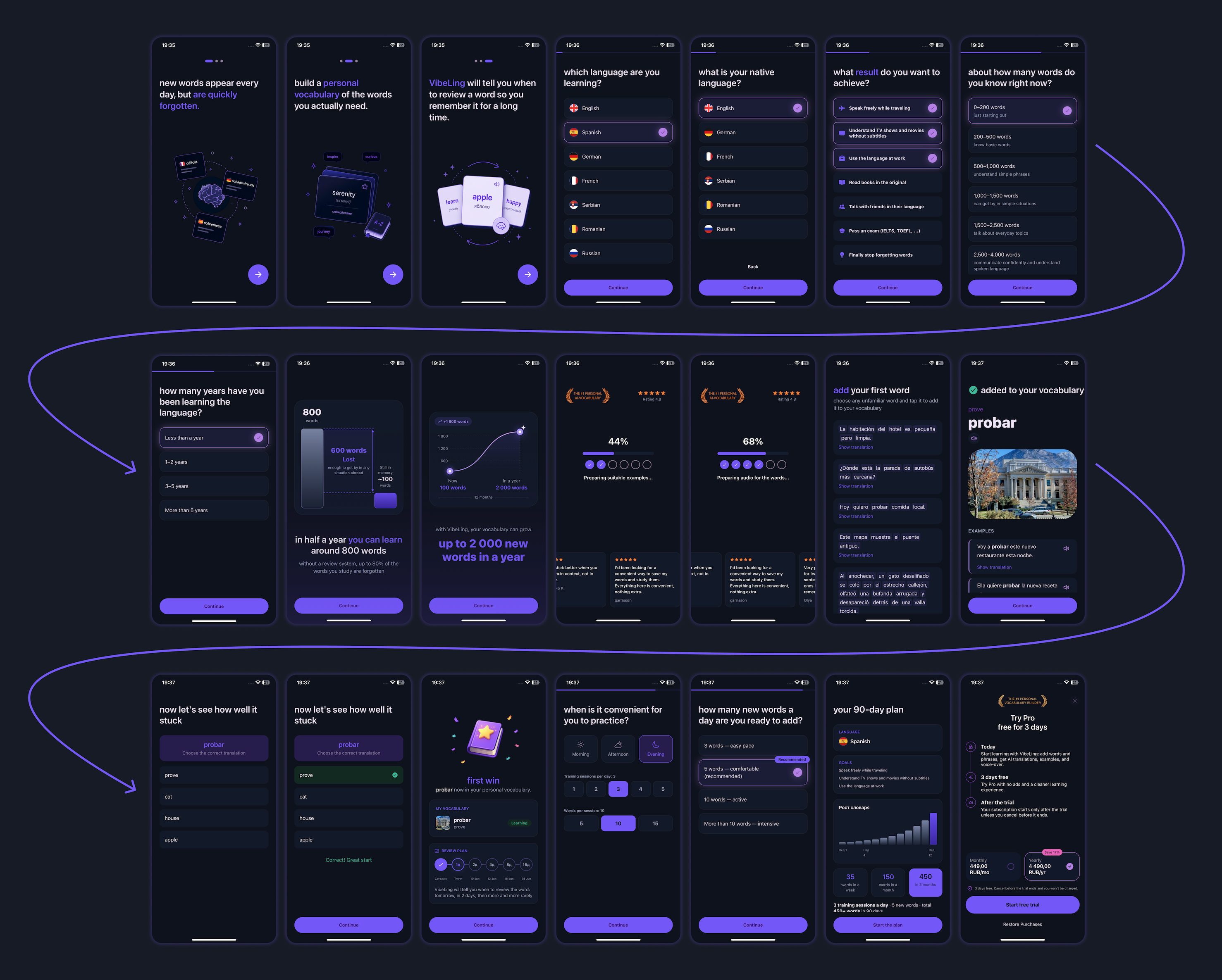
All onboarding steps and the paywall in VibeLing
Now in order: what was done and why. Every screen matters and affects the conversion to subscription at the very end.
Briefly explaining the app
Information about the VibeLing app
The very first slides are very light. Here we just tell the user in a couple of words what the app is and what it's for.
Because far from all users download the app deliberately. Someone might have just tapped "Download" without looking, and only after the first launch started figuring out what they'd actually downloaded.
Finding out the most important information
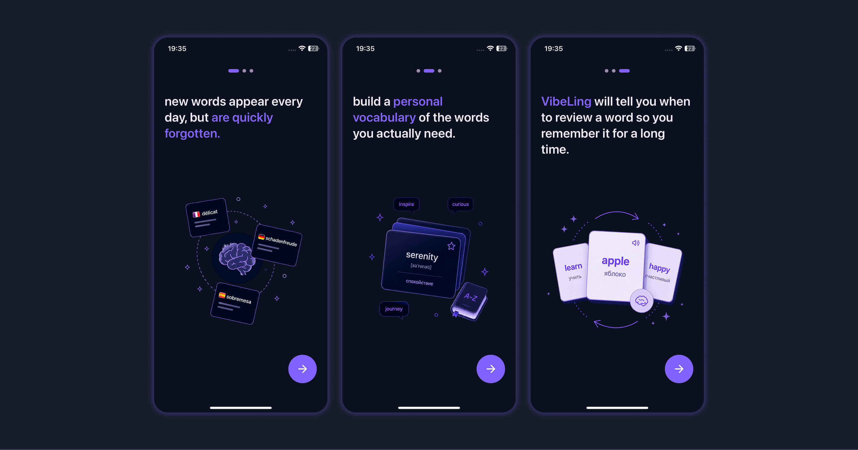
The language to learn and the user's native language
Since my app lets you learn many languages, it's important for me to find out which language the user needs and what their native language is, so I can show the translation in exactly that language.
This is literally the most important information. Because if the language they want isn't available, there's no point in continuing.
On top of that, we find out the goal of learning the language. Already here we show the user that we're giving them not just a bare tool, but a personalized app tailored to their personal goals.
Plus these goals are used later inside the app itself — for recommended word presets.
Not the most pleasant part of the survey, but a very important one
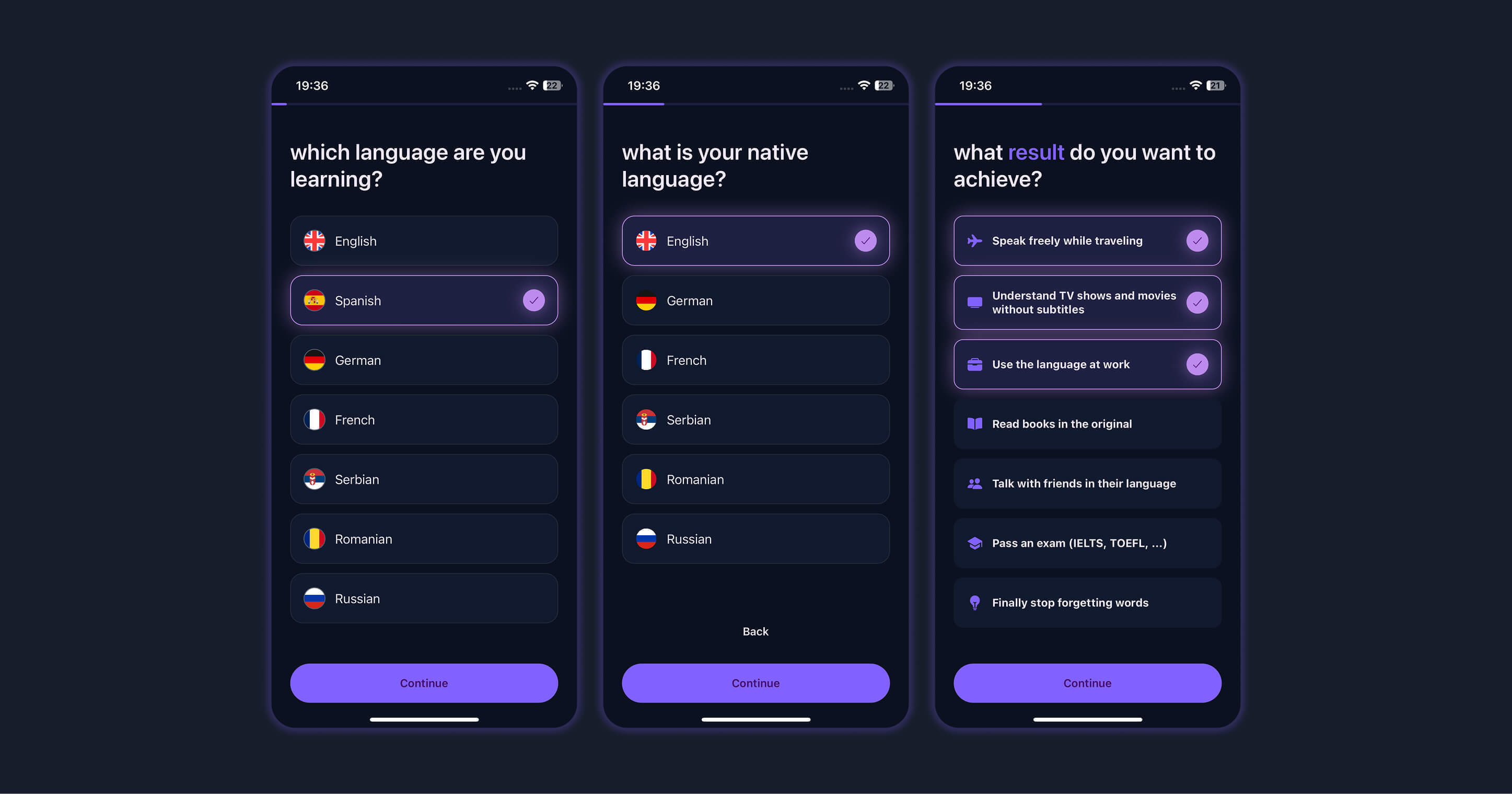
Missed opportunities
The goal of the next steps is to collect information about how long the person has been learning words and what results they've already achieved. And after that, to highlight their missed opportunities: what results they could have achieved if, for example, they had used our app earlier.
I'd call this part the depressing one. It's important that the user reflects and even gets a little upset.
But don't worry — next we'll inspire them.
Creating the effect of personalization while running heavy operations under the hood
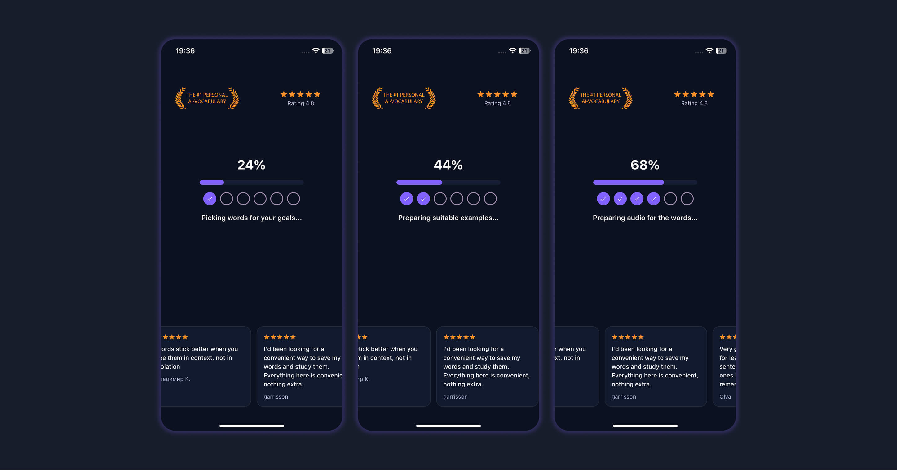
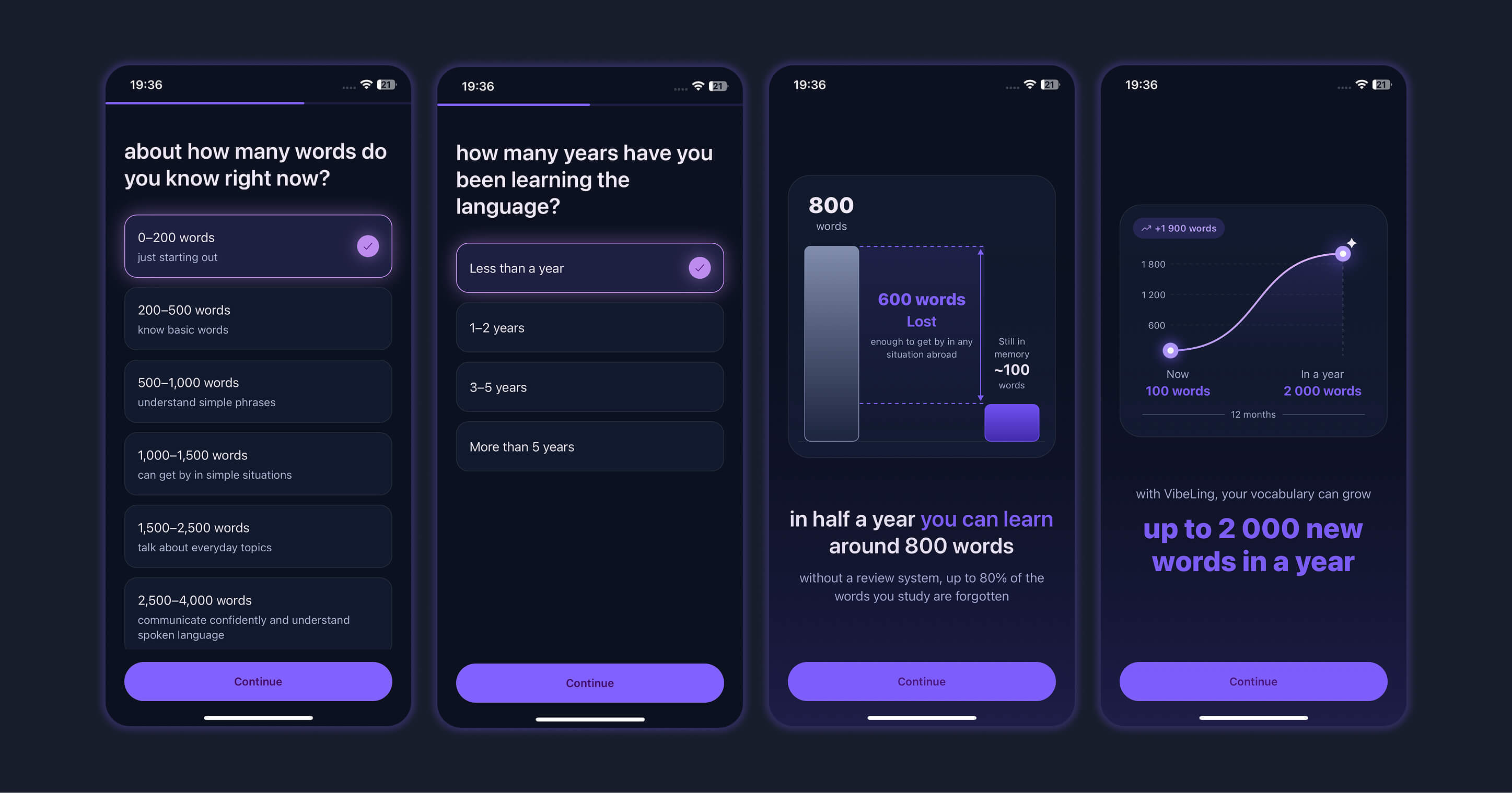
Tailoring the VibeLing app to the user
For the most part these slides are a fiction. Technically they're needed to perform heavy operations on the backend and prepare the upcoming examples with sentences.
At the same time, we use this moment to show great reviews and the rating. This gives the user a sense of a serious approach and real personalization for them.
Letting them use the app
First contact with the app
This is a very important part. Before showing the payment screen, the user needs to at least minimally understand how they'll be interacting with the app most of the time.
To do this, we let the user actually add a word they don't know — in the most natural mode possible: by selecting it from a sentence.
After that we show an example of one of the training exercises: a question with four translation options, from which you have to pick the one correct answer.
The person picks the correct answer, and we show them a success screen. On it we explain what will happen next.
And next, this word will appear in training sessions using a spaced-repetition system — less and less often, until it settles into long-term memory.
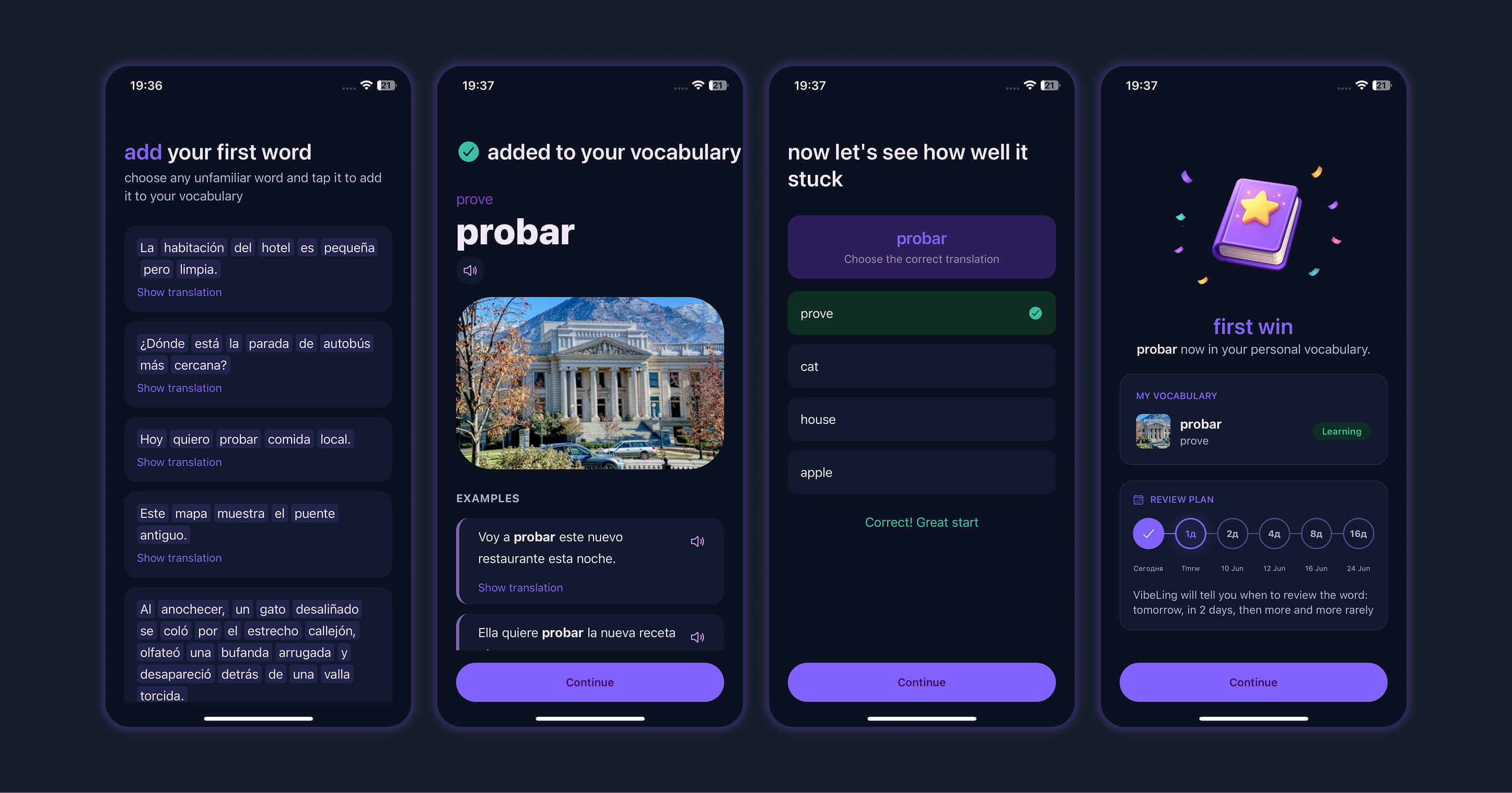
Collecting the last data for personalization
Frequency and length of training sessions
All that's left is to collect information about how often the person wants to learn words. This is needed both to actually configure the number of training sessions in the app itself, and for the final onboarding screen.
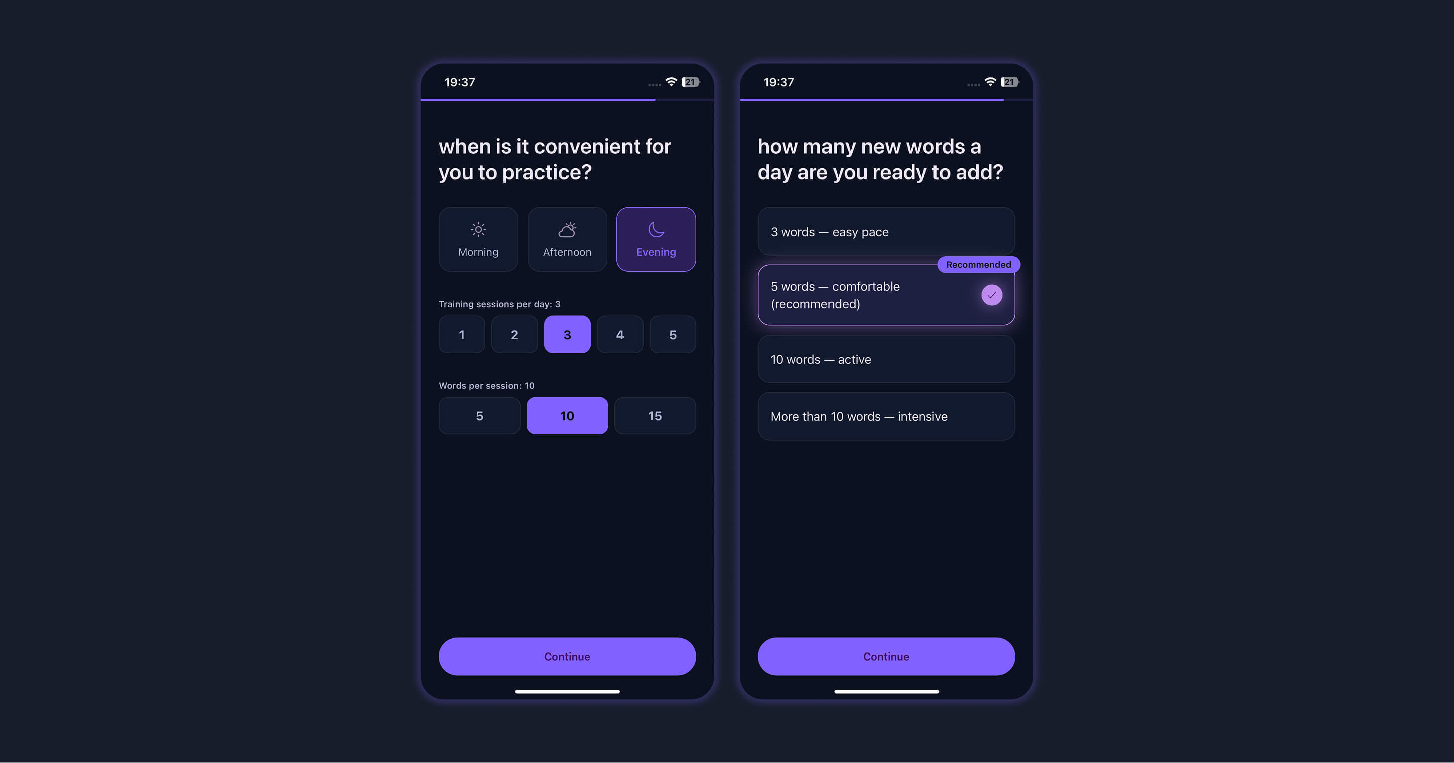
Presenting the personal plan and showing the paywall
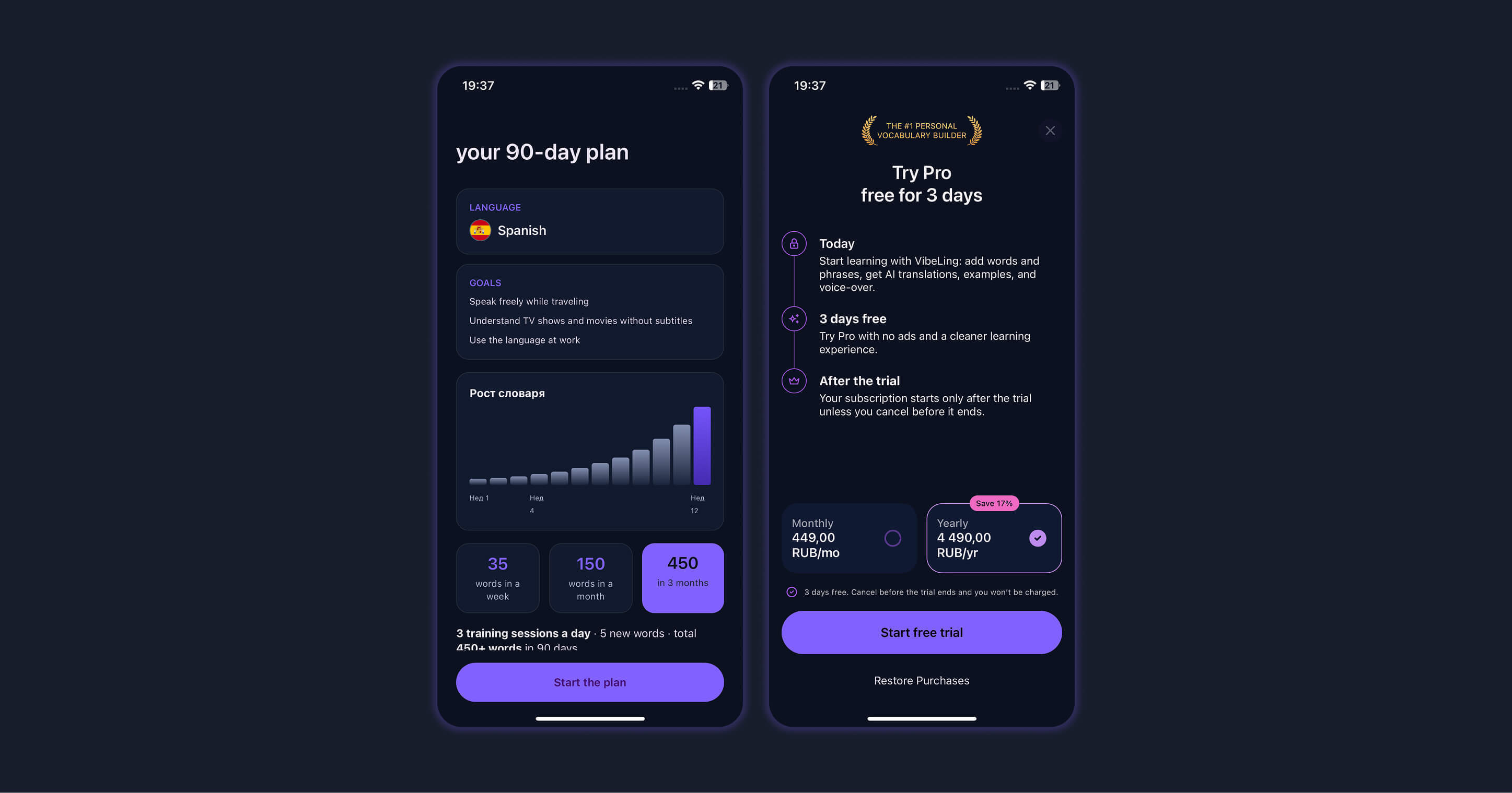
Learning plan and payment screen
Here we've gathered all the information: the learning goal, the languages, the training frequency. We told the user about their missed opportunities and showed how many words they could already know if they'd started earlier.
We also gave them a demo of the product and helped them start learning their first word.
Finally, we can show the final onboarding screen with a personal 90-day plan. Here we show how many words the user will know if they start using the app today and keep at it without a break.
And at the very end we wrap it all up with the paywall.
And here it's important to understand that the user is already maximally motivated to try the trial version. They understand the value of the app, they've used it, and they know why they personally need it.
The paywall has two options: a monthly and a yearly subscription. It's important to give a discount on the yearly plan to motivate the user to choose exactly that option.
Initially I thought no one would buy the yearly subscription. But I was very surprised when almost 50% of the payments over the last week turned out to be yearly ones.
You also absolutely need to add a 3-day trial. This is literally the gold standard. It greatly increases the final conversion to payment, because the user feels safer. And of course you need to state this explicitly — this is called "handling objections."
The user isn't forced to pay for a black box. They understand they can cancel the trial that same day if the app turns out to be garbage or just doesn't suit them.
Another interesting paywall hack
In fact, the app can be used for free. But we don't provide an explicit "Continue for free" button. And that's what most large mobile apps in the stores do.
In the beginning I had exactly that button — "Continue for free." 100% of users clicked it.
Instead of such a button, we make a not-very-noticeable little "X" at the top of the screen. Many people won't even realize they can tap it and keep using the app for free. But if they do realize — they can tap it and land on the main screen. And we can motivate them to subscribe further down the line, inside the app. But that's a whole separate big story.
Results
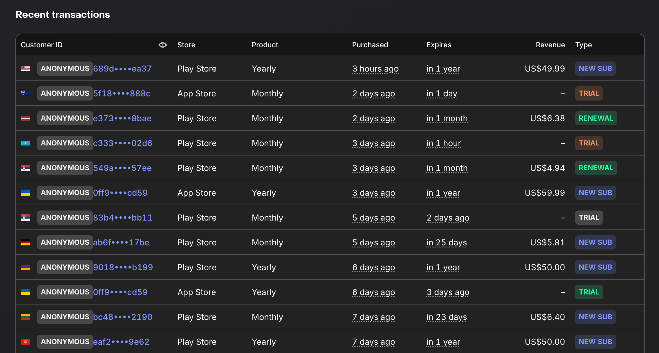
Subscriptions over the last week after releasing the new onboarding
Before releasing this onboarding, at best I was earning $55 a month. And those were only monthly subscriptions — roughly 10 active subscriptions.
After the release, in a single week I immediately got 4 yearly subscriptions and several monthly ones. Even though the flow of new users stayed roughly the same the whole time.
The conversion to starting a trial among new users grew from 2.5% to 5%.
And on top of that, I haven't even used additional ways to nudge users — for example, an extra 50% discount limited in time.
I'm sure it's possible to reach 10%.
This whole time I've been talking about the app VibeLing — you can take a look yourself at how everything is built there, if you're interested. And I'll be glad to get any feedback.

The onboarding point maps to free utility apps too: before any monetization decision, the user has to understand why the permission is worth it. With Kinetic Override I’m focusing first-run copy on no-root, local profiles, no ads, and visible replay controls so the macro recorder feels predictable before someone runs a loop.