I revamped my landing page and here's what I learned
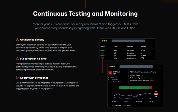
Hi there, I am Julian, and I'm building Owl Duty a SaaS to monitor and test APIs. After sharing my landing page with friends, developers and indie hackers I realized my copywriting wasn't good. I was too vague. So I took time to revamp my landing page and here's what I learned along with some personal tips.
🏋️♂️Your landing page is like an exercise
The more you refine it, the more you will improve your pitch and core value proposition. Surprisingly, creating and redoing my landing page helped me better understand what I wanted to build and what my limits were (time, money, network). My first version helped me to acquire a few early adopters, but I knew it was necessary to iterate and ultimately revamp my page to attract more people.
📝 Your copywriting should be attractive
... with catchy headlines but informative paragraphs at the same time. It should be specific without being boring. The idea is to retain your visitors' attention to the end and convert visitors to users/customers. I have to say it's really hard to balance and it may take several iterations to get it right.
🗨️ Talk about your landing page
In my case, I shared it with indie hackers, and developers (some of them are also my friends). Also, I decided to get an outside perspective and see how an almost neophyte person would understand it (almost because after 13 years together my partner understands most of the tech terms 😅). I got interesting feedback, especially on the copywriting and its clarity.
🎨 Get a good design!
I don't know about you, but when I see a generic page with a bad design I close it immediately. Why? Because the design reflects the seriousness of the solution and the passion of the founder. I revamped the design, but also replaced my generic illustrations with small placeholders describing the features listed. Screenshots work pretty well and give confidence, use them if you already have an existing product. Just make sure your design is great. As for the overall style, I tried to pick one that speaks to developers/techies as they will be my early adopters.
📲 Call to action!
There are many ways to convert visitors into customers/users, but I think a good rule of thumb for a landing page is to make sure your call to action is the first thing visible and accessible from everywhere. For this, I like to put a button in a fixed header, so that visitors can click at any time. I try to avoid asking for an email first, personal preference, but I want to be sure people buy the concept after reading my page. Plus, I don't want to be too intrusive.
👤 Who are you talking to?
Users? Leads? Early adopters? Not having a product yet, I adapted my speech and preferred to constitute a mailing list of early adopters. It's transparent, people know why they subscribe (my newsletter in this case) and it builds trust. Plus, they get a special benefit on early program products and services. Make sure your call to action is clear. If you already have a product, you can provide a sign up form instead.
⌚ Designing a good landing page takes time.
The first version took me about 1,5 days (copywriting included). The new about 1,5 weeks (new copywriting included). Don't get stuck and go for the shortest iteration at first but don't necessarily share your page publicly. Get feedback then iterate, and you'll see your business idea evolve as you start building, which should be reflected in your copywriting.
🔒 Build trust from the beginning
You will need to think about the actions and information required to be GDPR compliant: data processing, cookie policy, DPO, ... and maybe some legal notices depending on where you reside. It takes time and shouldn't be neglected for the obvious reasons of doing good but also for your brand image. Anyway you will face it sooner or later if you are serious about your business.
💡Tech recommendations
- NextJS is a great framework to build good SEO and optimize your landing page (not only of course).
- TailwindCSS is a great way to design UIs quickly with very short feedback loops.
- I use Netlify to host my page, they have a free tier and they automatically recognize your framework. They also optimize images if you need, and provide everything for SSL certs and adding your custom domain. They also provide preview pages in your pipelines (github app) so it's easy to share and get feedback before moving to prod.
- Github open sourced two fonts: Hubot-Sans and Mona-Sans - I use them for readability and "tech" style
And you, do you have any recommendations/tips for the community?

Great post, thanks for the tips! I checked out your site and it looks great, definitely appealing to the tech and developer audience. Looks a lot like the Github landing page which means you're doing something right!
Thanks for the feedback! I took inspiration from different "tech" landing pages to help me to find the right design. Github one wasn't in my list this time but yep that's true it has the same tone!
Congratulations Julian! Thank you for sharing. Will definitely apply these things soon. Where did you get your design? Websites like Fiverr or Upwork or something more professional?
Thanks! I made the design myself :)
I agree with everything said here.
Actually, it feels like building the landing page is harder than writing code
Indeed, you have to find the right words so that people have a clear idea of what you offer while being keeping it short to not be boring :)
From my experience, everything around the go-to-market forces you to think about what and for who you're building. It's a really great exercise.
Heck, I'm building something I'm using every-day and still I'm struggling to clearly name the value proposition when writing an update or building the landing page.
Exactly! Don't worry too much, the first versions are there to understand exactly what your users or customers want. Sometimes you have to agree to remove features, or refine your explanations. It can be a bit frustrating. What really helped me was getting feedback from people around me, that's when I started to see how I should present the solution.
Thanks for the insight and summary! I also believe constant iteration really is the key to success.
However, I have a constant struggle of what to include in my landing page.
Should I put more values or more actual tangible features?
Since my target users should be very technical, putting more features should be more appealing to them but I sometimes get bounce back from my team about our landing page is like a product catalogue, adding more value and now my landing page is too vague, once a again i cannot find a sweet spot at all.
You're welcome! Glad it's helpful!
Just write an imperfect first draft of your landing page taking into account your user/customer issues. Check if what you want to provide can solve these problems. Don't do any design at first, just work on your drafting. Less is more as they say, starting to work on a minimal subset of features will make it easier for you to validate them.
You need to get feedback at different stages. Try to iterate more than finding the perfect landing page from the start. I'm not an expert, I'm just trying on my side too! But I started with a vague idea of features, got feedback, removed some, and improved copywriting for others. The scope really depends on your ability, I'm a solo developer so I pay close attention to the number of features.
If you have an existing product with customers, I think it's easier because you already know what works and what doesn't. I would prioritize the main features of my landing page. Then add one more, validate if people subscribe to this feature (heatmap or send button click metrics or check specific pages viewed), and keep it only if validated. Then iterate.
Ask people what they think of your landing page, it can be very useful, they will indicate what they do not understand, what is not clear. Check out other landing pages, try to emulate their writing style, it also helps incredibly.
Useful indeed, have a long way to go. Thanks for sharing.
I'm glad to know it will be helpful to someone! Good luck !
Celebrate in style, Julian! We appreciate you for sharing your thoughts with us. Get ready to put these things into action soon! Discover the inspiration behind your stunning design. Looking for a platform that caters to your professional needs? Consider exploring options like Fiverr or Upwork.
Hi Julian,
Thank you for sharing your experience with revamping your landing page for Owl Duty. It's inspiring to see how you've recognized the importance of refining and improving your pitch and core value proposition. I appreciate the valuable tips you've shared, and here's my response to each point:
🏋️♂️ Refining your landing page is indeed like an exercise that strengthens your pitch and value proposition. It's commendable that you took the time to iterate and revamp your page to attract more people. The process itself helped you gain a deeper understanding of your goals and limitations, paving the way for a more compelling offering.
📝 Crafting attractive copywriting is a delicate balance between catchy headlines and informative paragraphs. It's crucial to captivate visitors' attention while providing them with specific and engaging content. Achieving this balance may require multiple iterations, but the effort is worthwhile as it contributes to converting visitors into satisfied users and customers.
🗨️ Seeking feedback from a diverse audience, including indie hackers, developers, and even outsiders, is a wise approach. Their perspectives provide valuable insights into the clarity and effectiveness of your copywriting. Embracing outside viewpoints helps you refine your message and ensure its understanding across different levels of technical familiarity.
🎨 Design plays a pivotal role in the perception of your solution and your commitment as a founder. A well-designed landing page, void of generic elements, instantly communicates the professionalism and passion behind your product. It's fantastic that you revamped the design and utilized screenshots and placeholders to showcase your features effectively. Choosing a style that resonates with developers and tech-savvy individuals is a smart move, considering your target audience.
📲 Placing a clear and accessible call to action (CTA) is paramount on your landing page. Ensuring that the CTA is visible from any part of the page, such as in a fixed header with a clickable button, facilitates easy conversion. Your decision to prioritize presenting the concept before asking for an email aligns with your intention to build trust and avoid being intrusive.
👤 Identifying your target audience and tailoring your message accordingly is essential. While you're still in the pre-product stage, focusing on early adopters and building a mailing list demonstrates transparency and fosters trust. Clearly communicating the benefits of subscribing to your newsletter strengthens the relationship with potential users. If you already have a product, a sign-up form can be a suitable call to action.
⌚ Designing a remarkable landing page requires time and iterative effort. Your experience of spending around 1.5 days on the first version, including copywriting, and then 1.5 weeks on the revamp indicates the dedication you've put into perfecting your page. It's wise to seek feedback and iterate without rushing to share your page publicly. This iterative process aligns your evolving business idea with your refined copywriting.
🔒 Building trust from the beginning is a critical aspect of your business. Addressing GDPR compliance, data processing, cookie policy, and legal notices showcases your commitment to user privacy and establishes a positive brand image. Being proactive in this regard demonstrates your professionalism and responsibility, ensuring your business remains on the right track.
💡 Thank you for sharing your tech recommendations as well. Leveraging NextJS for building SEO-friendly and optimized landing pages is an excellent choice. Additionally, TailwindCSS allows you to design UIs swiftly while maintaining short feedback loops. Utilizing Netlify for hosting your page, with its free tier and convenient integration with frameworks, simplifies the deployment process. The availability of SSL certificates and custom domain support further enhances the user experience. Lastly, the open-sourced fonts Hubot-Sans and Mona-Sans from GitHub contribute to readability and add a touch of "tech" style to your page
.
Keep up the great work with Owl Duty, Julian! Your insights and dedication to refining your landing page will undoubtedly contribute to the success of your SaaS.