I revamped my landing page. Roast it please 🔥
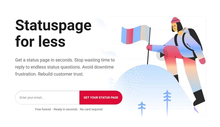
http://supstatus.com
With feedback I got from twitter friends, I changed a lot of the design and copy of Supstatus.com.
My goals for the landing page are:
- Convince visitors that it's important to get a status page.
- Show that Sup is a simple & affordable alternative.
- Convert ofc!
Do you think it works? Looking forward to your roasts 🔥
Thank youu :D

My first question when seeing this: what is a status page? (My first guess is something to do with social media.)
Then I read the small text describing the benefits, and figure out it's probably one of those monitoring/status reporting pages like https://www.githubstatus.com/ But it's not clear.
It's a nice page, and nice benefits description, but nowhere does it actually explain what the product actually is (unless you instantly associate the term status page to monitoring and not something else) . I'd suggest a picture of a status page to make it clear "this is the thing you're signing up to get"
I agree! A status page visual / screenshot could help with that I think. Thank you for your feedback!
Sandwich feedback, but you already know my opinion on this, so I'm just doing this for the hecks.
➕
➖
Pointers:
:D
Thank you Julian for your feedback and help, here and on twitter! 🔥💪
Great design and the application's features are displayed well.
You may increase conversion by adding a CTA button somewhere between "Regain Time" and "Automate With Services You Use".
You may consider my edits to some of your copy below.
Up & Running in Seconds
Publish your status page in seconds. Your customers will instantly have one central location to check your status.
Communicate Incidents Faster
Your status page keeps customers informed about updates. Create your page to reduce service inquiries and free up time for your team.
Display Your Uptime
Showcase the full picture of your uptime to emphasize the stability of your application. During downtimes, it will help rebuild customer trust.
Positive Customer Experience
Keep your customers in the loop to provide a positive customer experience. This will help you avoid customer frustration during downtimes.
*If you want to return the favor feel free to critique CompetitorZoom, https://www.indiehackers.com/post/where-can-i-make-improvements-a50cea5266.
Oh thank youuu Greg for your feedback!! 😊 Sure I will!!
Really great design! and very clear messaging.
Are you targeting startups as your customer? I guess then "growing startups" social proof is fine.
Also, where did you get your graphics? they look nice!
Thank you!!
Yeah, startups are my focus right now because statuspage.io already has the big companies. And my main advantage currently is pricing which bigger companies don't care about.
Illustrations are from https://icons8.com/ouch
Thank you for your feedback!
Really nice, clean, professional look.
And most importantly it gave me a trust feeling!
Thank youu!!
Looks great to me! Agreed the cookie notification probably isn’t required?
Thank you, Deweysi! Do you think it's too big? Or isn't necessary at all?
From what I understand, you wouldn’t need it at all
What cookies are you storing where you need that disclaimer?
I use Google Analytics, Paddle payments, Hotjar, Crisp chat.
These all store cookies, but they don't start unless you agree on cookies. I didn't spend time on it, it's all metomic.io :D
Do you think the disclaimer is unnecessary or too big?
Yeah, my eyes just kept gravitating towards it. If you don't need it, I'd remove it. Overall though, I think your design is really strong and effective.
Good design
Thank you, Alok :D
This comment was deleted 7 years ago