I rewrote my entire app UI in 2 weeks after feedback said it felt "vibe-coded"
I'm building FlareWarden, a solo-founded uptime monitoring tool. I put it out for feedback recently and got the kind of honest responses that make you close your laptop and go for a walk.
The two biggest hits:
1. "Your app feels vibe-coded." Someone pointed out that I'd basically built a top dropdown nav and stopped thinking about layout. Too many clicks to get to useful info. Nothing surfaced proactively. No dark mode. They were right — I'd been building for does this feature exist instead of can someone actually use this.
2. "Your branding isn't accessible." I had this teal/red palette with a shield logo that I genuinely loved. Deliberately avoided the dark-header-white-page SaaS look. But multiple people independently said the logo colors didn't pass accessibility checks and the brand wasn't landing. When several strangers agree on the same problem, it's not a taste issue.
What I did (2 weeks, dozens of features rewired):
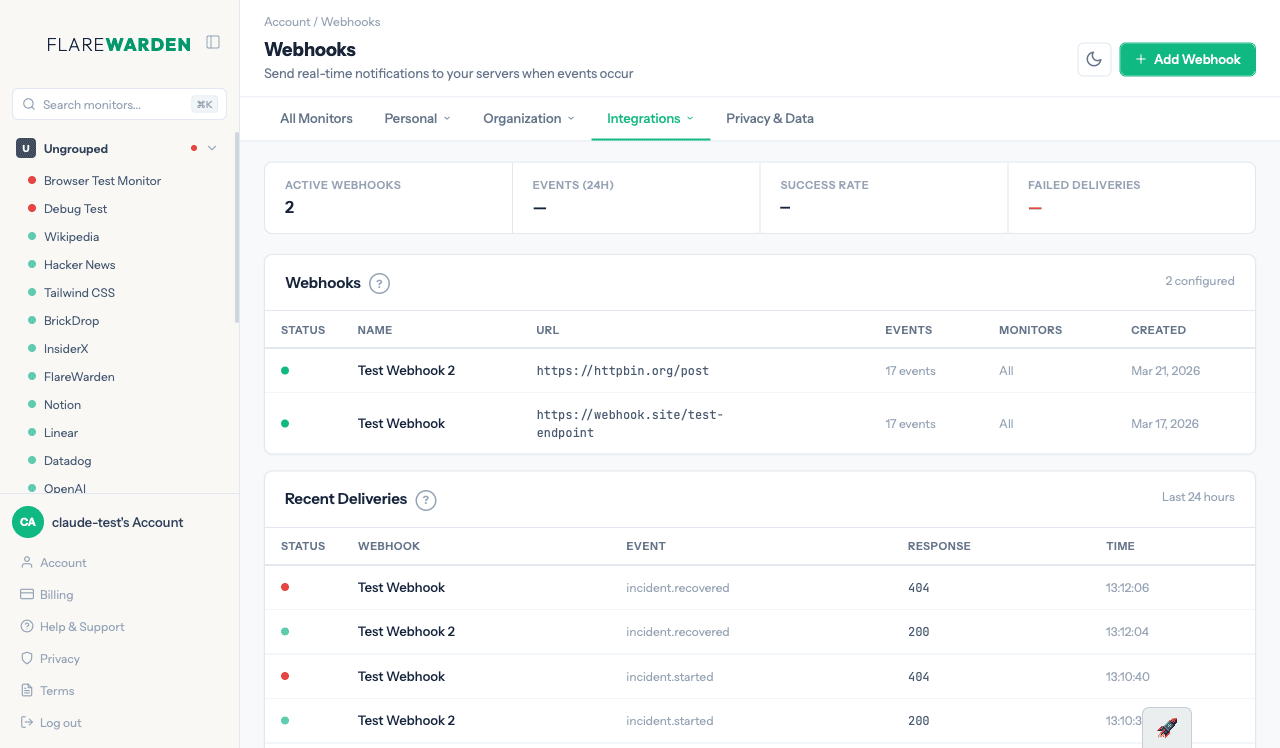
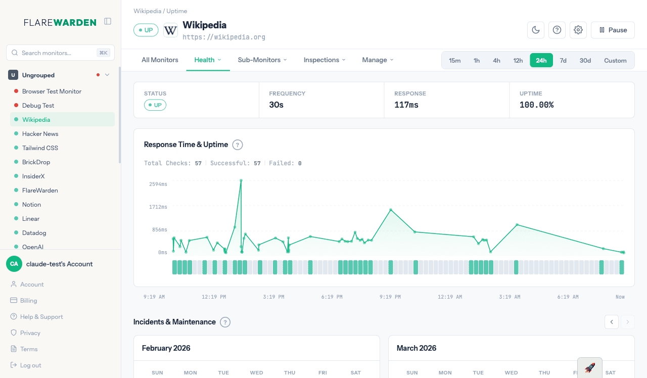
Brand side — killed the shield, killed the red, moved from teal to emerald green, switched to a wordmark, and leaned into "Warden" as the visual anchor instead of "Flare." Simpler, more legible, actually accessible.
App side — full UI rebuild, same information architecture underneath. Persistent side menu showing all monitors with live updates. Dashboard that surfaces incidents across monitors with deep links instead of burying them. Contextual calendars on most pages. Actions moved into flyover panels so you stay in context. Nearly everything updates live without page reloads.
The approach shift was the real change: before I built functionality and gave it a representation. This time I designed for usability, clarity, and information density first, then wired the functionality back in.
The hardest part: rebuilding features you already have into a new interface. You're not shipping anything new. You're just making what exists actually good. It's the most tedious kind of work because there's no dopamine hit of "new feature launched" — just the slow grind of "this interaction is slightly less annoying now."
The thing I'm still not sure about: I genuinely liked my old brand. It was different. The new one is objectively better but also safer. Has anyone else gone through this — killing a brand you liked because the feedback was clear, and still second-guessing it after?
Old Design

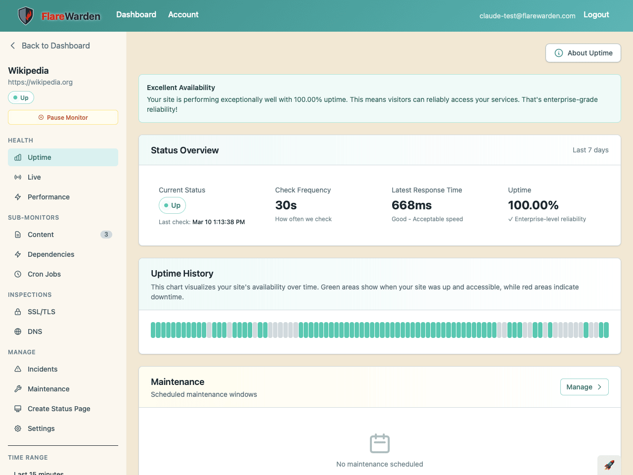
New Design