I’ve made over $2,000,000 designing websites - here are my top 5 tips

I’ve generated over $2,000,000 in my career as a website designer.
I’ve designed websites for some of the biggest brands in the world including PayPal, Sony, Nestle, Marks & Spencer and Samsung.
In this post, I’m going to share my 5 top tips that will help you create amazing website designs.
Let’s dive in!
1. Use just 3 colours

When picking your colour palette I recommend using just 3 colours. One colour for your background. One colour for your typography. And one colour for your accents. By accents, I mean things like buttons. A grand total of three colours!
Check out any popular well-designed websites. Most of them predominantly use just 3 main colours.
You can use variations of your 3 colours. For example, when I use black I do use some greys. But rarely do I ever introduce more than 3 completely different colours into the design.
There will be times when you can’t pick your own colours. For example when you have brand colours to work with. Great! Just use black, white and a single brand colour for your highlights.
2. Use just one font
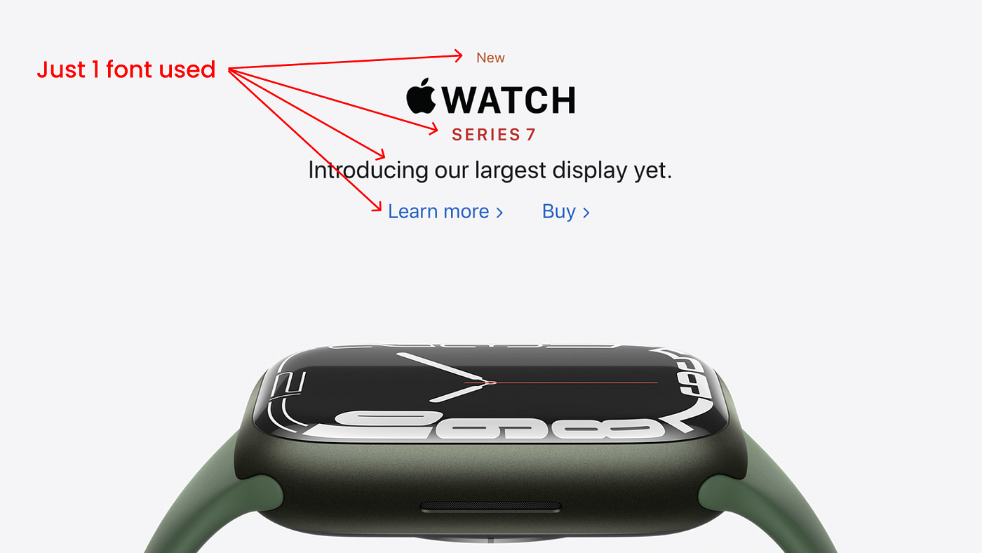
When choosing fonts for your website design I recommend using just one classic typeface.
Your font family must include a number of different weights. For example Heavy, Bold, Medium and Light.
To achieve variation and hierarchy in your designs you can change up the size and weight of your font.
Super important! You must pick a high-quality font. It must read well in long copy. For example your blog posts. I recommend using classic fonts like Helvetica and Poppins.
“But my client uses brand font XYZ and we must use it”
If you must use a brand font. Use it just for the main headers. Then use your single chosen font for the rest of your website designs. Done!
3. Make everything modular
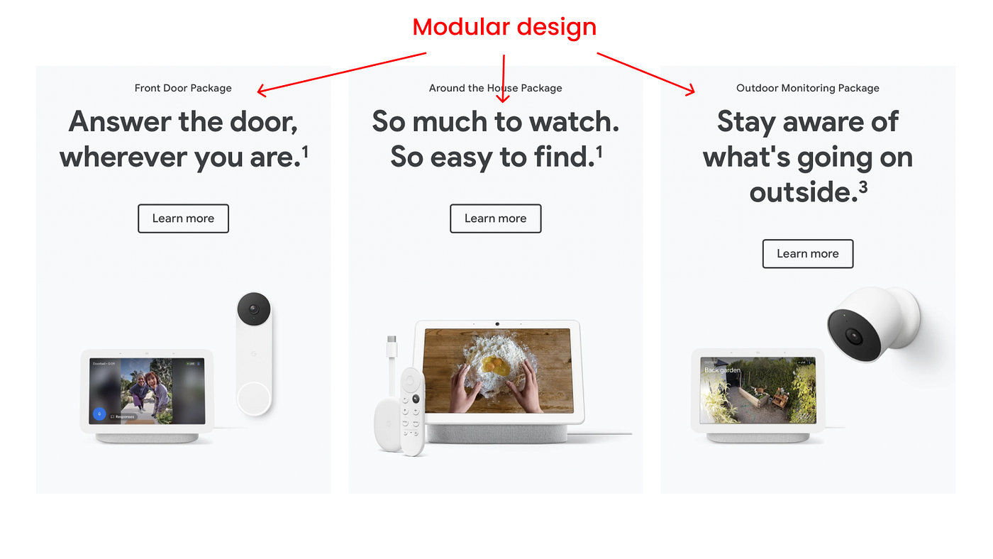
The average website design is going to be viewed on dozens of different devices.
Your design must be able to flex and stack and still look good. This means using a modular design.
By modular design, I mean every element you create should be self-contained.
Whenever you’re laying out your page elements, always be working with independent, separate modules. How your design is going to flex vertically and horizontally. And how it’s going to stack on top of each other.
Don’t use intricate design elements that span across the whole page. They may look fantastic on desktop but often fail completely on mobile.
Design using modules for today’s internet.
4. Use high-quality images

I like to compare website design to cooking. To create amazing food, you must use amazing ingredients. The same applies to website design.
Don’t cheap out on imagery! Make sure you use high-quality photography, illustration or video in your designs.
I’ve seen amazing websites let down by crappy stock imagery.
You don’t have to spend a fortune either. There are some fantastic free stock photography sites out there.
It’s about spending the necessary amount of time and money to find those perfect images. Do it. It’s worth it.
5. Use your main colour in your imagery
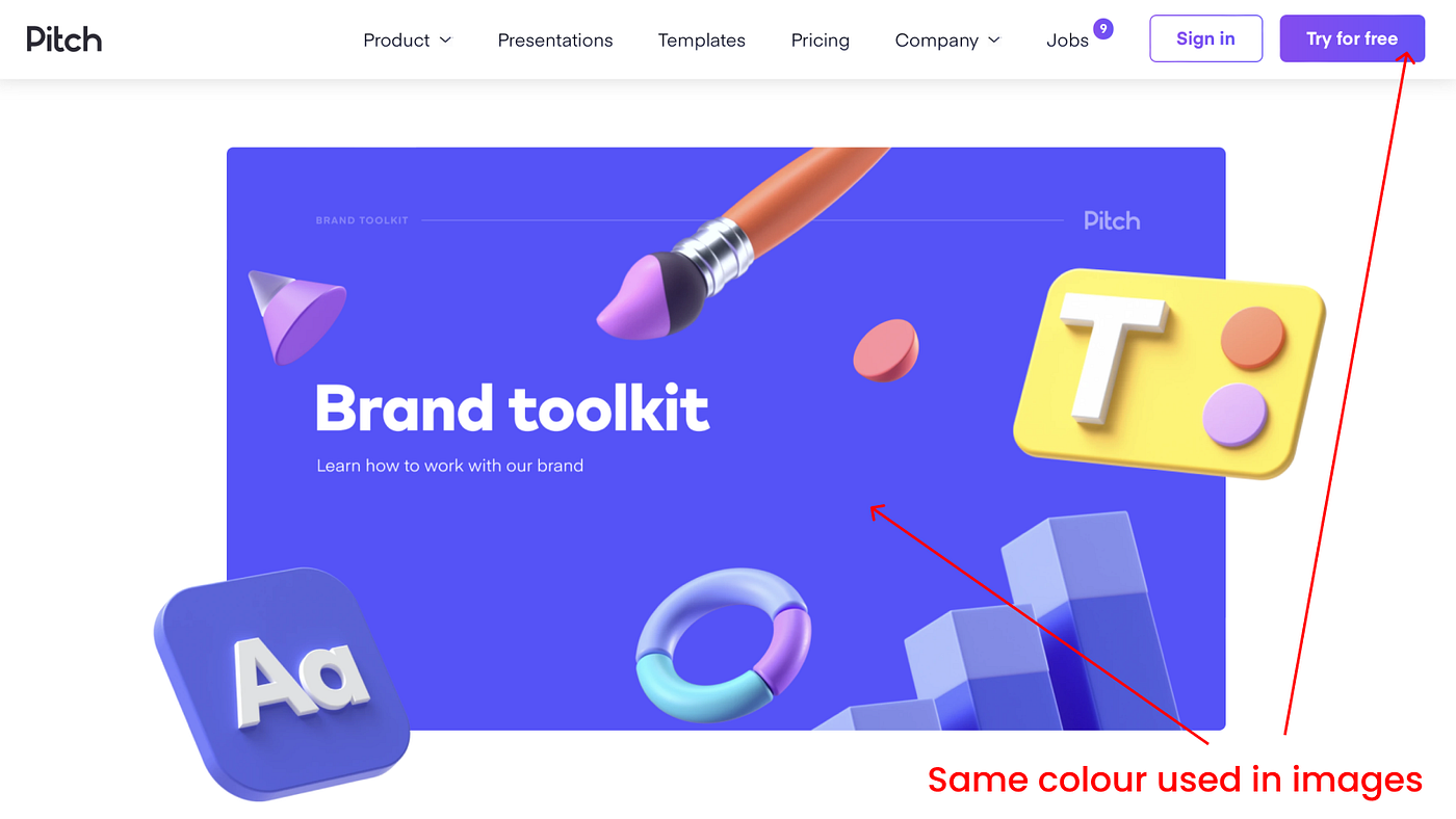
This is a subtle one. But it works wonders. When choosing photography or illustrations for your designs incorporate one of your main colours into your imagery.
For example, if one of your colours is pink, introduce that exact same colour pink into your imagery.
You may have to edit your images to incorporate your main colour into them. And ideally, it should be the exact same colour. Or as close as possible.
When you do this you’ll find your design has a wonderful consistent feel to it.
Wrapping up
I know some of these frameworks are restrictive. That’s the beauty of them! Restrictions encourage creativity.
To this day I still employ all of these frameworks when I’m designing a website.
Give them a shot. Especially if you’re just starting out. Stick to them you’ll be well on your way to creating amazing designs.
PS: I’m creating a brand new course for digital product designers. It’s launching soon.

Thanks for this write-up! All of this seems so doable and even a little relieving. I really appreciate the remidner about using just one font and no more than 3 colors.
Appreciate the feedback @Silvio_SF I practice these all myself : )
Funny enough all these tips sound like no-brainers, but they are actually very spot-on.
I have been working on wireframes and visual designs quite a lot the last few months as we are working on multiple SaaS tools and most tips hit home.
Thanks for the write up Craig, much appreciate the effort!
Appreciate the kind words @Reginald_O and great to hear you're getting busy yourself.
Bonus tip: Whitespace / padding / margins.
You'd be amazed by how many sites can benefit from simple padding and margin adjustments.
Yes! +1 for this @zchry you have to let your UI elements breathe.
I liked how you compared design with cooking - sounds cool :)
I'd also point out the legibility of the text. Designers started to neglect this rule. The aim of the text is to be read, not just "seen".
Thanks for sharing!
Great tips! 🤩 They are a "must-have" for any project. Also, sometimes I like to use 2 fonts, and I search "Font pairings" for harmonious typography.
Nice! How do you score top clients if you don't mind my asking ? What tips can you give to other web designers with 0 clients?
Hey @captain_tech I have mostly worked as a contractor on an hourly rate for big companies. So I don't have my own design company so to speak. The rates for product / website designers is amazing right now ... so I recommend being a contract or / freelancer and you can make good money in UX / UI design.
Thanks man!
How would you recommend getting into that? Similarly to how contracting as a dev works (building a portfolio or a few references and then just going at it)?
Yes, your three biggest tools are:
Great tips! Thank you for sharing this.
I have a question. If I want a webpage to load quickly, what should the file size of a website image should be?Won't using a lot of high quality images slow down a website?
Some people say images should be less than 250 kilobytes for the sake of web performance, do you agree with that?
Hey @matchamania the tool I use is Google Page speed to determine an overall page speed including images.
You can check it out here:
https://pagespeed.web.dev
Thank you! I will check it out.
@CraigBarber really hit nail on the head in this one.
I absolutely agree with everything!. At the end of the day, it's the users we are building for, so over-complex designs are not necessary.
Awesome stuff.
But what about the elephant in the room- the business methods you used?
I.e branding, pricing psychology, niche , complexity of sites built /costs of sample packages you've sold to SMBS, Corporates, big brands etc?
Tips on the business side would help
P.S Awesome 5 tips!
Hey, my main channels are LinkedIn. I connect with loads of people on there and they do have opportunities.
I don't have direct relationships with clients - I freelance contract so.
would be great to hear that too!
that's a great design
Thank you, Craig - this was incredibly helpful, esp as I am working to redesign my site but don't want a completely new brand structure. I esp love this statement: "Restrictions encourage creativity." Yes! Congratulations on your success and thanks for your guidance. :) Shannon (MsForgive)
Are you a self taught designer? How long have you been designing professionally?
BTW Congratulations ! THanks for a great tips. Very inspiring article ^^
Hey @shoshowho thanks for the kind words.
I'm in fact a 'classically trained' designer - meaning I studied design at university.
My career spans a huge 20 years. So i'm passing all of my knowledge onto you guys - no need to spend money and time on university ; )
Your tips are great keep it up
Thanks for the tips, it is appreciated :)
Wow, just realized I have been doing this with my design, but never took notice of it until this article enlightening me on the good path I took.
Hi Craig, thank you for this! Just starting to learn to build website, this help lot in deciding which way to go with a design/website idea.
Love the simplicity of this!
This is awesome Craig. Thanks for sharing!
Thank you Craig! This post is really insightful; these are things we may take for granted but in the end they change how users experience the website.
What a great summary, nice way to simplify something which many people find challenging.
Great write up. As some already mentioned, I really liked this three color concept, I got introduced to it by Thobias with his inspiring collection of colors: https://access.mymind.com/colors
Great.
Is there a reason this wouldn’t be applicable to an eCommerce store? I have a client with a pet food store asked me for a redesign.
Hey @borispov
The 3 colour concept is applicable to all product design including ecommerce stores.
For example, white page background, grey / black type and a strong accent colour for your buy / add to cart button.
You can use tones of the 3 colours... but for the most part stick to 3 core colours.
Really valuable tips, simple yet highly effective and easy to overlook, thanks for sharing them!
Some easy and effective tips. Thanks for listing them down!
Fantastic post Craig! I have had similar success on the dev side of web work. It's the attention to small things that has a huge impact.
Thanks for sharing this! I definitely forget these guidelines sometimes. Now I've got some corrections to do on our sites😄
Thank you for putting this out there. I am going to take these tips and incorporate them into my project.
Great thread Craig. These are all great. I really liked the tips on using just 3 colors and 1 font. I have noticed that one websites that I like and it was a good reminder.
One other thing that I have seen make a big difference in pro level design is consistency of spacing.
This was a struggle of mine for a while, I would just eyeball what felt like enough space within a section, but it was never consistent.
The more consistent your design spacing, the cleaner and more organized it feels.
Anyway, looking forward to seeing more content from you. Thanks!
Hey @ldpuri Yes! This is very true.
When I'm designing space is incredibly important.
I actually use a 'variables of 4 pixels rhythm'
It means that everything is spaced in a variable of 4.
For example 4, 8, 16, 32, 64 etc.
It also makes sizing elements easier and you don't have to think.
Awesome! is it safe to share my website link for reviews?
Thank you for the tips, very interesting to know that from an expert
The best tips, thank you. I'm in my first year as a computer science student and will certainly make time to try some web design.
Great post Craig. I'm a programmer with no graphical design skills. I'd like to start my own tech blog with view to gaining freelance work. Any tips on how I would go about choosing those 3 colours and what colours work well together?
Hey @BackendDev yes it's super simple.
I also love this site for colours:
https://colorhunt.co
High-quality images are also important to consider in your mockups. If you use really good images, but the client probably won't in the future, that is something to keep in mind. Very good write-up!
Some great free image sites here:
https://cursorup.com/photography/
Very good advice,
Will help alot of designers give a more professional end product
Learned lot of new things. And I also like your domain name. Thank you for sharing these amazing tips with us.
(P.s. Would love to know store behind name! )
Very Useful ! Can you please tell how to make structure on webpage
Great write-up thanks, reminds me of the Refactoring UI e-book
Thank you for this great info..
High quality images.
One font.
Fewer colours.
And boom! You're good to go!
Thank you for the tips Craig. These sound simple and yet they make a website look a lot more beautiful and stunning! Just a question though, how did you first get started as a Web Designer in terms of finding clients and promoting yourself out there?
Hey @rajashilan
Yes, your 3 tools are this, in this order for day rate / contract work:
Alright, got it. Thank you Craig! :)
Great summary with actionable insights!
Thank your for the pointers! Really appreciate that. For me the hardest part of frontend development has always been the design and UX side of things :)
Thank you! They seem pretty straightforward when you read them, but they sum up solutions to most common design issues I see on mediocre websites. Well put!
This is a solid list. Love how simplistic you make it. Thanks for sharing!
Excellent post! Really love the short and sweet summary with some quality tips.
Great tips!
Thank you for this amazing write-up!
This is a great list. I am wondering, however, how you make 2 mills just designing? Who did you work for? It's hard to make 2 mills running your own unicorn.
Hey @xtabbas good question, I've been doing website design for many, many years. It's not like I earned that in one year : )
Awesome tips, Craig! Do you have a workaround for brands with multiple brand colors? They almost complete a rainbow..
Hey @kimabitria yes I do... pick just one of the colours in the brand and use that as your accent colour.
For example, if the logo is pink, red and green. Pick the colour that you think is going to work the best and just use that.
it's still using their brand colour - just not all of them.
A million thanks for this 😍
One item I'd add to this list is don't scroll jack (taking over the scroll mechanism with JS). So many sites are ruined by this for 2 reasons:
Oooor, if you're looking for the absolute best-looking web design, stick to the absolute basics like Bear Blog https://bearblog.dev
This. Also mouse cursors. There has been this annoying trend (especially with hip marketing agencies) in the last two years where the site overrides your mouse cursor and makes it a large circle. It’s so awkward to use and always lags behind the movements.
Yes, great point @HermanMartinus anything that over rides the scroll or mouse cursor is a no no for sure.
Thanks for the great tips. I am going to earn 3M dollars;)
Great tips! This is actually what we're trying to do with https://botmenot.com/
Although, truth be told, there are more than three colors, but I think it's justified due to the nature of what we're trying to illustrate with them (bad vs good protection score).
1 and 2 are good guidelines for non-designers, but not always true if you're a talented designer. Mailchimp is a great example where both tips don't apply, but the design still succeeds. Anyway, I still think it's solid advice, but in your course you might want to consider highlighting some examples of where you can go with typography and colour when you've developed an eye for it 🙂
Hey @blunicorn thanks for your feedback, yes of course there are always exceptions. As noted my course is going to be mostly for beginners so I'm aiming to help with this : )
Gold, thank you
Nice breakdown! 🔥 I made the mistake once of not going modular. My whole site was full of intricate design elements and it was a mess. It would often load weirdly and was such a pain to make changes to, so I can really appreciate seeing that reminder here.
Hey @midwestFounder - yes it's easy to make this mistake - especially when you're starting out... now I always think modular when I'm designing : )
https://store.google.com is a great example of modular design.
Hey, great tips! I totally agree with using just 3 colors and one font. It keeps things clean and cohesive. And I couldn't agree more about using high-quality images. It's like using fresh ingredients in cooking, it makes a huge difference. Thanks for sharing these insights, they're super helpful! Can't wait to check out your new course. Cheers!
Clever and helpfull tips Thanks a lot
and how did you get clients?
There’s an error on your launch list site.
Thank you for simplifying a topic that can be bogged down with complexities and theories.
It’s refreshing to hear that the secret to good web design is focusing on simplicity and cohesion, not complexity.
I want to start my own web & app development agency. How do i get clients with very little to show in portfolio?
You have to have a folio. If you don't have any 'real' work to show it's best to feature designs you have created on your own.
I put together some awesome folio examples for you here:
https://cursorup.com/portfolio-design/
After successfully changing my poor grades by maverick and i was able to graduate as one of the best students and finally working in well paid organization, you’re only hurting yourself if you pretend your grades don’t matter.. visit Maverick Angelos today for grades change at bluehackangels407@ gmail .com . Colleges look at grades, scholarship organizations look at grades, and employers look at grades too. However, you don’t need to have a 4.0 to be successful. But Good Grades can show every amazing quality you have, and colleges, scholarship organizations, and employers understand that too. Your school degree does not determine your life. However, good performance can earn you a good reputation and success.
Using high quality img pretty good
Nice Tips! What is your opinion on dark backgrounds versus white backgrounds for your websites? I notice most people use white and it looks very clean. In what case would you be okay using a dark background for your website?
I would stick to white! I've used black / dark and it's really tough :(
I thought you will give suggestion upon how to find client!
Anyway thanks for your new ideas!
LinkedIn is a good start...
that's very helpful, thanks 😁💪
Nice read .
I was a guy that was crazy about colors and tipography but after i try the 3 colors I don't look back. It's easier and looks much better.
Do you choose the 3 colors trough some website?
Yes, here's some great sites for colour examples:
https://cursorup.com/colours/
Love it and can 100x agree with everything*.
I see there are at least 4 colours:
... 4. error/exceptional state/text
Thoughts?
Yes! Getting more advanced now with error states ; )
How did you develop a better sense of what is good or bad when it comes to design? Any specific resources you recommend?
Design is subjective thing no one knows what is good or bad so, designers(I am talking about me here) prefer to use design principals.
You can go for flux academy, designacademy to learn about these things!
Thank you so much for the recommendations, they look awesome! Just what I needed since I haven't developed that skill yet!
Great examples of good design here:
https://cursorup.com/portfolio-design/
Some component libraries like Tailwind make this aspect really easy since they use these kinds of tips into their templates. Great post!
Nice one
This is a bomb post. Saving it in my Notion right now!
Great tips! I'm saving this for later. Thank you for sharing!
Niiiice brother , good luck
Yes Its a great post. Above and beyond it should be purpose driven than aesthetics
Brilliant, simple-to-follow advice. Easy for even me to remember! Thanks for sharing :)
When you say you made the websites, did you do both the design work and the development? Or did you develop a design that they submitted to you?
I do both, I use Wordpress and Elementor for the 'no-code'
Great and helpful post!
I'm also building an open-source platform that's https://www.codingspace.codes/, a website where we provide a variety of web development challenges that will help developers improve their web development skills and become better at web development.
I would like to get some feedback on my website from you, so I can improve it!
I also wrote a blog on "How I Built A Web Development Challenges Website With $0 (And You Can Too!)", you can read it here: https://thefierycoder.hashnode.dev/how-i-built-a-web-development-challenges-website-with-dollar0-and-you-can-too
Amazing writeup! Thanks for sharing 🔥
Awesome tips, thanks for sharing those :)
Confreaks.net - Tips cara main mesin slot online. Permainan slot gacor 2022 jaman kini bertambah banyak mendapatkan perubahan. Membaca mesin slots sebelumnya berwujud gulungan besi berisi lambang maupun gambar serta dimainkan dengan manual dengan memutar tuas yang terdapat di mesin. Di ketika tuas diputar, karenanya bisa nampak lambang atau gambar yang memberikan jackpot atau tak. Langkah kerjanya masih simple serta hanya memiliki sifat single payline atau satu garis. Kemajuan zaman yang semakin kencang ketika ini memajukan permainan slot untuk menyesuaikan diri dan berubah ke prosedur online. Tersedianya mekanisme online di permainan slot ketika ini lebih menolong jalan masuk para penikmat slot online dan lebih tepat sasaran serta bisa dimainkan dimana saja. https://confreaks.net/
thanks, it's very helpful
This is very spot on. Some I would use even 5 colors.
CONTACT US FOR ALL KINDS OF HACKING JOBs @ We offer professional hacking services,we offer the following services;
-University grades changing
-Bank accounts hack
-Erase criminal records hack
-Facebook hack
-Twitters hack
-email accounts hack
-Grade Changes hack
Contact us on whatsapp + 1 681 532 3704
Email- [email protected]
Great Tips Craig. Any thoughts on no-code platforms for designing websites?
Yes, I use Wordpress and Elementor - really good!
nice tips!
Thanks for making this guide! Simple yet obvious stuff.
What platforms would you recommend using to get your first few clients as a beginning web designer?
LinkedIn
Thanks for sharing this awesome insights. These things looks very easy but still most of the time we ignore these basic steps.
Thank for the post! Nice tips, I'm planned to use some of them in my project
Thanks for sharing such informative details, keep rocking
Thanks for sharing these valuable information Craig.
Thanks for your tip, it will help my web look better.
Great stuff
This is great, I've never really enjoyed design (probably because I suck at it) but this has simplified it. The modular design is such a good point, it'll save me so much time when making an app responsive. I love the idea of using 3 colours too.
What does you design process look like? Is it a lot of playing around in Figma or do you have a set of conventions that you usually follow (in regards to the layout of components)?
Hey @benjaminbialy,
Thanks for the kind words.
Design process is reasonably formulaic - but of course there's a bit of monkey brain involved too! LOL!
The beautiful thing about digital is we can iterate and iterate : )
Hope this helps.
Haha perfect, thank you!
Simplified the whole process...thsnkss!
you made it so simple.
awesome tips!!
Excellent advice! I’m primarily a developer, but do try to apply good design principles to my apps.
The main point about keeping things simple is key. 1 font, 3 colors. That’s all you need when you use a strong type scale.
this has been very helpful to me because i am just starting out in web development
Realmente tenho que refazer meu Site. principalmente pelo excesso de cores
Great work, what I am trying to sort out is the color scheme of my website https://parrotsforsale.pk can you suggest the best way to generate a color scheme or color codes like you have said three to use, I need to know how to decide which three are relevant.
Please take a look and guide thanks for your time.
Hey @TechFives
When picking colours for your site I recommend stealing from other sites : )
For example CursorUp.com's colours are picked from Masterclass.com
But in your case I think your colours are working! Reason being they are the colours of your logo - so this is smart.
One piece of advice on the site structure is maybe make your site a limited / fixed width - it's quite wide which makes it a little hard to read.
Craig
Goldoilplc.com, slot yakni permainan judi online kecuali Arcade yang paling banyak mempunyai ragam tema sehingga menarik sungguh-sungguh banyak penggemar. Temukan slot gacor 2022 di Goldoilplc.com.
Kunjungi : https://goldoilplc.com/category/poker-online/
Hi everyone, We just launched Web3 Encyclopedia. Web3 Encyclopedia is a collection of meticulously curated resources for learning from beginner to pro. 40+ Curated Job Boards + 20+ Web3 University.
Now we're live in Producthunt, please take some time to upvote.
Check this Resource vault out here: https://web3encyclo.typedream.app/
Social - https://twitter.com/Web3encyclo
thanks , it was help-full
Thanks for sharing you top 5 tips about designing a layout. My question is to follow no. 4: When using a high quality image about what images size you are talking? Ignoring the pay loading speed (or e.g. using a lazy loading for images) whats about the used (mobile) data of your visitors. Still ignoring this point?
Hey @hismir great to hear from you and thanks for your question... I'm referring to the visual quality of the images here. Not the file size of the images. Yes you should do both. But for design you should spend time looking for nice images and not cheesy ones that will make your overall website design look bad.
Awesome tips. One question on #5, my website is crewcharge.com. I've received extremely polarizing feedback.
On the one hand people say it's eye-catchy (because of the orange tint and bold big words)
On the other hand people say it's too saturated.
I'm also suspecting the display plays a role here.
Any thoughts?
Hey @goforbg
Yes, just checked out your site.
It is an awesome post, thanks. Have you any free font family recommendations? I generally using Roboto and Montserrat :)
Not OP, but I like Poppins for a modern geo font and Inter for sans serif; both are on Google Fonts.
Love and use Poppins! : )
Hey @yagmur you bet as Timm says below Poppins is a fantastic font with lots of variations... I use this font myself of https://CursorUp.com
Always check out https://Fonts.Google.com - it's great for lots of lovely free fonts : )
Hey Craig! Thanks for the wonderful advices, check out my landing page and give me tips on how improve please? iweydii.com
This is interesting, but to be honest seems a bit like outdated advise. Particular these three points:
These things were certainly somewhat true 3-5 years ago, but industry standards have quickly been shifting away from them in an effort to make brands stand out, not blend into the crowd.
My own design site uses every color in the rainbow, 2 distinctly different fonts, is far from uniform and generates over $1.5m a year. If I had designed it like everyone else's, the business may have never even got off its feet and established its own identity in the market. And there are many other examples like this.
If this is indeed targeted at beginner designers, perhaps I could see the value in starting here but I would encourage designers not to draw "creativity" from these restrictions, but to go far, far beyond that and break the mold of what a typical landing page looks like.
Yeah, I said something similar in my comment. It's probably because neither of us are beginners, but I still think even if you're giving beginners some guidelines to get them started you should show them the full breadth of what's possible. I just checked out DesignJoy and noticed you're taking a similar approach to colour as us, albeit with slightly different tones - looks great :)
(* ゚∀゚)ノシ
Great tips!
This comment was deleted 2 years ago.
It's best to have a 3rd colour for your main call to action - otherwise it can get lost ; )
Exactly, simple yet beautiful. This applies especially to startups.
This comment was deleted 4 years ago.
Hey @noegoio Thanks for the kind words.
I'm deep into making my course at the moment.
I've set an ambitious timeline of an April 2022 launch for my main course.
I'll also be releasing a free Figma course later this month.
This comment was deleted 4 years ago.
Hey @pptpedia I've mostly worked in a contract capacity.
So in the UK a good product / website designer charges per day.
And those rates are anywhere from £300 - £600 per day.
This comment was deleted 3 years ago.
Hey @Primer,
You bet!
Here's my public folio which features a bunch of case studies featuring major brands:
https://craigbarber.co
Beautiful work!
Thanks for the tips in here @CraigBarber! Also glad to see you followed your own advice and your "Know when I'm free" section has just three colors :)
@alex_docugraph You bet! this advice stands for both beginners and pros alike : )
This comment was deleted 3 years ago.
Hi Primers, you are quite active here and you share good points in comments. If you are active on Twitter, I would like to connect you with you there. :)
This comment was deleted 3 years ago.
Got it.