I'd love your feedback on whether my value proposition is clear?
This is a pre-launch landing page. The goal is to determine interest by capturing an email address. I'm not confident that the description and value prop are clear, and I would really appreciate some feedback. The idea itself doesn't have to compel you, what I'm really interested in is the description and value prop being clear.
Also, please share your own landing pages and I'll be happy to provide my own feedback. I'm not a designer, but I enjoy writing and editing, and I've been looking at a lot of landing pages in the last couple days :)

Hi kaustubhb,
The description is very clear the value prop less so. I very much understand why I would want a custom feed but not the features you are offering.
What's the difference between your feed and my just Googling? Typically a feed would have features like noticing which links I click on an adjusting accordingly. Or another feature might be knowing what everyone else clicked on for my interest and being able to push things out to me - like a news feed does.
Anyway our landing page is https://www.uclusion.com and any help you can give us will go a long way.
As a developer uclusion speaks to me. The header is great, I think the subheader could be made more powerful/action oriented. Something like: Stop wasting time in meetings doing things that can be better done asynchronously. Uclusion is designed for asynchronous development. Try it now and see improved results within 2 weeks.
Also, not sure if it's on purpose, but you don't share that I can get 6 months free until I get to the pricing page. Sharing that detail up front makes it more of a no-brainer.
I really like the "how much process is hurting your performance" section. I think the UX here could be tighter to show me the info without me having to click around to find it, but I don't have specific ways to share (not a designer :))
For evergreenfeeds, thanks for your feedback! I think I might need to prioritize "why someone should care" over "what it is" in that first description section. In case you're curious, the way I see evergreenfeeds is that they're somewhere in the middle of the two ways users usually end up looking around the web. On the one hand there's search when I know exactly what I'm looking for. On the other hand there's discovery when I'm scrolling through a feed not looking for anything in particular. Evergreenfeeds are specific to a topic of my choosing, so they're better for educational purposes, when I don't know what I'm looking for or I'm not looking for anything specific, but I want to learn about a topic (like SEO best practices, or heart healthy cooking, or real estate investing, etc)
Thanks very much for the advice - I've attempted to implement fixes to all of your points.
Back on Evergreenfeeds - you have to give us more of an idea of the mechanism behind (even if its not coded yet) - for example when I don't know what I'm looking for I can also hit Reddit. So its important to communicate what your service really does for a person - which means you have to say something about how it works.
I think the Header and description do convey the message of what the app does. However, it doesn't feel captivating enough and seems a little wordy.
Maybe you could phrase it as a Problem and a Solution (I don't have a background in copywriting, but have been researching a lot lately for my recent launch). Maybe something like:
H1: Tired of jumping through multiple sources for content on the same topic?
Subheader: Evergreen can save you loads of time by pulling it all into one place --> Simply enter a few keywords and the magic happen
All the best with your project. Sounds really cool.
Would love your feedback on my app: https://junior-boss.com
Love your landing page and I love the idea of teaching kids business skills. UI-wise, looks great! Only comment, there is a lot of white space that could be condensed.
Content-wise, I think the "why" and "what" are clear, but it's not so clear to me how junior-boss will help at each step. If I'm a parent I'd like to know how junior-boss could aid me in teaching my kids (the "Learn More" cta could be used to give more in-depth explanations here).
I love the templates as starting off points, but how customizable are they? A little self-serve demo on your landing page that I could play around with would be awesome!
For my landing page, thank you so much for your feedback! I like your Problem/Solution framework. That way I would prioritize answering "why" before answering "how". I suppose if I answer "why" well enough, you might be compelled to scroll a bit to understand "how".
Thanks a lot @kaustubhb. Great feedback - I will continue working through them as I collect wait list sign ups and build out the features on the app. That way I can use what I'm building to show more about "how" it works.
Great idea for a self serve demo - I will give this one a try.
All the best with your project.
Hi gokulmadan,
(This is disrael not the post's author.) Your landing page is awesome! Only minor suggestion I can make is that you should invest in allowing me to signup with Google and maybe Facebook - sites that want me to remember a password are a turnoff.
That's a really great idea @disrael.
I've built my app entirely using no code, on bubble. I will definitely look into how I can integrate signup with google or facebook.
@disrael - Thanks again for the awesome recommendation. I've just successfully added the ability to sign up with both Google and Facebook on Junior Boss
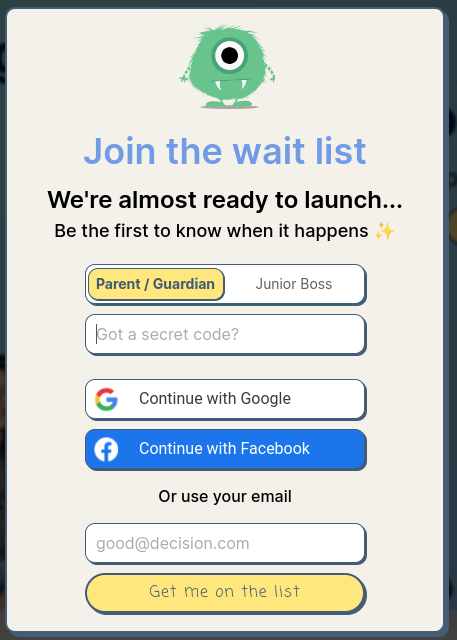
Hmm did you push to production? I'm not seeing it.
Yup, I've pushed it to production Junior Boss.
It isn't on the Log in/Sign up pop up... It's on the Waitlist popup that the other buttons on the page trigger OR the "Sign up" button on the log in/sign up popup also triggers.
I didn't want it on the actual Log in/Sign up pop up as I didn't want to users to think that they were going to be logging into the app. This is just for collecting wait list sign ups.
Please let me know if you are still unable to see it.
Oh got it - I would split out Log in and Sign up as two different buttons - that's pretty standard.
Yup, that makes sense. I will make that update in the coming days. Thanks again for your suggestions. Really appreciate it.
I can see value.
I use Google Discover a lot but also find it shows me a lot of stuff I have no interest in. But when it shows me really specific niche stuff that I'm interested in it's great.
I would suggest positioning more around: avoiding information overload... or maybe around professional/work information. E.g. really good industry specific feeds, like the way people buy industry magazines relating to their work.
I'm so happy to hear that, and thanks for the suggestion on positioning, you really nailed it. I hope to find a saner approach to help a learner utilize all the valuable content that's out there, without overwhelming with information overload. I think others feel this as well, so now I need to figure out how to convey the message and connect with those who feel that pain. From the suggestions here, it def sounds like I should prioritize the problem/positioning to explaining how feeds are created (which I can still do further down the landing page).
Thanks again! Do you have a project/landing page you're working on?