Report
🚫 THREAD CLOSED: Please submit your website at Roasti 🚫
Share your website link, and I'll provide you with 10 5 brutally honest comments on Markup to help you in improving your design. Courtesy of Designfly

Please feel free to provide your most honest feedback. Thank you in advance for your time and insights!
https://www.masteryourinterview.com
Please : https://bettertweet.io/
Here it goes - thanks if you take a look! https://www.ratepunk.com
The lovely visual of the site. I like everything from the colors to the fonts :)
Looks awesome to me! :)
That's so nice to hear, thanks!
Incredible press logos. How did you get all that? Do you just have an impressive PR person?
sounds painful, but we'll go ahead with it. Here you go: cubiloon(dot)co
Hi Bradley, just signed up for indiehackers and saw your awesome post! Waiting for your roast on our website https://napps.io
We are Shopify Mobile App Builder for Shopify and WooCommerce
I'm ready
https://www.monitup.com
Hi friends
My name is Aliya Khan I am a new member of this forum site
Thank you so much
I'll get back to roasting more sites in the AM, keep dropping those links.
Lol. Not finished. But app is live. Prepared to be roasted into oblivion!
https://formulashq.com/
Would love to! :)
Mailchest
Up for being roasted. 😄
Qwurty
https://app.markup.io/invite/accept/g0XFfztL
Thanks for the offer, Bradley! I appreciate it.
Here's my product website - EarlyBird, I am eager to hear your professional advice on it!
https://app.markup.io/invite/accept/Znl0qdem
Just staring out on blogging - theaieffect .co
Im not allowed to post a link unfortunately
thanks in advance <3
https://getfreetax.com/
Ok, let's do it!
https://tagu.vercel.app/
https://acetrace.app/
Serpple is an advanced free SEO tool that provides accurate keyword rank tracking along with unique additional features.
Yes, please: https://www.denote.net/
Would appreciate any feedback: www.referhub DOT org
It's a job referral matching web app. Just finished the landing page!
Remove scroll overflow in your .p timeline as it displays scroll bars in the browser :)
What OS and Browser are you using?
Vivaldi (chromium) on Windows. The problem does not occur on mobile but it appears also on firefox on windows.
.p.timeline {
overflow: scroll;
}
shows scroll on default.
I would appreciate your feedbacks on my website LogoMakerr.AI (https://logomakerr.ai/).
It's an AI-powered logo design maker platform that creates logos and brand kits so any comments regarding the design would be a big help.
Thanks!
Yes, I would like you to share your genuine review. What things do you think need to be improved on our website Churnfree?
There are some problems in your own website @bradkins, would you like me to offer you a light roast?
I would greatly appreciate that. Don’t be shy
So, I'm looking at your website, https://designfly.io/ and the first obvious issue I see is that the website is painfully slow. Google's PageSpeed tool gives it a performance rating of 39 out of 100. That is so slow, that Google is going to penalize you with its search results.
In regards of UX, I don't really understand the logo at the top of the landing page. When I move the mouse cursor over it, it starts to spin and if I click it, it will simply reload the page. There is no use in any of that.
You are using a rather light gray font color over a dark background that has light gray horizontal and vertical lines on it. This is not idea for legibility, I would suggest using a lighter font.
Visually, the word "Startup" and "Go unlimited" are rather similar. This is problematic, because users might not realize that one is a clickable button, one is a text effect. I would suggest making the CTA button more clearly a clickable button. Also, I'm not sure if I love the "Go unlimited" text for your main CTA button. It's a bit odd choice of words. "Let's start" or anything along those lines would make it much more clearly a CTA.
The above issue is also within the next visual elements, all the "Submit your request" etc boxes look exactly like buttons, but they are not.
In the portfolio screenshots section, I would prefer to see actual screenshots that I could click to enlarge to see your previous work, instead of these automatically scrolling non-clickable images.
The UX of the FAQ box is also a bit odd. Some parts of the question boxes are clickable, some are not. They should be fully clickable, i.e. the answer should be shown no matter where within the box user clicks. Also, these boxes look visually identical to the earlier "submit your request" etc boxes, which were not clickable.
Overall, I think this is a pretty good looking website, its main UX problem is that it's not always clear what elements are clickable. For better usability, I would use a lighter font color and conversion wise, I would tell the story about who you are and why should I buy designs from you instead of other nameless and faceless people online.
Please yes please - https://airlyft.one/
Yes, please 🙏
https://mokachat.com
Yes, please: https://www.salesforge.ai/
Can't post a link yet but if you can tradeschoolsnearme dot co don't be too brutal
Thanks
Love it!
Pretty new on IH so I cannot post url :(
--> dataaxy
Agradecido por tus comentarios en esta Web que lanzo la semana que viene
Vendemos motos usadas.
abcmotor. app
Ok, fine. But its super early alpha release, Bradley. Have at it. https://bitcoinlaunches.com/
codeform .it - React Native Templates
Give it a shot https://httpsms.com
Go on!
https://o2pay.co
OxygenPay, Global, secure and irreversible crypto payment gateway
Thanks, Man. Here you go:- https://aitools.fyi/
Love to hear feedback from anyone.
https://loggl.net/ - Realtime event monitoring
https://logspend.com Reduce your OpenAI Bill.
https://obeatow.com - visual bug and feedback software
https://leadgen.tools
B2B AI Lead Generation SaaS + Training
https://codelessapi.io
Thanks!
Hi, it looks like you configured your Google Sign in incorrectly. Let me know if you need any help as I have been dealing with their sign in api for nearly 4 years
Yes I'd like some help please! I just tried through a friends google account, wasn't able to see the issue
Error being thrown: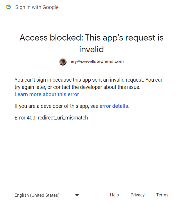
You were right, thank you so much! I've fixed the issue now. I added both domains, https://www.codelessapi.io and https://codelessapi.io and it seemed to do the trick!
Could you try again please? Also, let me know if there's anything I can do for you! :)
works fine now
Thank you!
https://www.auto-swiper.ch/
https://luskira.com
https://cartfox.io/en/
Hey there, I doubt anyone roast it ! It helps travelers/nomads explore new places, find activities and things to do in +35k cities !
Download Android: https://play.google.com/store/apps/details?id=com.linked4.app.social
Download iPhone: https://apps.apple.com/us/app/viby/id1222353770?ls=1
Got time for two? :P
https://duckist.com - Share password between your coworkers, clients, freelancers easy and securely!
https://toolel.com - Share developer notes, tools, and ask questions without any ads making it super simple :)
Thanks for your time Bradley, here is something to roast: https://omnisome.com
https://unheardroots.com/ :)
Well I assume you're overloaded with requests already ;)
If not, feel free to take a look at https://webtoapp.design
I've been thinking of reworking the landing page recently (once again...)
https://bbleadify.com/
https://tacotranslate.com
@bradkins linkedcamp.com
cloud based LinkedIn Automation Tool.
go ahead Bardley! Will be waiting for your roast - duonut[dot]c[o]m
Go ahead, Bradley! https://serverfluent.com/
Do your worst 😈 😅 https://loginllama.app
You go boy! https://www.rubiqubic.tech/
Here it is..Have a look at: Textdrip
Please review my app's Launch Soon page: https:/[/]team-sight.c[o]m. Sorry had to write the URL like this because currently not allowed to paste links :(
Let's do this and thank you!
tacodigest.com
Go ahead.
Lexingtonthemes.com
Kindly or unkindly roast our forms backend https://fabform.io
Looks great! One suggestion from me:
The text like "No credit card required. It's free to try!" is hard to read over the gradient color. Maybe try tweaking the gradient color a bit :)
www.saleshookup.com 👀
🔺🔺🔺🔺 Please search for "Victrays" on Google and click on the first link that is related to AI tools.
I just signed for indiehackers because I saw this post :)
https://clous.app
Were do you all make your websites
?
I used webflow
Thank you
Next.js framework
devondemand.7thpillar.com
vaynus.com
Sorry for the delay, but your roast is ready: https://app.markup.io/invite/accept/aigzHnXs
https://www.blossomsurveys.io/
Sorry for the delay, but your roast is ready! 🔥
Here's the link to your Markup file: https://app.markup.io/invite/accept/uCZ-_8wt
https://www.wyloapp.com/
Burn it to the ground. 😬
Sorry for the delay, but your roast is ready! 🔥
Here's the link to your Markup file: https://app.markup.io/invite/accept/TUX67LVd
https://slashpage.com
Sorry for the delay, but your roast is ready! 🔥
Here's the link to your Markup file: https://app.markup.io/invite/accept/RNoqsjs4
I'm a fan of your service and think you have a great idea for effortlessly creating web pages and channels. I like how you make it easy for anyone to create a page without any technical skills or sign-up required.
However, I also think there are some areas where you can improve your website and your service. Here are some suggestions that I hope you will find useful.👇
Your website design is too simple and bland. It does not reflect your brand personality and value proposition. You should use more colors, fonts, images, and animations to make your website more appealing and engaging.🎨
Your website copy is too vague and generic. It does not explain clearly what your service does and how it benefits your users. You should use more specific and compelling words to describe your features and benefits. You should also include some testimonials and social proof to build trust and credibility.📝
Slashpage does not offer much variety and creativity in its web page designs. All the pages look similar and bland, and they do not stand out from the crowd. The design elements are limited and basic, and they do not reflect the personality and style of the page creators. Slashpage does not allow users to customize their pages to their liking, and it does not provide any templates or components to choose from. The best way to solve these faults is to switch to UIHUT B2B Design Platform, where you get the access of reselling and using and your users can access over 23000+ designs for various niches and purposes. I believe it will help you 20X growth at least buy may in a very low cost like 6-7k USD.🔥
Your website navigation is too confusing and inconsistent. It does not follow the best practices of web design and usability. You should use a clear and consistent menu that guides your users to the most important pages and actions. You should also use clear and consistent labels and buttons that tell your users what to do next.🔗
sportyfun net
https://app.markup.io/invite/accept/YmUKVcYv
https://organice.app/
What do you think of this feedback? Do you think it's helpful?
https://app.markup.io/invite/accept/MTDFR2GW
Burn ittt "infinitdesign .co"
https://app.markup.io/invite/accept/0JrVhvYT
you rock bro thanks
Hey man! I hope you've been able to implement some of the changes I recommended. If you like some more help, I just launched https://roasti.co to continue providing design support to the community.
👍
Roasttttt it: https://www.save.day/
https://app.markup.io/invite/accept/JLoKfJXz
Thanks a lot for your rcm. I'll improve it
No problem, I'm glad you found my feedback helpful! If you like some more help, I just launched https://roasti.co to continue providing design support to the community.
https://listybee.com/
https://app.markup.io/invite/accept/0LnZOjY4
Thank you so much @bradkins , for your really constructive review ! working on changes!
https://itsthedougscore.com/
https://app.markup.io/invite/accept/tJcmelz9
Health and fitness
No link?
gridlab.ca
https://app.markup.io/invite/accept/cbP79roD
Roast away and add your initiative so I can help you get the word out about your roasts 😂 https://buildinpublic-streak.web.app/
https://app.markup.io/invite/accept/EsbVtClx
thanks -- updated and markup.io is slick
No problem! If you like some more help, I just launched https://roasti.co to continue providing design support to the community.
Please do - SaaSHub. And many thanks.
https://app.markup.io/invite/accept/QReDYsmd
Hey @bradkins, many thanks for your feedback/review. It was actually helpful. I've also regarded most of the highlighted issues. Cheers! And good luck with Designfly.
No problem, I'm glad you found my feedback helpful! If you like some more help, I just launched https://roasti.co to continue providing design support to the community.
Ah, I love the homepage of roasti.co! It's soooo good. Amazing job.
I appreciate that! It's been a fun project.
https://favird.com/
Thanks!
https://app.markup.io/invite/accept/BqurkyQ5
https://recurai.com/
https://app.markup.io/invite/accept/_CHp_EKW
AyaIQ
Thanks for this!
Hey! I noticed you made some changes that I recommended and they look great! I'd love to showcase ayaiq.com on Roasti.co, I added a before and after shot of your landing page along with a link, you're the second review, you can check out what it will look like here: https://roasti.webflow.io/
All I need is to gather a review and headshot to feature on the site, you can submit it here: https://form.typeform.com/to/eXRcP7px
Thanks so much!
Thanks Brad for the roast! I've filled the form in, happy to be featured. Goodluck with your venture, it's a great idea.
Link isn't working
Thanks for letting me know, fixed
https://app.markup.io/invite/accept/cHiCgn2L
This comment was deleted 3 years ago.
This comment was deleted 3 years ago.
Link doesn't work