Is this a decent design for a dashboard?
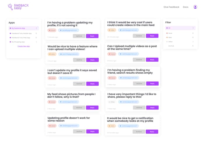
Here is the dashboard design I made for feedbackfairy.io not being a designer, I appreciate any kind of feedback. It's basically a feedback collection widget to collect feedback from users and this is the dashboard where you see all the feedbacks your users left you.

I'm not a designer either, but this looks pretty good. The only big issue would be the contrast with some of these elements. The font is far too light in the tags/badges/whatever, the "Archive" button, and the timestamp.
I would make the timestamp darker, and for the rest, make the text significantly darker and/or change the color of the text entirely. To make sure there's enough contrast, check out this site: https://webaim.org/resources/contrastchecker/ (there are other ways, but this is pretty simple).
Thanks! I appreciate the feedback. I’ll make sure to apply those before release.