Just Added Shadcn Tooltip Components
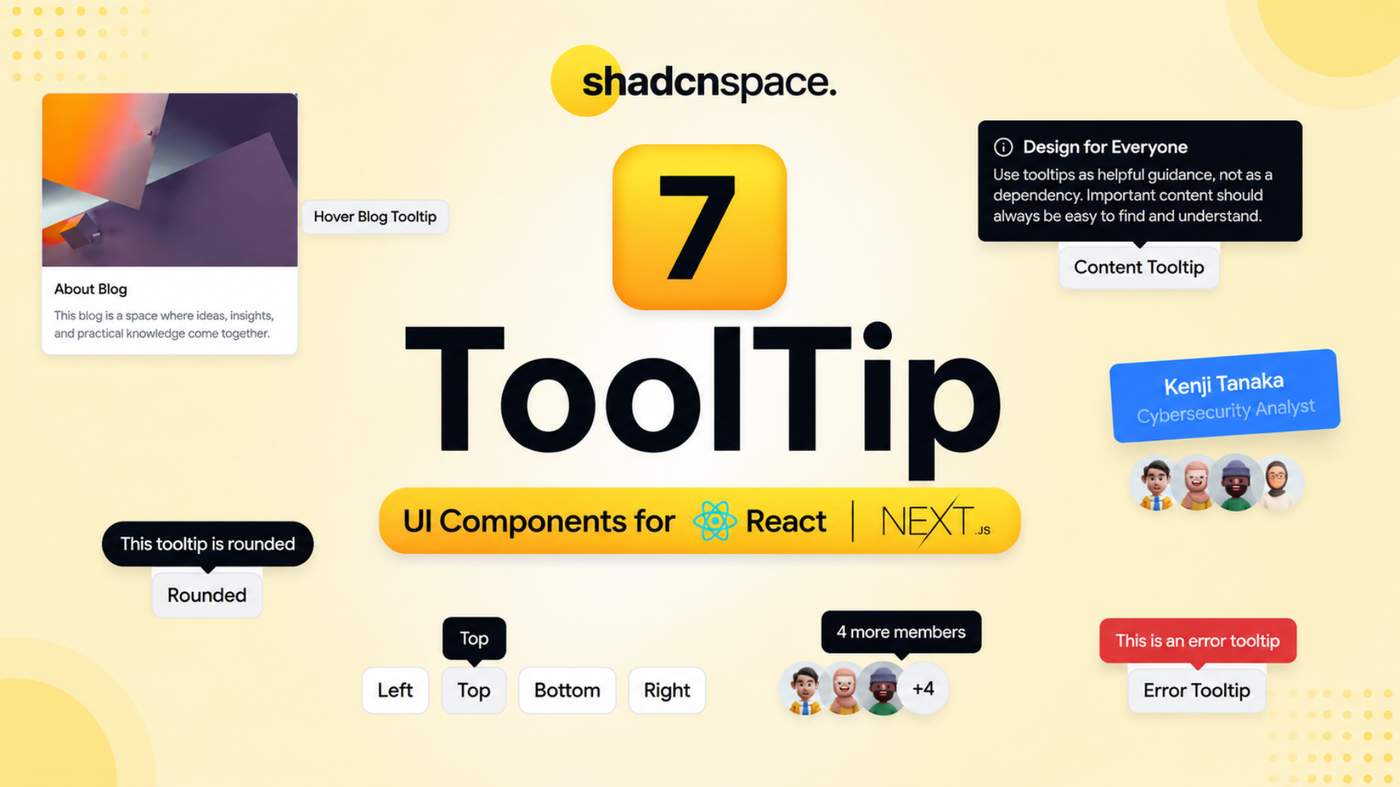
These ready-to-use tooltip patterns are designed to provide helpful information, contextual guidance, validation feedback, and additional details without cluttering the interface.
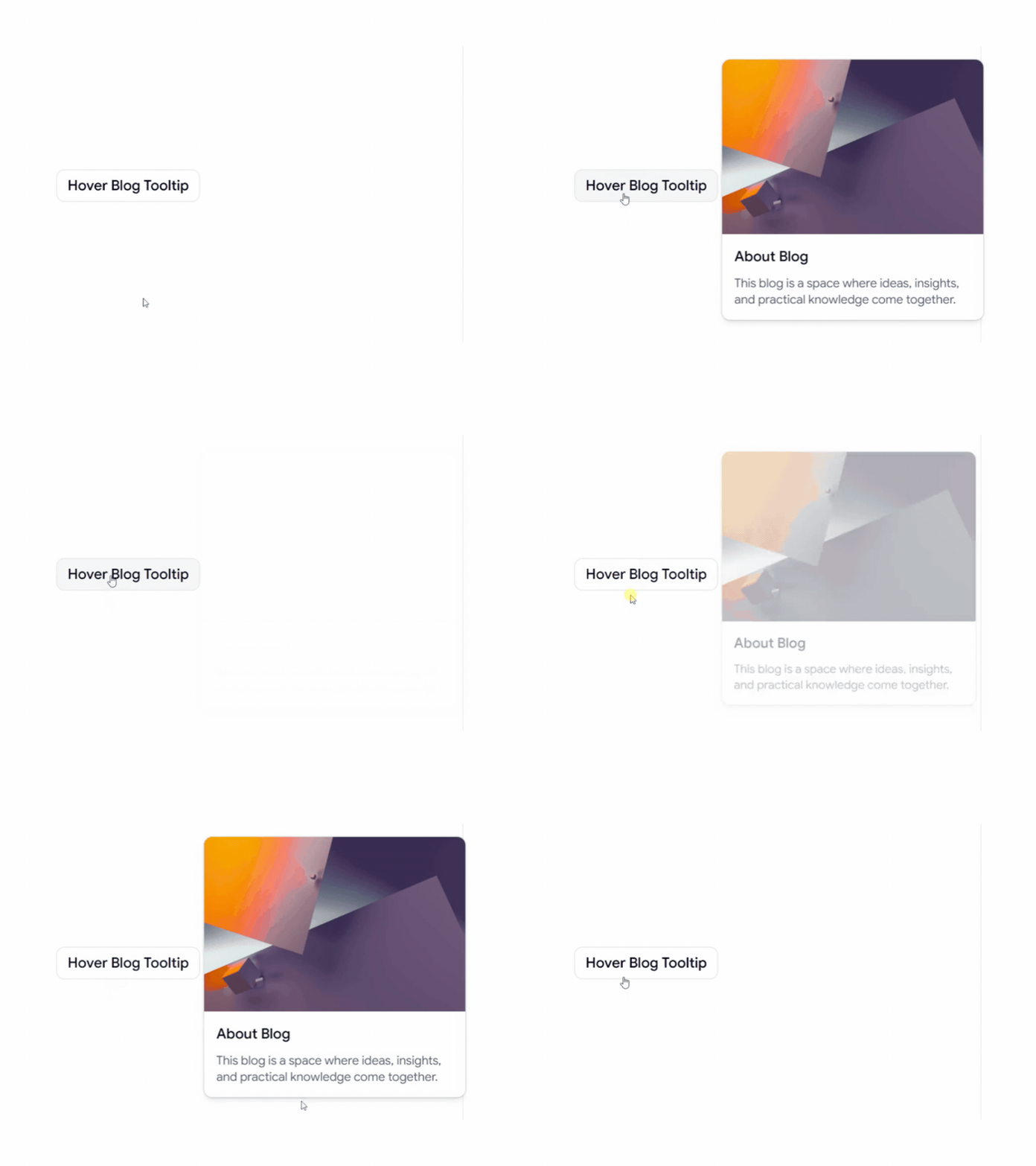
Hover Blog Card Tooltip
A rich hover tooltip for displaying blog information and content previews without leaving the current page. Perfect for blogs, content platforms, and editorial websites.
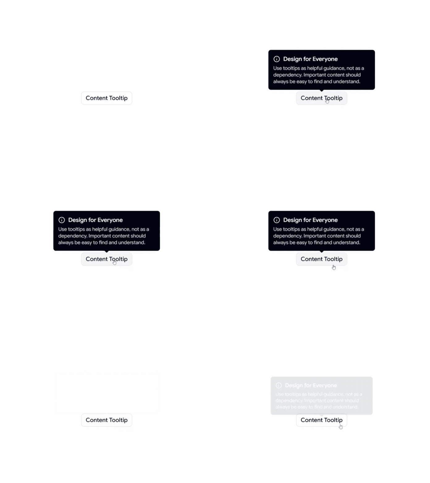
Content Tooltip
A simple content-focused tooltip for displaying helpful information, explanations, and contextual guidance when users interact with UI elements.
Animated Tooltip
An interactive tooltip with smooth animated transitions, designed to create a more engaging and polished user experience.
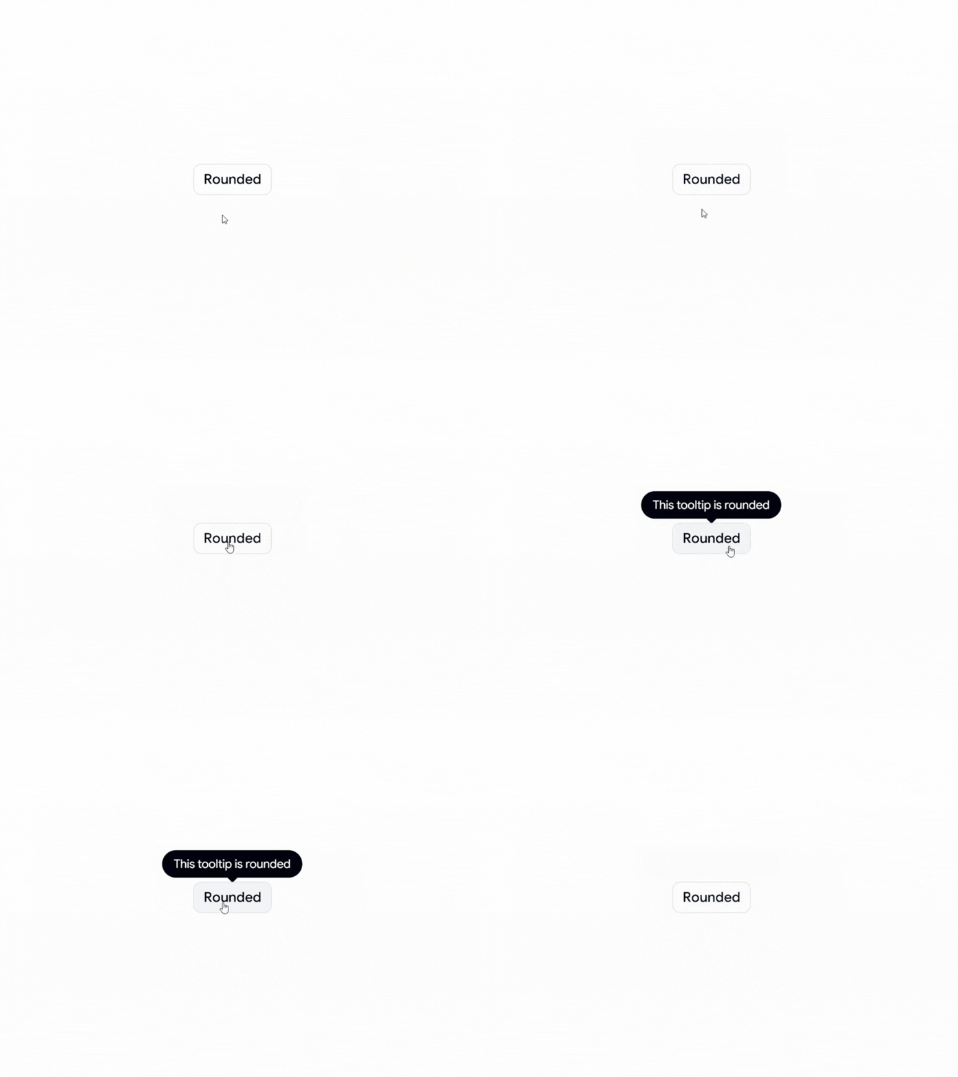
Rounded Tooltip
A clean and modern rounded tooltip style that fits naturally into contemporary interfaces and design systems.
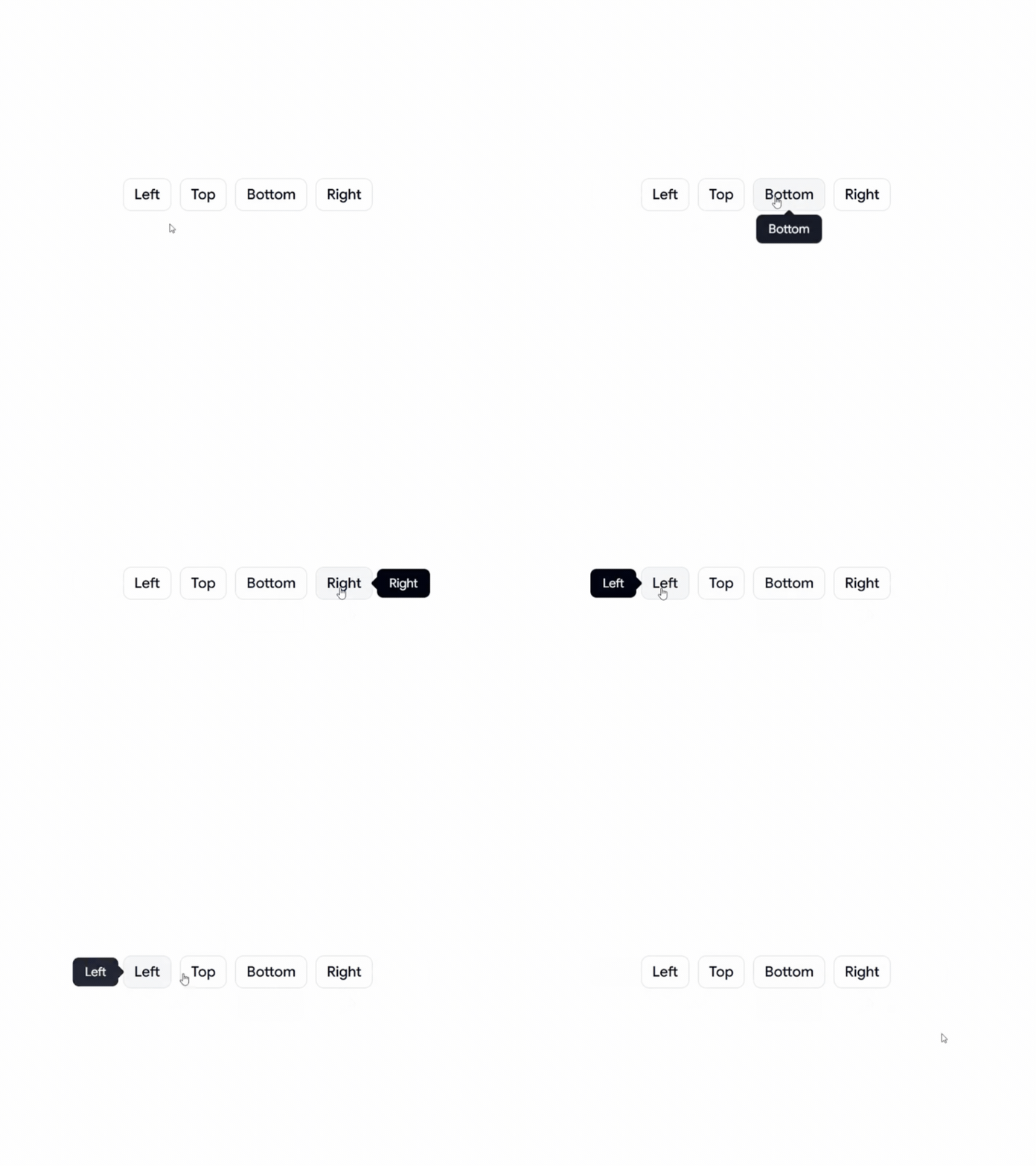
Positional Tooltip
A flexible tooltip with different positioning options, making it suitable for buttons, icons, navigation, forms, and other interactive elements.
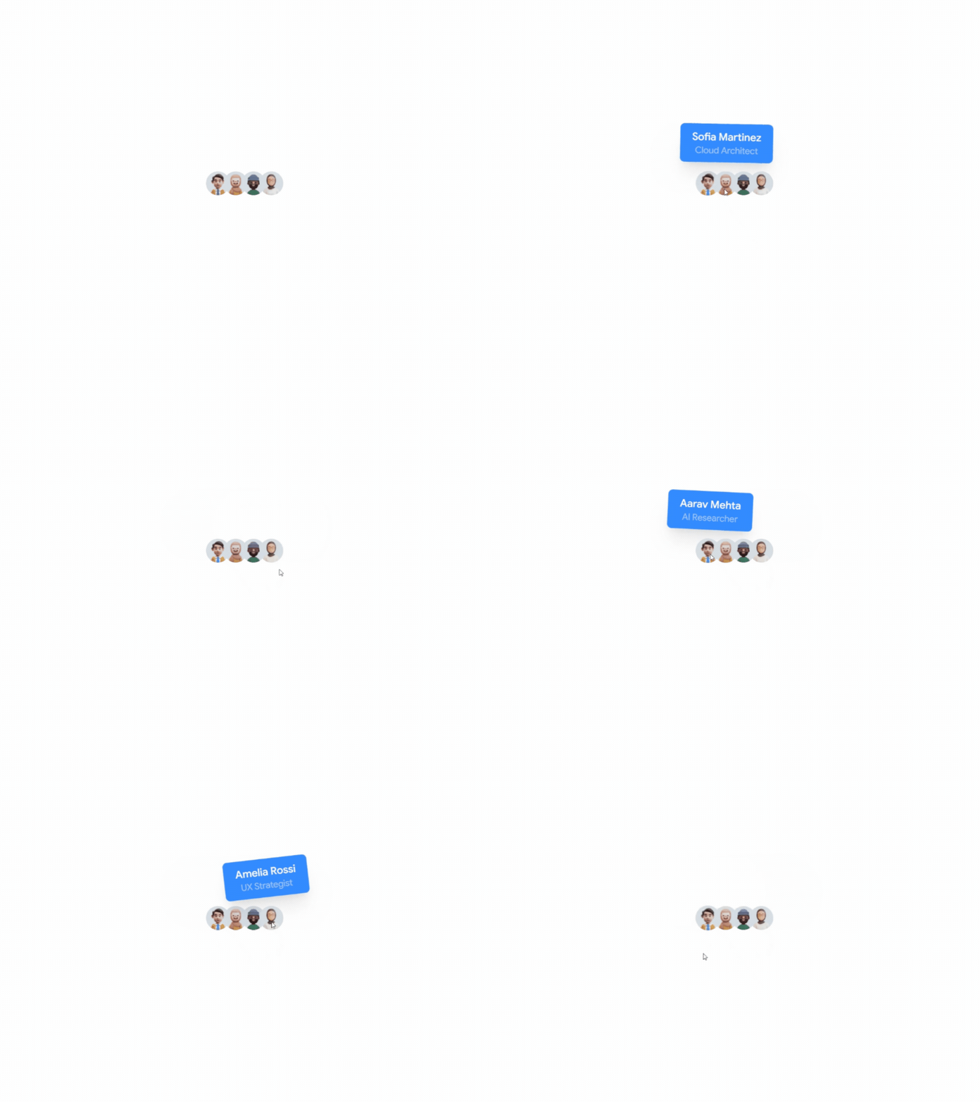
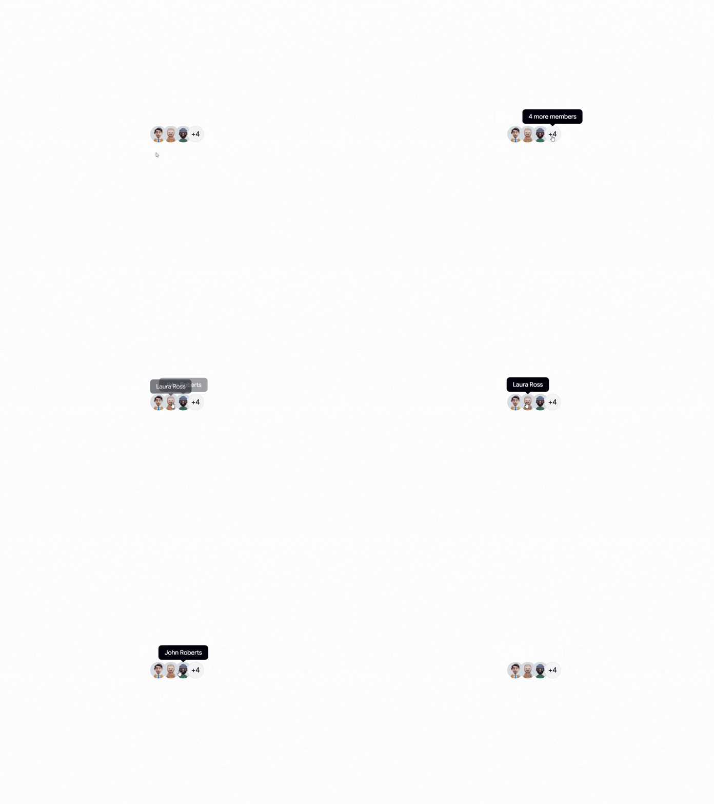
Avatar Tooltip
An avatar-based tooltip for displaying user information and profile details. Ideal for team sections, social platforms, collaboration tools, and user profiles.
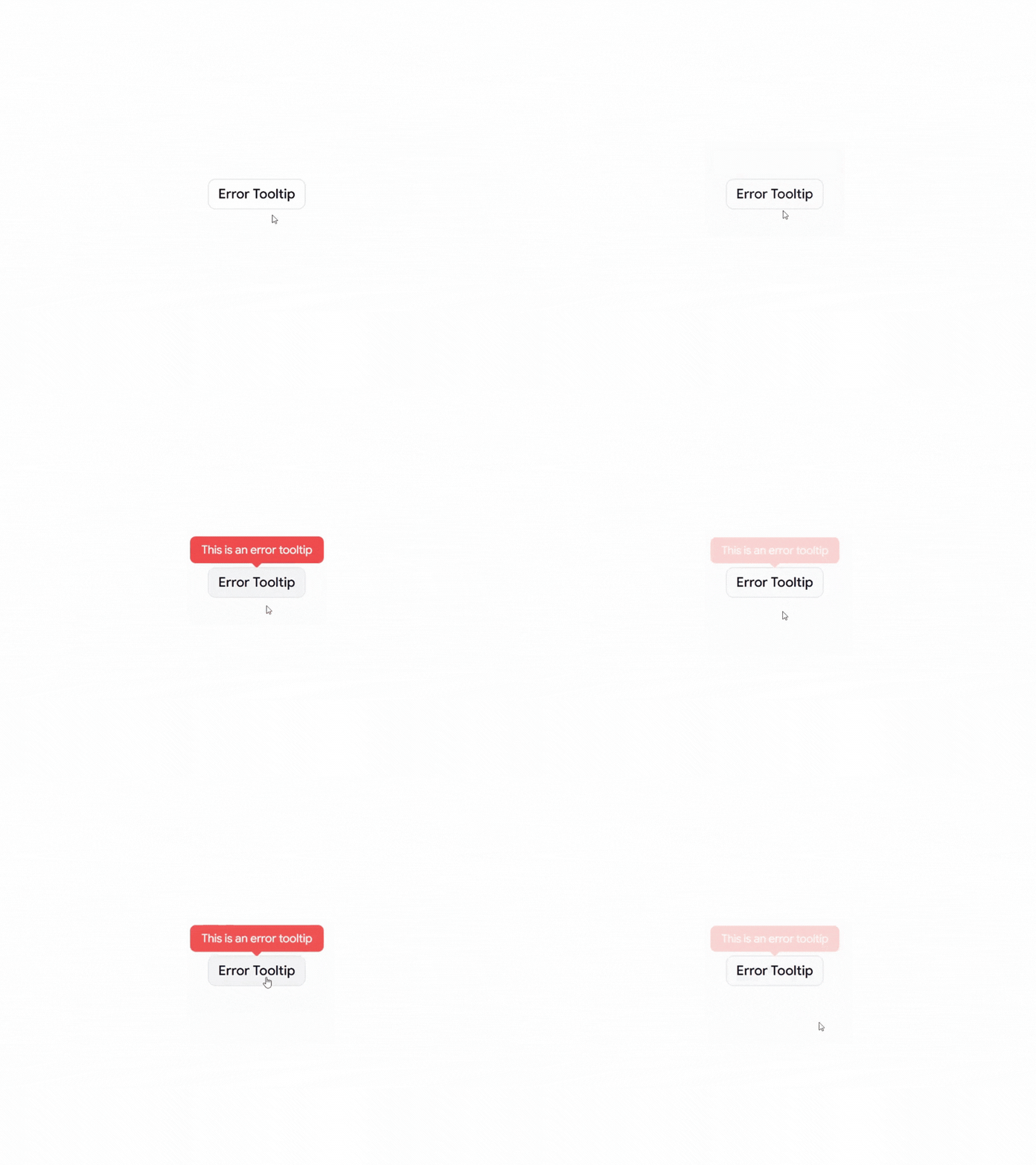
Error Tooltip
An error-focused tooltip for displaying validation messages, warnings, and helpful feedback when users interact with an invalid field or action.
Why Use Tooltips?
Tooltips provide additional context without taking up permanent space in the interface. They can help users understand icons, actions, form fields, and unfamiliar UI elements while keeping the overall design clean and focused.
Design Tips
Keep tooltip content short and easy to understand
Use tooltips for supporting information, not essential content
Make important information visible without requiring hover
Keep tooltip positioning consistent throughout the interface
Avoid putting too much information inside a tooltip
Consider keyboard and touch interactions when designing tooltip experiences
Perfect For
React applications, Next.js projects, Shadcn UI websites, SaaS products, admin dashboards, social platforms, team management apps, blogs, e-commerce websites, and modern web applications.
Check out Shadcn Tooltip today.

