Just launched the MVP of my first no-code product: CourseFit - Feedback wanted
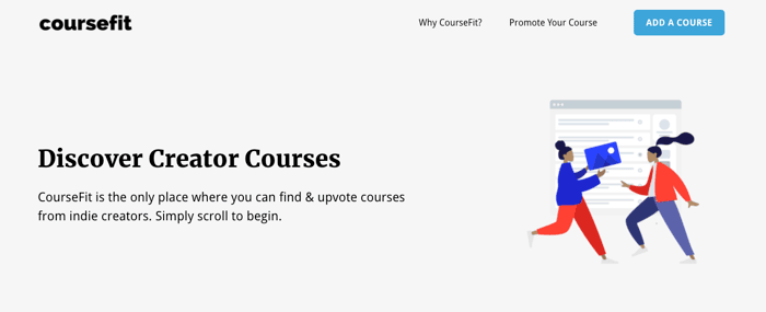
I'm beyond excited to share https://coursefit.io - my first no-code product.
I have had this idea for a while. With some extra time on my hands lately due to the current 'shelter in place' I decided to make it happen, using some of the tips and resources I've gotten from this community.
What I used:
- Squarespace
- Sheet2Site
- ConvertKit
- Stripe
The reason I created CourseFit is that over 100,000 creator courses exist on the internet without a good way to find them all in one place, to search by topic/creator or to upvote the good ones. CourseFit is like Product Hunt/G2 for indie course creators.
This is my first public mention of it so I'd love any and all feedback you have before I put it on Product Hunt or try to promote elsewhere.
Thanks in advance and for all the great no-code resources on here!
Edit: I wanted to note that I'm aware there is far from 100k courses on CourseFit right now. Adding as many as I can manually and then need creators to start adding their courses as well.

Thanks for using Sheet2Site 🙏
Congrats on launching. Big step!!! @npturner
Feedback:
I also used Squarespace to build my little side project, would be great to hear your advice :)
Thanks, Felix. Appreciate the feedback.
Sheet2site is really good at pulling the data together into the ranked format I wanted but the rest was going to take a lot of CSS to make it look the way I wanted. I'm pretty familiar with Squarespace so it seemed like a good way to get the design I wanted while embedding the Sheet2site data.
Hey Nate!
First off, great idea! I think you're absolutely right, there's a lot of noise out there...and it's a lot of time and work to check the various platforms.
A few (hopefully helpful) comments intermingled with questions:
I think your primary user is interested in finding courses relevant to their interests. If that's correct, what do you think is their top goal? I ask because your hero image says, "Discover Creator Courses" but the first CTA I see is the email signup. I might instead expect to see a Search bar [for users who already know what they're looking for] or course topics to select from [for users who don't know the right keywords to search for].
If Search and/or Discover are the primary goals, then I would suggest pushing this closer to the top of the page, and making the Search bar more visually prominent (size, color, typeface, line width etc).
HOWEVER...If at this stage, your primary goal is to get Course Creators to add their courses, then you may want to instead refocus the hero image on messaging/CTA for those folks instead.
Back to users who are looking for courses. Once the user selects a course topic, what do you think their next task might be? Currently, the workflow is: Select topic-->Get list of results-->Scroll through list of results (course details include: course title, instructor, topic keyword)-->Expand Tile-->Click on 'View Course' button (external link). This workflow emphasizes scrolling through search results, i.e. breadth of results. Would you want this to be the case if there's 100 courses listed in a category? Or do you anticipate a need for users to filter/narrow results?
Related to the above workflow, do the course details include everything that might be important and useful to users at this stage? For example, do you think users may want to see cost, how the course is delivered, reviews etc to help with their decision-making?
If 'View Course' is the behavior you want to drive, then I would suggest just hyperlinking in the course name rather than the expand/button click interaction.
Hope that helps a bit! Best of luck with the project!
Thanks, @mspf! I appreciate the detailed feedback. A lot of the functionality feedback I agree with and am just currently limited in this MVP.
I think your feedback on the conflicting focus of headline, CTAs and layout is valid and am going to address that to be more focused on the user to start. Thanks again!