Landing page roasting
Hey hey Indiehackers!
Please roast my landing page! Hoping to fine tune this to get decent traction. https://www.announcerocket.com
And if you would be so kind, please do stack rank here (takes 15 seconds); it would help me understand needs better: https://app.opinionx.co/e80016d3-c42f-4963-83b0-c74ae9fefa06
Thanks a bunch!

The over the fold area looks visually pleasing. Probably mostly because of the typography and the cute logo. The favicon is weird, though. You should use your logo as the favicon.
I don't love the buttons, though. The buttons being just black and white is a bit sad looking.
If I enter some random text to the Get Started box, it shows a red border around the input. That's a bit lazy. If I enter a fake email address, it just makes the button green for a few seconds, after which it turns back to black. This is not great UX.
But the main problem in the over the fold area is that picture on the right. What is that? Is that supposed to be a screenshot of your app? Or is that a stock photo? Right now, all that image does is creates confusion and provides zero value to this landing page.
And for good measure, you are showing the same confusing image again in the next area.
The "In-app changelog" section shows a different looking image, which might be a screenshot. But again, I'm not sure is this a screenshot.
Also, the copy keeps repeating that this thing can display content in my app. My what app? My Windows Desktop app? My Android mobile app? My web app? You have had a lot of real estate already, but I still don't fully understand what your product is. I assume it's a some kind widget I can add to my website, but I shouldn't have to be guessing what your product is.
After browsing all the way down, I'm still not sure what your app really is. There are no technical details what this is and what is it compatible with. If this is a web app of some sort, there should be a live demo available.
Even though I don't really know what this product is, $39 usd per month just to show something to my users in my app and without the option to even respond to feedback seems like a deal breaker. $39 is quite a lot and if you impose an artificial "cannot respond" restriction to that, it sounds like an absolute deal breaker. The features of your Basic package sounds more like the features of a free tier, not a $39 per month tier.
There is no Privacy Policy or any indication who you are, what you do with the email addresses you collect, who do you share your data with, who owns the data that is collected using your app and so on. You are asking a lot of money, yet you don't even provide the information who are you. That doesn't sound right.
I think this thing needs quite a bit of polishing.
Thanks for taking a look! Really love and appreciate your feedback. Yes, it's web app owners that I'm targeting, but you're right that I need to be clear. If you don't understand verbiage, it means I'm not communicating this thing clearly enough. Time to get back to the drawing board.
The changes you need to do to make this better are fairly minor. It's easy to get stuck inside the box, because you know what your product is, that's why it can get difficult to see how other people might find it difficult to understand.
Hi @jchan, congrats on the launch! This reminds me of Launchnotes (https://www.launchnotes.com/), which we used at my last startup, although they are taking a much broader approach than just product feedback.
A lot of folks here have shared some great commentary around the copy and design, but one thing I want to call out is your pricing and how it's structured.
For copy, I would rearrange the last two bullets in the "Growth and "Pro" so that there's better alignment in copy as you go down the bulleted list.
I would also reconsider some of the features you're providing in the tiers. For example, the "up to 100 teammate" in Growth feels like overkill. In my prior experience, we were paying for an Enterprise tier of Launchnotes and we only had 3-5 teammates using the product heavily.
One thing you could change is the level of support you provide. For example, in Growth, those customers could get email support, with a response guaranteed within 24-48 hours. For Pro customers, they can get phone and chat support, with a response in <24 hours.
I would also monitor the # of users/mo you're providing, and track how customers' user counts grow over time. You may discover that 50K at Pro may be too much, or that 10K at Growth may be too few.
Finally, I would list a few more bullets in the Enterprise tier. You can go with a few reliable standbys like "SLA Agreements" or "Dedicated account manager". I would also recommend moving the "SSO" bullet from Pro to Enterprise.
I hope this is helpful, and I'd be happy to chat more if you have any follow up questions.
Super cool product, and best of luck!
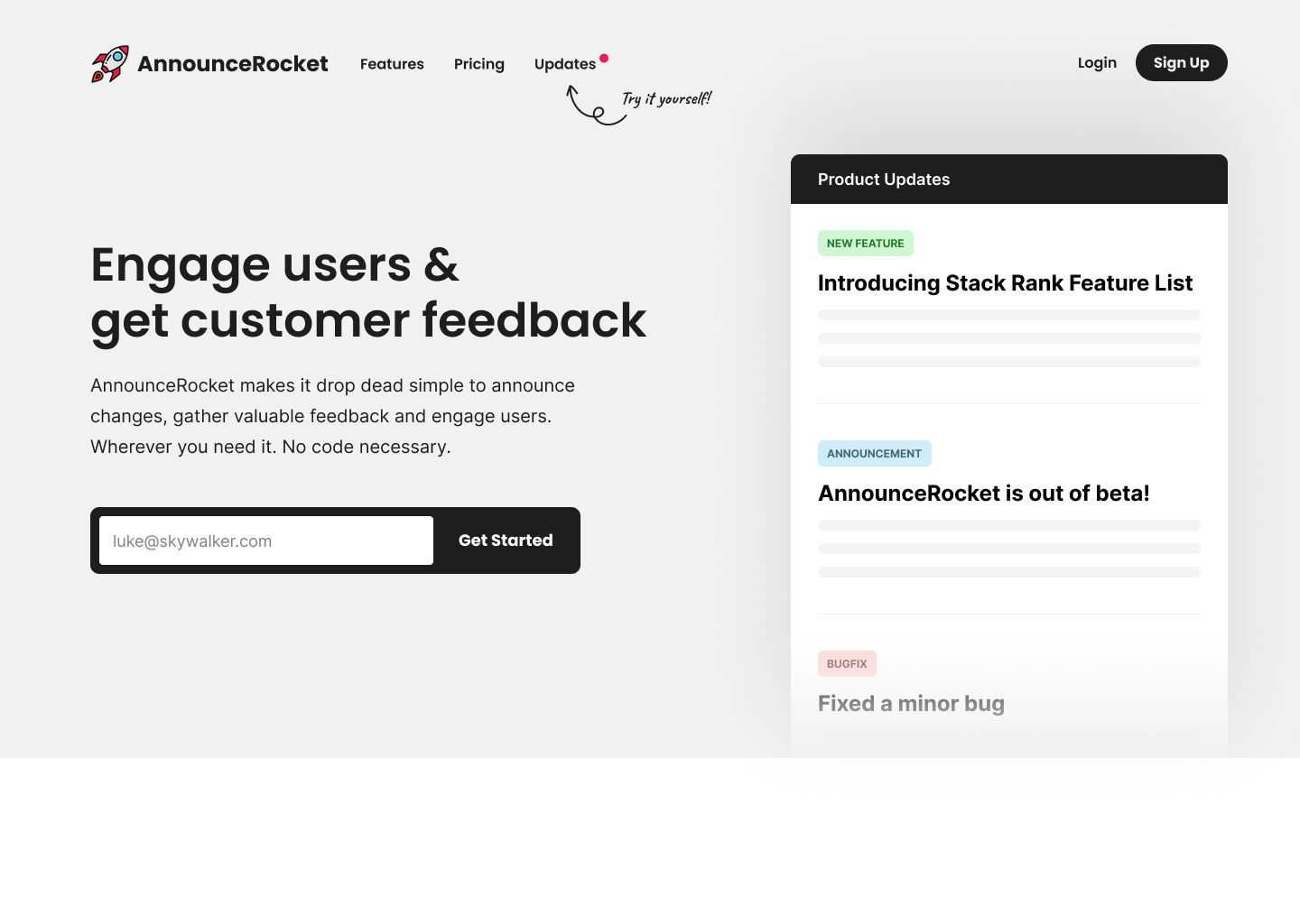
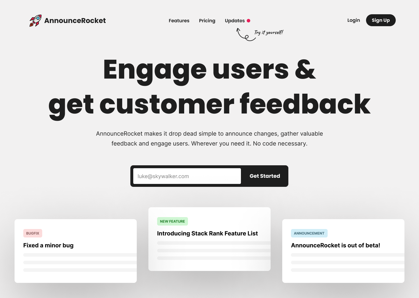
@jchan agree with many of the comments here, lots of great feedback. @VladCristea gave you some solid design direction so I would definitely give that a look. I had a couple above the fold concepts come to mind as well so threw those together for you.
Also, I know that Beamer operates in this space so it may be worth looking at how they got traction in the beginning to see if that path is a good fit for you.
Good luck with it!
Concept 1:
Concept 2:
Thanks for pointing out Beamer and for the designs! The designs look great, and being far from an expert in the area, do different designs lend better to different purposes? For example, aside from aesthetic of the two provided, are there other differences?
Great question :) There are lots of ways to look at design but speaking for myself I practice coming from a place of intention. In the product space this is usually goal oriented and based around conversions. But I like to think my goal is educating a potential customer, not selling them. The faster I can do that, the more effective I think it will be.
For example, with the 2 screens presented, I’m intending to educate the potential customer on how the product works so I want them to try it first and then reinforce what it does with a strong heading. So you could say I’m persuading through proof by showing how the product works but really I’m just educating them the fastest way I know how. I then try to tightly couple the message “engage users” with the design by doing the very thing it says, engaging the user (“try it yourself!”).
In concept 1 I’m assuming they may not be ready to try the product right away but I still call it out first so they know that it’s there. Then I try to force their attention with an imitation of the product updates view (which I would likely animate to make it appear more real and stand out). The animation starts answering the question (“what is this?”) and the heading hopefully provides an answer (“oh, I get it”). This may lead to them trying it (out of curiosity) which I already established they could do at the top of the page and that should help to make the product more “sticky” for them (“this could be really valuable”).
In concept 2 I really want them to try the demo first so I abstract away the design to ensure it doesn’t replicate the product exactly. I do this because I don’t want to distract them or have them linger on any one thing. I need to give the message a stage to itself. The heading is intentionally very bold to make sure the message comes through and it gives context to those floating cards. The cards themselves are enlarged so that they have a similar presence to the heading and they also set an expectation around what the product might look like when they try it. Hopefully this lends a holistic sense of what the product is in less than a few seconds. It gives an “impression”, just enough that the only question remaining should be “how does it work?” which can easily be answered by trying it or possibly by scrolling.
So both have the same intent (educating the user) but their approach is different (one assumes they won’t try the product, the other tries to convince them that they should). Either of these might be enough to get the customer to consider buying but that’s just the beginning. From there they have to find the offer enticing (perceived value vs price), feel confidence in the company, etc., etc. Some of those are things that intentional design can help with, some it can’t.
Ultimately, designing with intent is one of many steps to a more effective landing page. Clear and effective copy being a very critical part of it. When they both meet and inform each other it can really elevate the persuasion. And like all things in this space, you won’t know until you try it!
Deep man, thanks for showing me the iceberg, or just the tip more likely!
Hi @jchan, and congratulation for your project.
I see that a lot of indies are talking about the copy and just a few take in considerations the design.
So, here are my thoughts about the design itself:
Here is a fast design I did to show how I see this landing.
https://www.figma.com/proto/A7nGGn1PBHEpaRmkOfzvYz/Vlad-Cristea---WIPs?page-id=1845%3A42906&node-id=1845%3A42907&viewport=439%2C725%2C0.14&scaling=min-zoom
I hope these are helpful, good luck.
Wow! It's very impressive to be able to make a design so fast - and so good! Indeed, there's been a lot of discussion on the copy, so thanks for providing feedback on the design!
Cheers!
I think that the page is very visually pleasing, but like some of the other comments say, the copy needs some tweaking IMO along with a few other things.
Starting with the section directly below the hero with the value propositions stating "Keep Users Informed", "Engage With Users" and "Know What to Prioritize", it seems kind of redundant because below you more or less explain the same thing in features section. I would suggest combining the feature explanations section ("Create and Schedule Announcements"...) with the value proposition section ("Keep Users Informed").
Another thing in the feature explanation section is that the icons that are used as bullet points are not consistent, some of them have grey circles around them, while others don't. Additionally, I think the bullet point sections would sound better if they all started with verbs. I.E the last section ("Stack rank feature list") each point starts with action verbs "List", "Search", "Ask" however the other sections start with some nouns "Announcements" and "Drawer".
One visual correction in the feature section I would make is to make all of the mock up images showing the features the same size. As it is right now it seems inconsistent with the spacing where the pictures all have different amounts of white space between them and the relevant text.
A small consistency mistake I noticed is there are no periods on the whole page but under the summary for "Write content without code deployment" there is a period.
As of right now, this is what I can see, I will add more if I see anything else.
I hope this is helpful, good luck!
These things with the copy I got little lazy with and didn't notice! Thanks for looking and catching them!
I concur with much though not all of other comments. I’ll just add:
• The graphic that someone found confusing was actually the most-informative part of the page to me. It gave me an idea of what customers would see.
• Amplifying another comment: There’s no information about how your product would integrate with my SaaS web app. Does it do so on the front end? On the back end? And what assumptions are you making about my tech stack choices in order to provide an integration?
• Particularly since I don’t understand what form the technical integration takes… It’s not clear to me that I wouldn’t be able to provide such notifications to users within my existing web app for no more trouble than I could integrate your solution.
I understand your confusion with all the benefits vs. features dogma. For a customer of a technical product, there’s no alternative to being detailed about the CUSTOMER-FACING features. (The behind-the-scenes implementation details are irrelevant.)
Thanks, yes I think that's important that someone understands that it's easy to integrate because the thought is just need to insert a snippet of code into the header. This important small detail slipped my mind to be included!
You can use better copy to explain what you're doing.
I.e.
I read this:
but the reality is (*after reading the whole website) that your product does a couple of things:
So your h1 and h2 need to be less generic and more focused on the painpoints, which is the fact that as a company you often tend to overlook these 3 aspects because most companies make it too hard to share with customers the various updates.
So re-focus the product IMHO, right now it's doing too much...otherwise you are diluting the benefits of the solutions
Thanks for reading through and making this analysis. I know exactly what you're talking about because I also like talking about specifics. But, I read that writing copy that talks about benefits (this general stuff) is better than copy that talks about features (https://www.butlerbranding.com/branding/write-good-copy-features-benefits-values/). I'm definitely not opposed to changing it, but I'm kind of stuck wondering what's better if 1) articles telling me to be generic 2) yet I along with people like you are liking the copy that's more specific.
The size of the images is too small. These are intended to make things clear, right? A picture is worth a thousand words. I'd make them larger, perhaps add some markup to point out what is most important, and enable clicking on them to pop out a frame with an enlarged version. Good luck to you!
Thanks, that's good feedback. The markup would help clarify what it's doing.