Landing page tips for a new analytics product
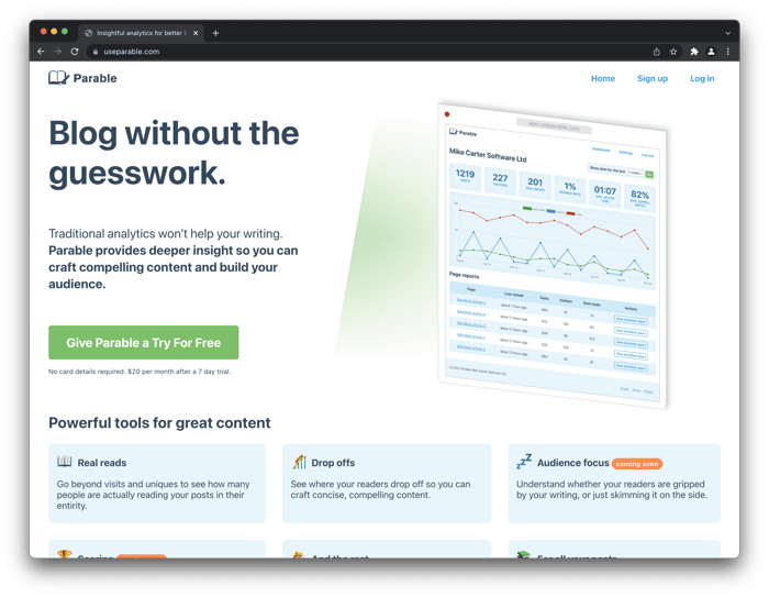
Hi! Long time podcast listener, first time poster here.
I'm building Parable, a web analytics product targeted specifically at providing insight for blog posts, articles, or other long-form written content.
I've put together an initial landing page, and am seeking any feedback I can get from anyone who'd like to offer it! 🙂
In particular, answers to any of the following questions would be much appreciated:
- Do you understand what the product does?
- Do you understand the value proposition, even if it's not something that would be valuable to you personally?
- How could the landing page better communicate the value?
- Is there anything I could use in place of testimonials while I don't have them?
- Is there anything special you've had success with that I could do to incentivise early sign-ups?
- Any other tripwires I've fallen foul of?
Feel free to be blunt brutal. I'm not precious about my work and prefer direct honesty. Thanks in advance!

Designer here.
Flash feedback and blunt like you asked :)
Design
You need to create a better grouping of elements. Headline, sub-headline and CTA should be closer.
Loved the animation but don't show it at and angle. Show me the interface and how much you care about the craft of you interface.
CTA - Refine the copy, its too long. Nav, make them black and remove the Home, logo should be home, its a pattern.
Feature and benefits. Split them in chunks of 4 and prioritize them. People will zone out if the see 12 at the same time.
Here's a good example of a design you can emulate:
https://imgur.com/57Y7bT5
This is great feedback, thank you! 🙌