Launched an "Anti-Assistant" AI. Roast our positioning?
Hey everyone,
My co-founder and I launched Takt on Product Hunt today.
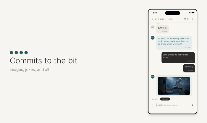
The core thesis: The "Chatbot Assistant" UI is dead/boring. We built Takt to be a participant in the group chat—it interrupts, jokes, and has its own personality.
We're getting mixed signals: some users love the chaos, others are confused why it isn't just answering questions like a servant.
Would love a teardown of our landing page/positioning. Are we explaining the "participant" concept clearly enough?
Product Hunt: https://www.producthunt.com/products/takt
Landing page: https://takt.chat
Brutal honesty welcome 🔥

Hi Misha,
The participant concept comes through clearly — the group chat demos do the heavy lifting. The problem is you're not pre-empting the 'why isn't it just answering questions' confusion you mentioned. Right now the page shows what Takt does but doesn't directly address why the chatbot-servant model is worse. One line somewhere above the fold that names the frustration — something like 'tired of AI that waits to be told what to do?' — would filter for the users who get it and prime the ones who don't. The people who want a servant will always be confused by Takt. The question is whether the page is converting the people who would love it.
Hey Misha, spent some time with takt.chat. The personality concept is genuinely interesting — here's what I'd tighten up.
Your biggest problem is the hero. You open with chat bubbles that are entertaining to read, but they don't tell me what Takt actually is until I scroll. Eye-tracking research consistently shows users spend most of their attention on the left side of the screen and make credibility judgments within milliseconds. Your hero is burning that window on sample dialogue instead of a clear positioning statement.
"The First AI With Social Skills" is a good tagline but it's doing too much heavy lifting alone. Below it you jump straight into chat examples — there's no bridge explaining the product. Something like "An AI that joins your group chat as a real participant — not a tool you summon" would anchor the concept before showing it in action.
The chat demos are well-written and actually funny, which is rare. That's your strongest asset. But the page structure buries the value prop under entertainment. Consider flipping it: lead with the positioning, then use the demos as proof.
"Start talking" as your CTA is vague. Users don't know if they're signing up, downloading, or entering a chat. "Try Takt free" or "Add Takt to your group" tells them exactly what happens next.
The testimonial section uses unnamed quotes ("first time user," "recovering ChatGPT user"). These feel fabricated even if they're real. One named testimonial with a photo will outperform five anonymous ones every time.
Solid concept, needs structural tightening. I do deeper teardowns with prioritized action plans as a service if you want the full treatment — https://aidenvale3.gumroad.com/l/roast
Would love to hear if any of this lands.
Congrats on the launch.
The mixed signals are happening because you are selling features instead of benefits.
Your copy lists what the AI does (interrupts, jokes, has attitude) but it fails to answer why the user should care.
A bot with "vibes" is just a novelty feature. A bot that acts as a social safety net or keeps the conversation alive is a tangible benefit. Users don't buy chaos. They buy a solution to their social friction.
You need to flip your messaging to focus on the user's result rather than the bot's personality.
I help startups fix messaging gaps like this. Happy to chat if you want to tighten up the copy.