Launched Really Good Innovation - UX feedback please :)
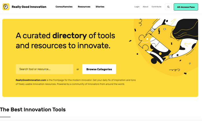
We have just launched our website https://www.reallygoodinnovation.com/
Would be great to receive some feedback on UX as we are not really pros in this. Much appreciated! :)
We have just launched our website https://www.reallygoodinnovation.com/
Would be great to receive some feedback on UX as we are not really pros in this. Much appreciated! :)

Looks interesting. A few resources you might consider adding:
@indieorbust has this in his LeanB2B book: https://mobile.twitter.com/nomis_ton/status/1209580727651561472/photo/1
@hiten's UseFYI has a huge list: https://usefyi.com/templates/product-management-templates/
The website looks great. Some things I'd change:
That's pretty much it at a first glance. What's the contribute page about?
Great thanks a lot for your Feedback Murakami! Highly appreciated :)
The contribute page will be so that people can submit content themselves that we will curate and then make available on the website.
Yeah, I tried to sign up, but something broke with a survey you've put on there. Are you looking for professional content people to join you?
Ok yeah that sign-up doesn work yet sorry. We're on it :). Yes we are looking for anyone who knows about innovation and has some tools and resources to share.
Yeah? Shoot me an email at exactly what you're looking for over at evgeniiliyanovasenov@gmail.com (or just use the button in my profile). Currently, I'm running the content strategy for one of the most disruptive franchises in the UK. ;)
It's Really Good @ReallyGInnovate!
Eye catching colors and structure. I'd adjust:
Thanks @felix12777 ! Do you mean not only have black text but also other font colors? Or what do you mean by stronger color contrast?
Welcome @ReallyGInnovate - Yes indeed! You can test the font vs background color combination using tools like http://colorsafe.co/
Looks really good.
Feedback:
Good work so far.
Thanks a lot! Do you mean instead of the categories that we show there should directly be content on the main page?
Correct. A good example is airtable.com with the ability to either see animated gifs of examples or get an opportunity to see use cases of a few of the tools in action to get a better grasp of a starting foundation.
Hey page looks pretty good! In the future or if you still are looking for some designer quality feedback on your designs I'd love to help you out! I recently started a design feedback website called Pastryy, we can provide designer quality feedback on your logos, websites and mobile app designs.
You can check us out here: www.Pastryy.com
Here's a sample of our feedback as well:
https://www.notion.so/saucedesigns/Ugenly-Feedback-a7639dc9016b4aa084a2831762aed34d
thanks for your proposal! Do you provide feedback with some algorithm / automized or personal feedback?
All personal! I take about an hour to two hours on each review.
This comment was deleted 3 years ago
Thanks for the feedback! We will have a look at flickity!
This comment was deleted 4 years ago
Thanks for the feedback!
Nice website! Regarding the pages "Bitcoin Address Generator", "Ethereum Address Generator" and also "Cryptocurrency pages & tools" I would make use of the space on top instead of just writing "on this page you will find...". I know that already. A short description of what that actually means would be very helpful and would be great for SEO as well.
This comment was deleted 4 years ago