Launched the beta for my SaaS (presentation builder), would love some feedback on the landing page!
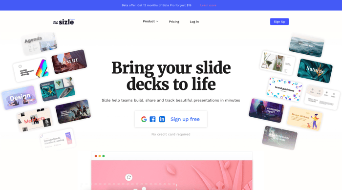
Hi all, recently launched a public beta for www.sizle.io, and would love to get some critique on the landing page, sometimes when you stare at something for too long you tend to miss some things that should be obvious. Thanks in advance to anyone that takes a second to check it out :)
Landing page: https://sizle.io/

Is it you that had a similar thing with a totally different landing page with the 1,2,3,4,5 on top?...
While this is prettier, I think the other one was clearer..
I really it. Clean, just the right amount of content and a very nice flow.
Your tag line, “Turning presentations into conversations,” is succinct, clear and engaging. I love it!
Good work! 🙃
Thanks a lot :)