Launching a New Collection of Shadcn Alert Components
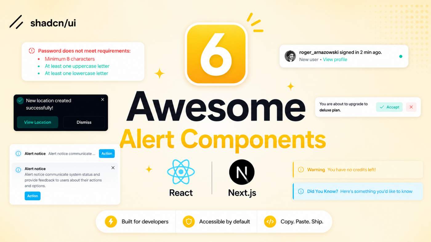
Explore our collection of 6 Shadcn Alert Components built with React, Next.js, and Tailwind CSS. These customizable, production-ready alert variants help developers create modern notifications, warnings, validation messages, and status updates.
Here Are 6 Types of Shadcn Alert Components Included
Alert with Password Detail
Password validation alert that helps users understand password requirements with clear guidance and validation feedback.

Alert with User Detail
Notification alert designed for comments, replies, mentions, and unread activity updates inside modern applications.

Social Alert
Simple social notification alert for connection requests, invitations, follows, and engagement updates.

Indicator Destructive Alert
Warning and destructive action alert designed to communicate critical actions, errors, and important account notices.

Dark theme Alert
Dark-themed alert component ideal for dashboards, admin panels, and modern dark mode applications.

Alert with Gradient Effects
Modern gradient alert with eye-catching styling for announcements, promotions, updates, and featured messages.

Why Developers Use Shadcn Alert Components
Alert components help communicate important information, warnings, success messages, and notifications without interrupting the user experience.
These components are commonly used in dashboards, SaaS applications, admin panels, authentication flows, and notification systems.
Best For
• React Applications
• Next.js Projects
• Shadcn UI Websites
• SaaS Dashboards
• Admin Panels
• Authentication Systems
• Notification Centers
• Developer Tools
Check out Shadcn Alert Today.


For a collection labeled production-ready, the deciding feature is the behavior contract, not the visual variants. I would document which examples use role=status versus role=alert, how dismissible alerts return focus, and whether the gradient/destructive variants still pass contrast checks. A small accessibility matrix beside the six demos would make this much easier to adopt in a real dashboard.