Less Can Be More (on removing features)
I think we (at least, I) fall into the temptation that adding features is good for users. However, today I did something non-intuitive and I think beneficial.
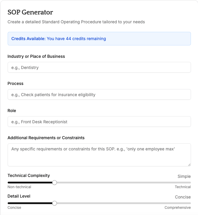
Here's what the main functionality looked like on the operatesmoothly.com before. Notice the sliders at the bottom. I thought they might be useful - e.g., cleaning an espresso machine can be a simple SOP, maintaining a hydraulic press might require technical details.
But instead, it just confused users! Because all our users are new, they didn't have any reference point, so they just picked arbitrary values. I decided that it was hindering conversion and understandability of the product.
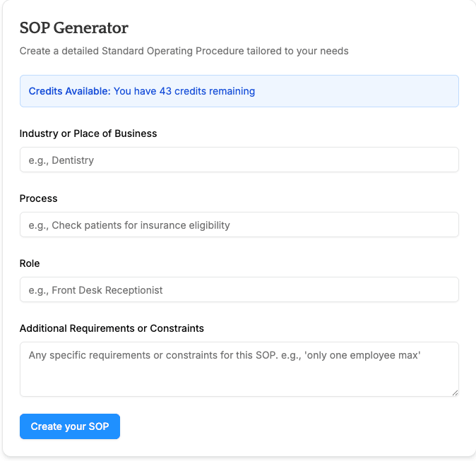
Take a look - I removed, and now there's only 3 mandatory fields to fill out instead of 5. I'm optimistic it'll improve conversion AND I'll add back the sliders as a feature in the "Pro" subscription package I'll launch later (presumably, the users that buy that will already be power users).

