Lookin For Feedback: Wicked Templates new landing page.
Hello everyone!
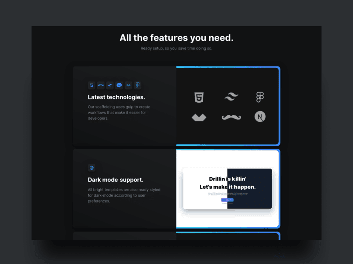
So, I was looking at the landing page again, and it was something missing, and I saw that I did not up emphasized on the features as I should have done...
You can see it live at
www.wickedtemplates.com
And please, let me know what you think also, thank you very much!
/Mike

@Michael_Andreuzza Your website is just stunning! The colors, design and copy is so neat! I naturally wanted to keep scrolling and find out more about wicketemplates haha.
I've made a detailed feedback for you using ruttl. You can check it out at https://app.ruttl.com/share/9BHoiIRKHAMSfO12MLN5.
Hope you find it useful!
thank you, Vijay! great insights.
Glad you found them useful!
A lot of great feedback here. I just thought I'd point out it looks like you misspelled 'refund' in your footer.
palm face. Thank you .Json Fixed it!
Hey Michael - I think you should drop the "." at the end of H1, H2, H3 etc
I also think your Call To Action before the footer (where it says Convinced) it's kinda weak - you're not incentivising enough all those who are "nay-sayers" or just not ready to purchase yet.... to click it, you're just adding one extra call to action there - INSTEAD what I think you should do is play on their emotions, understand why they're NOT convinced and try to show them a video tutorial or some examples of pages built with ur product. Or maybe send them to the FREE Template directory so to convince them with the purchasing of a $0 template :D
Futhermore, I would make the testimonial companies stand out more and I would add pages that link from Install, INtegrate, Deploy boxes....I was trying to understand how to Integrate it but that small amount of text didn't really give me much tech info - you're telling people to go check Tailwind Docs.... that's not good im afraid
Hope these improvements can lead to a big success!
Hey Orlie, thanks for your input!
No dot? oh, ok...I'll remove it.
I use to have nothing actually before, but a few weeks ago I put that button..n Sounds good to actually point them to a free one I can point them to the expo.
i am supposed to change the copy, Is been like this for months now, and the templates have changed quite a bit the way how to build them now them..
Definately changing the how to today.
just one question, wouldn't push the visitors away to another page if I put links there?
I used to have links to their tweets, but the performance was weak, so I removed them.
let me reword that, I'll take care of it.
Every input from every counts, I have been working on this landing page too long and it feels that I can't see anything else, so I am quite stuck with it.
Really appreciate Orlie, thanks a lot!
Yeah, that means customers are interested, it's a good thing!
make them into images that lazy-load using the loading attr (https://developer.mozilla.org/en-US/docs/Web/Performance/Lazy_loading)
In conclusion: you're very close! You're doing great!
oh, is it? Fair enough.
I removed it because, to be honest, it wasn't needed.
They are HTML code, the image is only the avatar, what It was making them slow was the actual link...
I have lazy load on the whole site, we also use a plugin that works with with gulp that minifies the images when the build process is done.
BTW, I took action on the 3 cards. This is all the process to be honest.
yeah but I would personally make those three link to the readme/docs with relative paths to each section
i completely forgot them,.....you mean this ones.
I agree with the first comment - love the color scheme and layout, but definitely feels crowded. More whitespace (vertically) between elements would probably help. =)
After you guys told me, I felt it too. too crowded up there...
ill fix that!
Thank you Catherine!
This comment was deleted 5 years ago
hey Timo!
I agree with the clutter, I'll fix tomorrow.
the spacing ok the features is tight to avoid scroll. butI can hava a look again.
tack Timo!