Looking for feedback on my landing page and product idea
Hello good people! 👋
After dreaming about it for far too long, I'm finally working on my first SASS tool. A lot of excitement, but also a ton of confusion and uncertainty. Need your help! 🛟
I'm building RefinedTweets. Before I explain the product, please take a look at the landing page and see if it does a good job of explaining it. 🙏
It's a Chrome Extension. RefinedTweets's main objective is to let you have ultimate control over your Twitter feed so that you can find more of the type of content you love and less of what you hate. I know you're sick of those "ChatGPT is yesterday's news" types of threads. :)
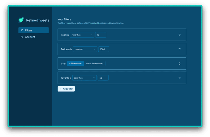
RefinedTweets does this by providing users with filters based on various data points. For example, users can say:
- I want to see tweets only from people who are verified/unverified,
- I want to see tweets only from people whose account is at least 2 years old,
- I want to see tweets that have less than 20 replies
- I want to see tweets from people with less than 10K followers
And much more.
I'm also planning to add AI-based classification to analyse tweets by intent (e.g. negativity, toxicity) and let users avoid the kind of content they're sensitive to.
Now your turn.
What do you think of the product idea? Would this be useful for you? Do you see any potential? Sign-up for the beta if you want to try it out or be an early supporter.
And how's the landing page? Did you get a clear idea of the product from the copy? How's the design? Anything I'm doing wrong?
I'm also looking for help regarding validating the idea. Any tips on that?
As I mentioned, this is my first SASS and I'm nervous about everything. Any thoughts, advice and feedback will mean the world to me. 🙏 😊
Also, if you wanna follow along with the journey, I'm on Twitter: https://twitter.com/faahim01

I'm not sure if it's difficult to do, but I would like to have the following feature:
a) I enter my Twitter username.
b) Below, my feed appears.
c) I can change filter settings directly on your website and see how my feed changes.
Essentially, it's a product demonstration without registration. Apart from that, everything is great. Good luck!
Thank you so so much @igor13 ❤️
Although I don't think I can have your feed on my site (at least to begin with), I can definitely have the filter right beside your Twitter feed on Twitter's webpage, where you can tweak stuff.
Also I do have plans to give people options to try it out without having to register or anything. :)
Once the product is up, I'll do it.
Really love the landing page copy.
That you so much @samyakr!
I didn't follow any rules or formats. Just wanted it to sound like a simple, fun, person to person talk :)
Nice landing page, does a great job of explaining what the tool is about. Loving the headline and how you explain the features. I'd lean in more towards the "Create your own Twitter Algorithm" narrative
Some copy improvements I'd suggest:
I'd spent some more time focusing on the problem and the value of the solution (maybe include some before and after pics).
As for the product, I think there's definitely value in building something like this but I'm not sure how many people are willing to pay for access.
Wish you the best!
I'll reply here, I like the landing page quite a bit overall. You've gotta some great feedback already for what to add and clarify, I just wanted to put in my two cents that I actually liked all of the quirky bits. I don't think you should jump to get rid of them. Possibly keep it the same, possibly even step it up a bit.
I had no idea what "AI threadbois" was, but I picked it up from context, and it matches the tone you've set in the rest. Specifically what LimitlessFounder felt off about and quoted above, I liked those bits of copy :) To each his own, right? That's a subjective style thing.
Add in a clear header, stronger call to action, and if possible it would be really good to be able to explore the filter on your landing page directly, as others suggested - I know that presents a huge step up in complexity, but it also might be the feature that makes or breaks your viability.
All in all, looks interesting, I'm unsure of the value but signed up for beta as I'm using Twitter more lately, and I'm curious.
Hey @mountaindad
Thanks for these counterpoints. I realised the same over the last two days. People are clearly split about these. One group really likes the light-hearted, fun tone, but the other thinks it should be a bit more serious.
Personally, I was definitely leaning towards the playful approach, and still think that's what I want to do. The "threadboi" bit might be a bit too niche, I'll try to think of something that has the same vibe, but maybe a bit more general. However, I'm going to stick with the playful and conversational tone here. :)
Thanks so much for the encouraging words and thanks for singing up. The good news is the extension just got approved for Chrome Store, so hopefully you're going to be able to try it out soon! :)
Hello @LimitlessFounder
This is some great feedback! I agree those copies are not really sticking. It way too much conversational 😅
I'm going to re-phrase pretty much all the items you mentioned.
I'm also a bit unsure about finding target audience group that'd pay for it, but I'm willing to take a chance and find out :)
Generally not against conversational copy and definitely wouldn't suggest going for a more serious and pretentious look. It's just that these phrases don't really stick with me personally, but as @mountaindad said, to each their own.
As for finding a target audience, maybe I can help you with that. My current company provides Market Intelligence services and utilizes data to find and understand markets, uncover opportunities etc
We're currently pre-launch so it would be a good opportunity for you to get some insights and for us to get some feedback
Hi again!
That actually sounds awesome!
I'm a first-time founder and could definitely use the help of something like that.
Also, good news, I just go the extension approved for the Chrome Web Store today. So I'm pretty much ready to launch. I'd love to discuss this in more details. Let me know.
Thanks! :)
It's really clean and self-explainatory. The SaaS is simple and understandable. But it looks much like an MVP. I'd try to revamp it with more features (micro-features if you will).
Hey @alvarovillalbaa
Thanks a ton for taking a look. Simplicity is what I was aiming for. Glad to know it was easy to understand.
And you're 100% right that it all feels very MVP, and that's because it is. I was just trying to gauge interests about this. Now that I've got some positive feedback, I'm gonna build out more features :)
Thanks again!
I looked at your landing page and I think it does a decent job of explaining your product idea.
This sounds like a useful and interesting product for Twitter users who want to customize their experience and find more of the type of content they love.
However, I think your landing page could be improved by adding some more elements, such as:
• A clear and catchy headline that summarizes the value proposition of your product. For example, something like "Refine your Twitter feed with RefinedTweets" or "The ultimate Twitter filter for finding the content you love".
• A call to action button that invites visitors to sign up for the beta or join the waitlist. You can also add some social proof or urgency by showing how many people have already signed up or how many spots are left.
• Some screenshots or gifs that show how your product works and what it looks like. You can also use testimonials or quotes from beta users or influencers who have tried your product and liked it.
• A FAQ section that answers some common questions or objections that visitors might have about your product. For example, how does it work, what are the benefits, how much does it cost, is it safe and secure, etc.
• A footer that includes some links to your social media accounts, contact information, privacy policy, terms of service, etc.
These are just some suggestions that might help you improve your landing page and increase conversions. You can also use some tools or services that help you create landing pages, such as Flowgiri, Ezytor, etc.
Remember: Be strong, grow faster.
On gosh, @deluar001,
This is some seriously great feedback! Thank you so so much. After reading your points about the headlines, I went back to the site and re-read everything. I can now clearly see how I'm spending the entire hero section just highlighting the problem and not really explaining the solution! I'm definitely going to tweak that.
About how the product works, I'm planning to put up a video demo showcasing it, where currently the big screenshot is.
I absolutely love the ideas about FAQ, Footer and social proof. Adding all these to my notes and will hopefully incorporate all of these soon.
Again, I really appreciate you taking the time and providing these super useful suggestions. Thanks man!
@faahim01 Make something that presents your strength and your country. That's my pleasure:)
I had a hard time reading the landing page. First, the main text after "your twitter feed is out of control" - "From AI threadbois to viral memes, You’re flooded with the craziest you couldn’t care less about." I spent a solid 20s reading "threadbois" probably because I don't know what that means. The emoji also took some thinking to realize what the main point of that sentence was.
By the way, that main text at t he top is cool, but I had to think to read that as well - if I was not reading it to give you feedback, I might not have stuck around to keep reading.
Then "Show me Tweets that has less than 10 replies." Tweets is plural, so you should be using "have" not "has". These are all minor things, but being that English is my most used language, I found it difficult to get through the page.
Other than the content being hard to read for me, I think its cool, but It's not a product I would buy. However, considering that I barely use Twitter, I'm not your target demographic anyways.
Hey @AlfredoSequeida
Thanks a ton for the very honest and valuable feedback! I think you absolutely correct with those points. Especially the term 'threadbois' is one that I myself wouldn't understand a few weeks earlier. It's a niche term I've been seeing on Twitter for a while. So I should definitely rethink that bit.
I have already fixed the 'has' typo. Thanks for that (English my second language).
Again, thanks for taking the time! 🙏
Nice one! In terms of potential, I believe RefinedTweets has a lot to offer. Twitter users are constantly seeking ways to streamline their feeds and customize their content consumption. Your tool provides them with the ability to do just that, and I can see it being useful for many people.
As for the landing page/website, it is missing TOS and Privacy pages.
Make sure the logo is compliant and doesn't fall under trademarks.
Hey @OffshoreCompany 👋
Very, very glad to know you think it has that type of potential. Sounded like a soothing music to my ear 😊
And yes, you're right, I actually haven't paid any attention so far to those very important things. I was just trying to validate if there's any interest in it at all. It seems like all the feedback is positive so far, so I'm gonna have to think about those things soon.
Thanks a ton for taking the time! 🙏
Hi @faahim01, I don't use Twitter so I'm not the target customer but I like the idea and a chrome extension seems like the perfect implementation.
Landing page feedback:
Drop the weird font "out of control" section at the top. It is cute but you want to maximize readability and understandability. Many of your users might have poor English skills.
Use more colors and font weights etc. to highlight the important parts. Your page is all kind of the same and it makes it very hard to skim.
Show don't tell. You show the "add filter" page but not the results. You want to show the value of the product, not the work needed to get there (i.e. making filters).
The layout is a little odd, I don't know if I should be paying attention to the "show me xxx" or "Supported filter datapoints". Don't divide your users' attention -> focus it.
I would have a video or better an interactive demo. Which showed a feed, of fake or real tweets. I would then have a dropdown, slider, etc. that would let me filter that feed down. Disable unverified. click. Tweets with over 200 likes. Move slider. 500 likes. And update the UI.
You want to be clear, focused, and demonstrate the product value.
Good luck.
Hey @nickls Thanks for this very well-thought-out feedback! I really, _really appreciate it. 🙏
I absolutely love how you pointed out the lack of showcasing of the actual product "You want to show the value of the product, not the work needed to get there". I was thinking I'm showing enough for people to get an idea, but now I realise it's not.
I also love the idea of something interactive that'll let you try filters out right away. I'm willing to implement that, but I think it's going to require a bit of time and I'm a bit unsure if it's worth investing at this early stage. I'm thinking about putting up a video for now. Will definitely come back to the interactive idea upon validation.
Agree with the oddness of the layout. I have this tendency of trying to stand out and then make things worse 😅 Will change to a normal stacked layout.
Was on the verge of not shipping the weird font, but people so far found it fun. Very true it can be confusing though.
Thanks again for all these great insights, these are going to be very useful for my next iteration. :)
Have a great day!
Excellent idea, Faahim! Such a personalized feed will be helpful, especially when you need to find some gold but not popular threads. I wish somebody would make the same extension for Youtube.
As for the landing page, seeing clear examples of how your product works will be nice. You have shown data points, but what if you show some cases? For example, in "Find your gold," you provide some pictures/gifs where your extension helps find well-thought posts or unique content.
I signed up for the beta. Good luck!
Thanks a lot, @Norovy! 😊
It's really assuring to see most people are finding the idea to be not so stupid, haha.
And I think you touched the core there, I've been personally using it exactly for that: to find tweets from real people that are otherwise gone under the radar. And it's been really nice! I think I've connected with more people in the last 2 weeks than in the last 2 years. 😅
Totally hear you on the example part. I'm considering adding a video in the place of the screenshot. I have a really rough walkthrough here if you're interested: https://twitter.com/faahim01/status/1661460716002639874?s=20
Thanks for the idea!
P.S. Did you get a confirmation in the UI when you submitted your email? Strangely, I don't see your entry on my list 🤔
Mind trying once more, or sending it to me directly? Sorry for the hassle 🙏
P.P.S Do you think there's a demand for something like this for YT? With the underlying structure already laid out, I think I can implement it for YT as well! :)
Hey, @faahim01!
Glad that my comment was useful for you. I love your video, and I think it really cool to show a walkthrough :)
As for the Youtube plugin, I assume having a more advanced search tool will be brilliant. For example, my team and I are now trying to find specific channels with DIY content to talk with influencers, but with the current search, it`s impossible. We have to pay for different platforms to scour through their lists.
P.S. I joined the beta list once more. Hope you will see my email this time
Hi again @Norovy
Thanks for taking the hassle and singing up again! It definitely came through this time. :)
Glad you liked the video. I've just re-recorded the same video (tried to present it a bit better) and added it to the landing page.
Also, The YouTube idea actually seems to have good potential, someone else here mentioned it as well, which signals demand. I feel like I'd have a headstart based on my work on RefinedTweets, but realistically, I don't think I can try it out now. I'm gonna keep it on project idea list and hopefully I can come back to it after RefinedTweets is in a good place. 🙃
Beta is coming real soon, the extension just got approved on the store. Expect an email sometimes soon :)
Hi! I think the idea is really interesting. I haven’t used twitter in a while, but when I did, I often felt overwhelmed by the tweets fed to me be the algorithm, and many times I’d miss interesting tweets from accounts I follow.
I’ll bookmark this and if I decide to use twitter again, I will definitely try it out.
The landing page is great! What did you build it with?
Hey @freeland
Thanks a ton for checking it out!
And yes, Twitter has always been a bit overwhelming in general, but oh man did you save yourself from some real pain by not being there recently! It's been a real chaos (the feed) for a lot of people. Seeing people being frustrated is what sparked the idea in part.
Definitely let me know if/when you come back, will love for you to try it out. :)
As for the building the landing page, I created it with Next.js. Purely because it's something I'm familiar with. I haven't used ANY of the fancier features. It's just plain HTML and CSS.
Idea is good ~~ but I personally won't go for it until its free
Hey @joshua_collins
Fair. I understand it's not that important for most users. Hopefully, there'll be a group for whom it'll be valuable enough to pay.
However, I'm definitely going make a good part of it totally free. Been thinking about allowing usage of 1 filter for free atm.
Hi!
I don't read the other comments on purpose when posting mine.
Concerning the landing page, my first impression is... WTF ?! But I read. It's interesting and I understand easily what it does. That's clear.
But I don't know it's a Chrome extension, you don't tell it on your page.
Concerning the product I won't use it.n,I'm not a future client. I could use it but only for free, Twitter is free and if I want to don't see some content we can mask some content yet. It's enough for me.
Good luck!
Hey @NicoBuc
Thanks a lot for taking a look and giving your feedback. Hopefully the 'WTF' resulted in a positive way eventually? The purpose of that is to stand out a bit and I'm still sort of on the verge.
Can totally hear your logic on not using it. I'd definitely agree that it's not for all Twitter users. I imagine it being useful for people who spend a lot of time there and who have a messy feed.
Thanks again! :)
Honestly I don't know if it's positive, I would read the content in any case :)
Sure it's different from usual !
I think from the feedback I've gotten so far, I'm concluding that not everything finds it nice, but some find it really fun. And those who doesn't find it very nice still gets the idea. So I'm keeping it 😅
Fantastic suggestion, Faahim! A personalized feed would indeed be invaluable, especially for uncovering hidden gems and lesser-known threads. It would be wonderful if a similar extension could be created for YouTube as well.
Regarding the landing page, incorporating clear examples of how the product works would be highly beneficial. In the 'Find your gold' section, showcasing compelling visuals such as pictures or gifs that demonstrate how the extension helps discover well-thought posts or unique content would enhance the user experience and illustrate the value of the product more effectively.
Hey @ranaphool
Thanks for checking it out. Glad to know you liked the idea.
You're spot on displaying how the product works. It's pretty clear from all the feedback that I need to put a better demonstration. I'm planning to create a demo video and put it on the page. Hopefully that'll do it for now.
Again, thanks for taking the time! 🙏
good job
Heyy! Thanks, man!
Looking forward to try out your MVP!
Great to hear you following your dream!. For the landing page feedback
Hey @stwboom
Thanks for the pointers. I'm going to put up a video to explain the product better. :)
Hey there! I wouldn't call myself a pro designer but I know a thing or two about design as I've made many websites in my life. Just wanted to drop by and share my thoughts on your landing page. Overall, it looks decent, but I think there's room for improvement. The design feels a bit clunky and plain, and it could benefit from some added visual appeal. Consider incorporating more engaging elements like images, icons, or videos to make it more eye-catching. Additionally, the text could be made more concise and punchy to capture visitors' attention. These tweaks could really enhance the user experience and help make a lasting impression. Keep up the good work!
Thanks a ton, @Sjohn
These are some great feedback. Totally agree that it's a bit too plain at the moment. I already have some ideas to incorporate what you have mentioned and plan to update the page soon.
I like your landing page and it's really refined! I guess a video/gif would help people to understand how this chrome extension is used when they are using twitter :)
Hey @angello26,
Thanks a ton for checking it out. And absolutely, I need to have something to better demos the product. Going to put up a video on the page showcasing the actual flow.