Looking for feedback on my redesigned landing page
Hello, recently redesigned landing page for my app called Produktly. Previously it was a SaaS just for building product tours, but I have started to expand the features to a full-blown digital adoption suite so also decided it was time to update the landing page
Trending on Indie Hackers

The phrase "Digital adoption suite" doesn't mean anything and it's used in the primary headline. My first thought is... "what is that?" and "what does it mean to 'empower' my users?"
Focus on the outcome, not the "what" for your headlines. Something like: "Reduce new customer churn by 87%" is far more benefit focused.
This headline:
"Trusted by over 370 companies, large and small"
I'd remove it. 370 is not a big number and could be having the opposite impact as intended. If it was 5,000+ then that'd be something to include. I like the "tours completed" metric, you should focus on that in the headline.
Thanks, "digital adoption suite" is used in the industry and does a mean collection of tools that can be used to improve digital adoption (such as product tours, checklists, tooltips, announcements, changelogs etc.). But you are right that it could be more clear
Some options I have been thinking about are:
It looks nice overall, but here are some observations -
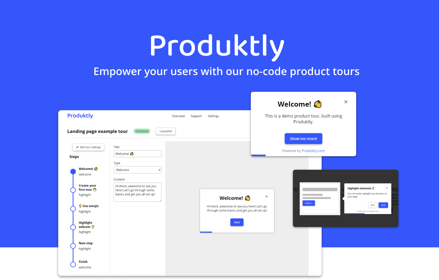
Page is very content heavy, probably more visuals and lesser content would be more easy on the eye
It would be good to have a screenshot of your app in the hero section itself along with some social proof
The screenshots are a little pixelated. Using SVG images to improve the quality of the images will definitely beautify your website more.
This is personal, but, as a "tech geek" whenever I see a website using Tawk.to, I don't feel as excited about the product in comparison if the chat widget was of another company like Crisp, Intercom, Gleap etc
One question I would ask is how many of your potential users know what a 'digital adoption suite' is? Your headline is one of the most important elements on your site to get the attention of a user. Instead of describing the product, think about what the product does for your users. When I read that, I want to feel like you are solving my problem. Or you are at least the tool to help me do it.
I'm sure some do, but you might be right that not all do.
I think that the potential users are roughly in two groups:
I only got as far as the Value proposition / headline & sub as this is the most important piece. If you don't get this right - as in being very clear on what you provide/the problem/solution, who you provide it for and why they should care (benefit) - most are unlikely to scroll any further.
I think your sub head does a fair job on this actually.
/We provide you with all the tools to build engaging product tours and checklists, guaranteed to improve onboarding and boost adoption, no coding skills needed!/
But 'digital adoption suite' is problematic because first thought is "what is that?" And not in a "oh i'm curious" sort of way, because you're asking the visitor to try and figure it out, when what you want is "got it, sounds good, makes sense". If you have / can get traffic then some split testing just on that first headline would reveal a lot i think.
This may help in understanding what your headline needs to do:
https://landingpagehub.net/value-proposition-statement-guide-ffw-1-5-1/
Hmm yeah you might be right, it's just hard to combine the full offering into just one sentence.
Some options I have been thinking about are:
Or some combination of those. Previously Produktly had just product tours, but now we offer checklists as well (and are planning to add other similar features as well) I would like to highlight that as well. That's why the "digital adoption suite" seemed good. And tours and checklists can be used for more than just onboarding
I usually do a main headline connected with a sub or short paragraph - this gives you more options. You can also use an image and the three elements conveying your core message which can mean you need less words.
Honestly, there is not that much intrinsically wrong with what you're saying, but there is with way you're saying it and that dampens down your credibility.
This for example:
""2x your retention and adoption by onboarding your users better""
Just doesn't read well. using the word "better" at the end of the sentence is the main culprit i think.
Off the top of my head (and thats now how it works btw - it takes time to get right), i might start with..
"Double your adoption with more effective onboarding"
But for me personally, I still don't get what your selling and who for - so it needs more.
A copywriter here would be a worthwhile investment and save you a ton of faffing about.
Here, I had another quick bash - emphasis on the bash - at it for you...
"Product tours and checklists designed to optimise onboarding, boost adoption & improve retention. No coding required."
Caveat here, being that i'm only working with what you've already done. If i'd been starting from scratch i would have interviewed you to get to the essence of your message and my own understanding, and could have come up with something altogether different (maybe, don't know enough about it, as i said)
The point is though, there are numerous ways to skin a cat, many of which can work, you just need to explore how to do it as simply and clearly as you can, so your visitor gets it without having to think too much about it.
Thank you so much!
That makes a lot of sense, and I definitely need to think about it more.
I do like both of those suggestions, so I will try to them for now at least. Especially the sub-header quite perfectly captures the message. The header is also good, I would just love to incorporate the other benefits there as well, but maybe it's not possible without making it too long
You don't have to cram everything in to the headings. You can follow on with bulletpoints benefits. Just ensure its all above the fold and can be seen one one screen without scrolling and you're good.
Off to a great star! Would add the following:
Hope it helps!
Thank you! Those are all good ideas
Regarding the header you might all be right, given the large amount of comments about it :D
Some options I have been thinking about are:
I think it's pretty clean and explains well what you're offering, but I also think it might be time for you to break the site up into more pages. You could easily have dedicated pages for the different use cases e.g. onboarding, activation, new feature release tours etc. I think the single-page site approach now devalues your brand/service offering a little bit given that it's clearly becoming quite a comprehensive offering :)
Thank you, yes breaking it up into more pages makes a lot of sense
Nice and clear design.
Noticed something on iPhone.
When you click on the menu icons, it opens up the menu however it shows the button Get started in the menu and you also see it again (just below and behind) from the main home page so it looks like the button is duplicated.
Maybe remove one or blur out the background when you open the menu. Tried to post a screenshot here but new to IH so probably why.
Well done
Thank you! Nice find, I will get that fixed
Daaaaaang that’s clean! Bravo!
I dig it! Not sure what it looked like before, but I think you filled in the TailwindUI components nicely! I especially like the demo!
It looks really good and professional! It's clear, has informative sections, images. I think you could also add social proof section with comments of satisfied customers.
Did you make the page from scratch (is it Angular, by the way?) or used a landing page generator?
Thank you!
Yeah social proof section is a good idea, I will have to go gather some comments
It's React and Tailwind CSS mainly, a combination of their ready to use components and raw CSS
Thanks for sharing
You can click on the menu icons and it opens up the menu, but the Get started button appears twice (just below and behind) on the home page, so it appears that the button is duplicated. The background of the menu should be blurred out when you open it if you want to remove one. Having trouble posting a screenshot because I'm a newbie to IH, so it's probably because I'm not familiar with it.
https://bapehoodie.co/
I like it