Looking for Honest Feedback on therappai’s UI (AI Video Therapy Platform)
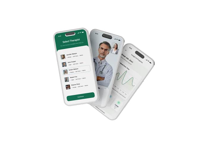
Hey IndieHackers 👋
I’m James, founder of therappai — we’re building the world’s first AI video therapy platform to help founders, teams, and employees manage stress, burnout, and mental health through short, human-like AI video sessions.
We’ve just finished our first complete UI pass, and before we push it live, I’d love honest, constructive feedback from this community.
If you’ve built SaaS products, wellness tools, or B2C apps, you know how much design impacts trust and usability — especially in something as personal as therapy.
Here’s what I’d love your thoughts on:
Does the interface feel safe, human, and trustworthy?
Is navigation intuitive and simple?
Any moments that feel “too AI” or disconnected?
What would make you more likely to sign up or stay?
You can check out the current UI mockups here 👉 https://www.figma.com/design/igASkLbxvuFC96hoq4Bl4l/Therappai---F
Every bit of feedback helps us make therappai feel more human and helpful.
Thanks in advance — always happy to return the favor on your product design too.

Really like the clean, calming aesthetic you're going for - it fits the therapy vibe well. One small thought: the insight section feel info-heavy at once. you might try breaking it into slide-cards or small swipeable chunks so user doesn't feel overloaded.
Overall though, this is shaping up nicely!
This looks like a really thoughtful approach to making mental health support more accessible. The focus on trust and human-like interaction is crucial for something this personal. Best of luck with the launch!