Lumiate - Reduce stress and anxiety while using laptop productively | Help Needed :)
Hi everyone,
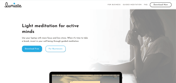
We're starting to see more passionate and engaged users as well as increased web traffic. However our free download conversion rate is sub-optimal. Any feedback you could provide on what's lacking, or what's working and we should lean into, on the homepage to help downloads could really move the needle for us.
Many thanks in advance!

Okay let me just be bold here; this is fucking amazing! 😲
I was a little bit skeptical while opening your website and installed the app purely to give you some feedback. Only now your app is up and running I can see the value of it!
I really think the message on your website is not coming across like it should. I think people are not downloading because they do not understand.
I think we Dienox might be able to help you, we have a lot of experience in these sorts of landing pages and app design and we like to help fellow IH'ers. Send me an email at marijn@dienox.com if you are interested and we'll see what we can do!
Anyway, keep it up. My screen is on clarity mode for the rest of the evening 🙏
Why a downlod? Show me now :)
As in: You can just create a webpage that turns greeen (your webpage) and show me what it does and how it works.
That's a good point, Yannick. It was definitely a big decision for our road map going native vs. web. Would a video demo suffice in the mean time, or be helpful?
Why not have a show me how this works” section and have people click through to a new web page where it turns green, etc.? You don’t need a video for that?
The development hours required is a deterrent, so I try to use no-code solutions when possible.
Outsource it?
Hey @Lumiate, looks great. As a developer who uses headspace most days, I guess i'm in your target audience.
My initial impression is that the site looks nice and polished, the app looks like it has some really useful features and would be something i'd be interested in trying. Unfortunetly i'm on Linux so I guess that isn't an option.
In terms of feedback for the site:
These are fairly minor things but I guess everything adds up for conversions, few more iterations and i'm sure you'll be landing more
@harlanzw sorry for the delay, sorry that we're not on Linux! I've been working based on your suggestions, check out the new https://www.lumiate.co
I really love the product :) Overall the message was clear to me. Perhaps too long sentences and technical vocabulary for non initiated meditators?
Hi Tabby, did you get a chance to try it? I get what you're saying about technical or robotic language, I'll work on it today!
Purely my opinion here, I don't like the font you're using. I think it's hard to read. I think you could also re-evaluate your copy. For example:
I'm not sure what this means. This statement is also sandwiched awkwardly between two other value props. So it's hard for my eyes to consume.
This is probably true for every human. If you're talking to everyone, you're talking to nobody. Can you write a crispier, more user-specific call to action here?
I feel like I had to dig to find this statement. This statement explains how your product will achieve the value prop noted at the top of the page. It's buried imo.
Your page required me to scroll further than I expected. I think the laptop image should peek out from the bottom of the initial landing. I bet that would encourage more users to scroll and learn.
Have you thought about offering your product via the app store? It will provide for a more trustworthy experience than downloading an arbitrary dmg file. It will also allow you to use the official "app store" button that users are already familiar with.
Hey John, I implemented much of your suggested changes. Please take a look at https://www.lumiate.co. Thank you so much!
wow that was fast! I think that's a solid improvement. I have some more thoughts if you're interested :)
I'm not sure why this section exists. Tbh it actually confused me bc at first glance I wondered if your product had music and email functionality etc built into it. Does this section address a pain point that lots of users call out? If not then I would consider removing it. Orrrrrr I think that the testimonials should serve this purpose. Maybe you can find a testimonial from someone that says like "answering emails is less stressful with Lumiate". I would drop this section and possibly use testimonials to provide the same value.
I think your product is super interesting. I'm using it now and have plenty more thoughts but I don't wanna overwhelm or overstep haha.
Hi John,
I can't thank you enough for your feedback. Feel free to overwhelm me and you're welcome to email it to me if you prefer: james@lumiate.co.
We have the account because we're adding a paywall soon. Perhaps moving up google authentication in our backlog would solve the problem.
I removed the use case scenario. I was just trying to drive home that you can do anything while you use Lumiate, but your original advice I think remedies that issue.
I fixed the "For Businesses" button, thank you very much for reporting that bug
I'll make sure to spend some time looking for analogous products. F.lux is the only one that's functionally similar and there site is pretty no-frills (more of an IP play running on donations); corporate wellness wise there's eMindful and of course apps like Headspace and Calm.
I'm glad you find it interesting. The more you meditate, the better the pulsing will work. Again, feel free to step as far as you would like.
Cheers,
James
Thanks John! You gave me a lot to think about. I'll get back to you!
This comment was deleted 6 years ago