Making not-ugly things - My Learnings
Some Context
I would like to preface this by saying I'm by no means an expert and these are just some tips that have helped me 😅
As a developer, I usually think about function first and form has always been an after-thought.
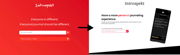
But this lead to rather horrendous looking things (see first pic). I've slowly been forcing myself to design first and develop later.
Here are some of the things that helped me design websites that look decent:
1. Design on Figma
Most people probably do this, but just in case you don't - please design somewhere before you build. It really really helps.
2. Backgrounds
A lot of the time, I've gone with colourful gradient backgrounds (see first pic) and they're not terrible but a white/dark background generally always looks more clean and more professional.
3. Fonts
This is something that can really level-up your website. I found that you can use ⬆️⬇️ to cycle through fonts in Figma and it REALLY helps in getting to know which font suits your project:
And once you find the font you want you can always get it from https://fonts.google.com/
4. Making the pages more interesting:
This may seem obvious but it wasn't something I did until recently: Make different backgrounds for different sections of your website. It's more clean and helps the user. For example on introspekt.app I added a dark rectangle with a skew as the background for my below the fold section.
Conclusion
Many of these may have been known to you but I hope you found atleast one thing that was useful.
Sometimes, you know about things but it still takes a reminder for you to start actually doing it, I hope this post can provide that reminder.
Have any more tips? Leave them below!

Great tips @GalacticLeopard!
I especially like your tip on font choice. However, I'd suggest you don't use too many fonts. No more than 3 fonts!
Oh definitely that's an important tip.
In my landing page I only use 3 main ones - Poppins, Montaga and DM Sans. I should probably do a different font for the header and subheader. The title is special and uses a lot of fonts, just to show that every journal is different.
May I add another personal tip of mine:
Use images! It’s incredible what a bit of png, visualization or mock device can add to the visual interest and feeling of a website.
100% Anders. It makes a HUGE difference.
Thanks for the tips! I like the one with the red background, though. 😂
😅 I liked it initially but it looks a bit unprofessional and gaudy.