May you give us very a honest feedback for New App Icon ?
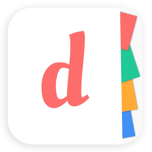
As Ddays has evolved a lot over the last few months, we have chosen to adopt a new visual identity more in line with what has become the app.
I NEED TO VERY HONEST FEEDBACKS on new app icon of Ddays.
What do you think about this new app icon?
Do you think this new app icon match with Ddays?
Thank you very much for your unfailing support.
Have a nice week end !

To me, the new icon looks more like a note-taking app because it looks like Post-It notes. Also when seeing the name
DdaysI immediately think of the infamous D-Day which has pretty negative connotations.Hi levidxyz,
Thank you for your feedback. We chose Ddays because life is composed by lots of good days and this days need to be organized well. The color don't refer to war.
Futhermore, the spelling is different and we didn't use "d" uppercase in app icon.
I have no experience as app logo designer etc, but to me this looks like post it notes.
I expect a note taking or "something with post its" app.
Hi Kaoieflke,
Thank you for your honest feedback.
In Ddays it is possible to make todo list and share it.
Although, the current typeface for "d" is good enough. As Sergey said it does have a very long ascender. I'd totally try another typeface and see if it looks any better. Wish you all the luck for your app!
Hi HeerenDarji,
Thank you for your honest feedback.
We will try Sergey advice and we will check if it looks much better.
Thank you so much to cheer me on.
I hope you will try Ddays when you will want to plan a special day.
Sure! :)
The best way to check, is to take screenshots of all of your team's home screens and add the icon there. If you like how it looks and it is not getting lost, it should work. Important thing so it doesn't blend with other icons and not too similar to any "common" application out there. Once people use your app enough times, they'll build muscle memory on how to find it. The icon won't matter that much anymore.
As for the graphic part, I feel like it is not "d", but "a" with a very long ascender. Might be only me, but something about proportions of stem width to x-height suggests me that. Overall it looks appealing and I think will pass the test that I suggested above.
Hi Sergey,
Thank you for your honest feedback.
Your advices were very useful. I will try it and I will check it.
My team and I chose to change this app icon because we think this new icon is more compatible with the values we want to convey.