Meetopia - the app for running great meetings
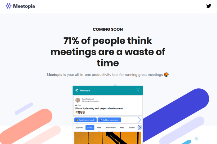
It's early days but, in the spirit of "if you're not embarrassed by the first version of your landing page, you've launched too late", here it is:
Meetopia - the productivity app for running great meetings.
I'd love to hear what everybody thinks. I think it needs some work but early feedback would be appreciated.
Oh - and feel free to sign up 😉👍 for early access!
Thanks IH family!

I would say the logo in the corner needs to be SVG or a bigger PNG. But overall great start!
What do you think of mine?? -> https://kritikos.app
Now you mention it the logo is fuzzy. Thanks!
About Kritikos - two things:
The carousel vertical spacing is too large. I didn't see any content below without scrolling.
Add a section/paragraph about why/what I need feedback before the #1 picture.
Otherwise - nice and clean design. Very clear. Great to see a testimonial.
Great start for sure! Here are some of my notes (for what they're worth):
I assume you are going to change up the hero image bc i see the tailwind logo in the mock nav. I assume that is bc this is just an early test.
I think you should make the "Why you need Meetopia" section something a bit more engaging rather than a 3 column text + description. It looks overwhelmed with text having the features beneath it set up the same way (columns with text + description).
I am always looking for clever solutions to help the endlessly boring and unstructured meetings I attend. Maybe to stand out, your app could benefit from some sort of a satirical video that introduces your key features. I remember Dollar Shave Club starting out that way and gained a ton of traction early on from it while easily setting it apart from similar services.
Consider a section that has quotes from users or people who are talking about the very problem you have solved.
I think this page looks great overall and can't wait to see what you do with the app!
Thanks for the feedback @skyforest and thank you for the encouragement!
It's scary as sh*t showing off new work. I'm never sure if it makes any sense to anyone!
The screenshot is just a static page with some scrolling regions (nocode - yay!).
There's no app as such but it might be enough to turn into a video to give users a taste of whats to come.
Tailwind logo: you spotted it - gold star for you ⭐!