🏟🔥Minimal Landing Page for Stadium Live is up!
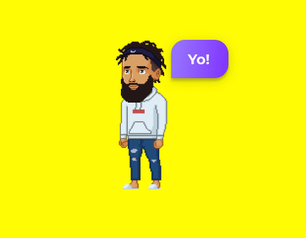
Been working on this fun sports platform and we're getting some beta users onboard! Would love to hear your first thoughts, feedback and more.
If you're into sports or e-sports, make sure to claim your unique handle and get on beta!
#landing-page-feedback

Thoughts, fwiw -
• So many bright yellow pixels
• The headline isn't big enough
• KSPs are a lot to read, can you reduce the word count dramatically, perhaps giving them header and bodies? So I can read the header and decide if I'm interested?
• Can't tell what's happening in the screenshots.
• Which "new generation"?
• "Geek out on live sports with friends" shorter version viable?
• The button C2A has too many words -- perhaps "Join Beta" or "Claim Your Handle" but not both.
• Was uncertain upon landing whether the bouncing "Live" brick was your logo or something indicating that this site is now live, probably need to consider a non-animated logo to identify your product.
• Is this an app or mobile website?
• Consumers don't care about "platforms" or even really know what that means in my experience. That's a term for entrepreneurs and investors.
HTH
Tpf
Thanks for the thorough feedback!
This appeals to our target market: Gen-Zs and provokes 'fun' and 'energy'
ex. snap.com / https://downtoshop.com/
The yellow hurts my eyes :|
Bearing in mind I don't know much about e-sports, I'd like a bigger/clearer picture of the mobile snap shots to help me understand better what it looks like.
Thanks Rosie!
For sure - again, this is just a minimal page just to get the ball rolling.
We'll have a full out landing page once we have more to show ;)
Also, yes yellow is our main color by choice and design.
This appeals to our target market: Gen-Zs and provokes 'fun' and 'energy'
ex. snap.com / https://downtoshop.com/
Will echo people's sentiments about the yellow :) I personally really love the concept though, and the pixel-art aesthetic is really cool. I'd like to see screenshots of all the features you listed broken down underneath in more detail (e.g. what does "cheer" mean? What "games" do you play?). Btw, if you're looking for more opinions, I've got a service where for $12 you can get another 50 opinions on your landing page. If you're interested you can check it out here: https://scoops.io/
Here are some simple things to improve your landing page;
• Move your anchored navigation (that's at the bottom) Home About Twitter to the top of the page.
• Add your about info under the top portion of the site. So it's not empty at the bottom.
•Your headline I would bump up the font size.
• Make Super fun sports platform for the new generation your H2
• Join the beta button should be #0F3974
Thanks for the suggestions!
I just noticed I gave you the wrong blue - I was thinking of this blue, #0a23f7.
Blue and yellow work well together. You need a contrasting color rather than using the dark grey - I would also use that blue color for the headline copy. I reworked your page a bit - See example here: https://imgur.com/w4lJnqA
I like the bright yellow, I like your logo and the illustrations you use. Definitely makes it stand out -but the goal is to make your page look legit. Right now with the animated background and all the emoji's it comes off like a kids sports fan page. I think you can achieve it easily.
Wow - yellow.
Completely agree with Rosie - please add a bit more - especially at the top - about what this is about or what benefit it is giving to me if I sign up. I could not really tell if I could use this.
My thought process was this: