My step-by-step guide to creating the perfect landing page for your SaaS 📈
A landing page has two parts:
- What user see at first (above the fold).
- What user see when they scroll (before the fold).
Let's start with the most important element: what the user see at first.
The perfect structure:
- A short sentence explaining the value you provide. (Title)
- A short text explaining how this value is derived. (Subtitle)
- Add call to action. (CTA Button)
- Add an image or a video of your product explaining his value. (Visual/Video)
- Add social proof. (Happy users etc)
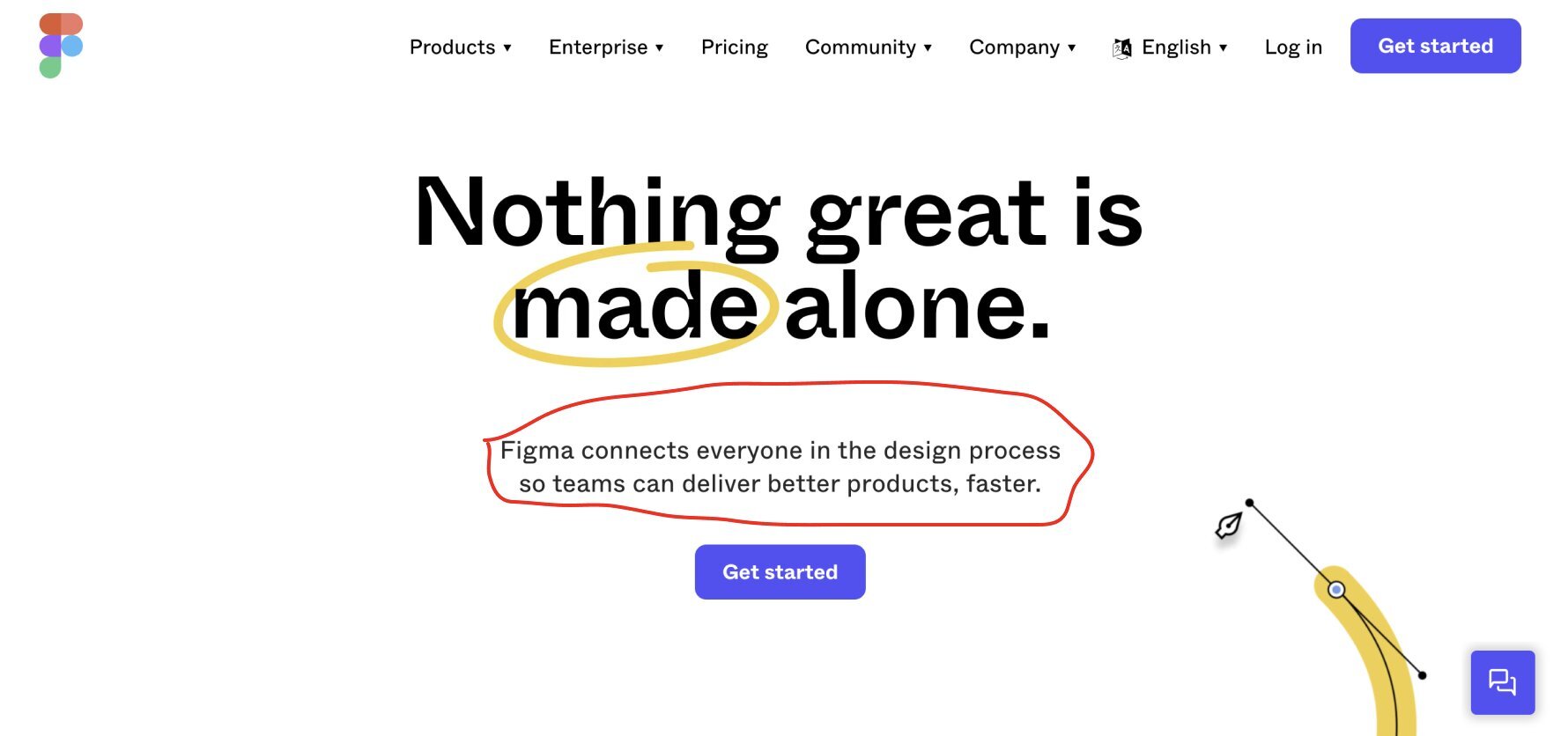
Example with Figma 👇
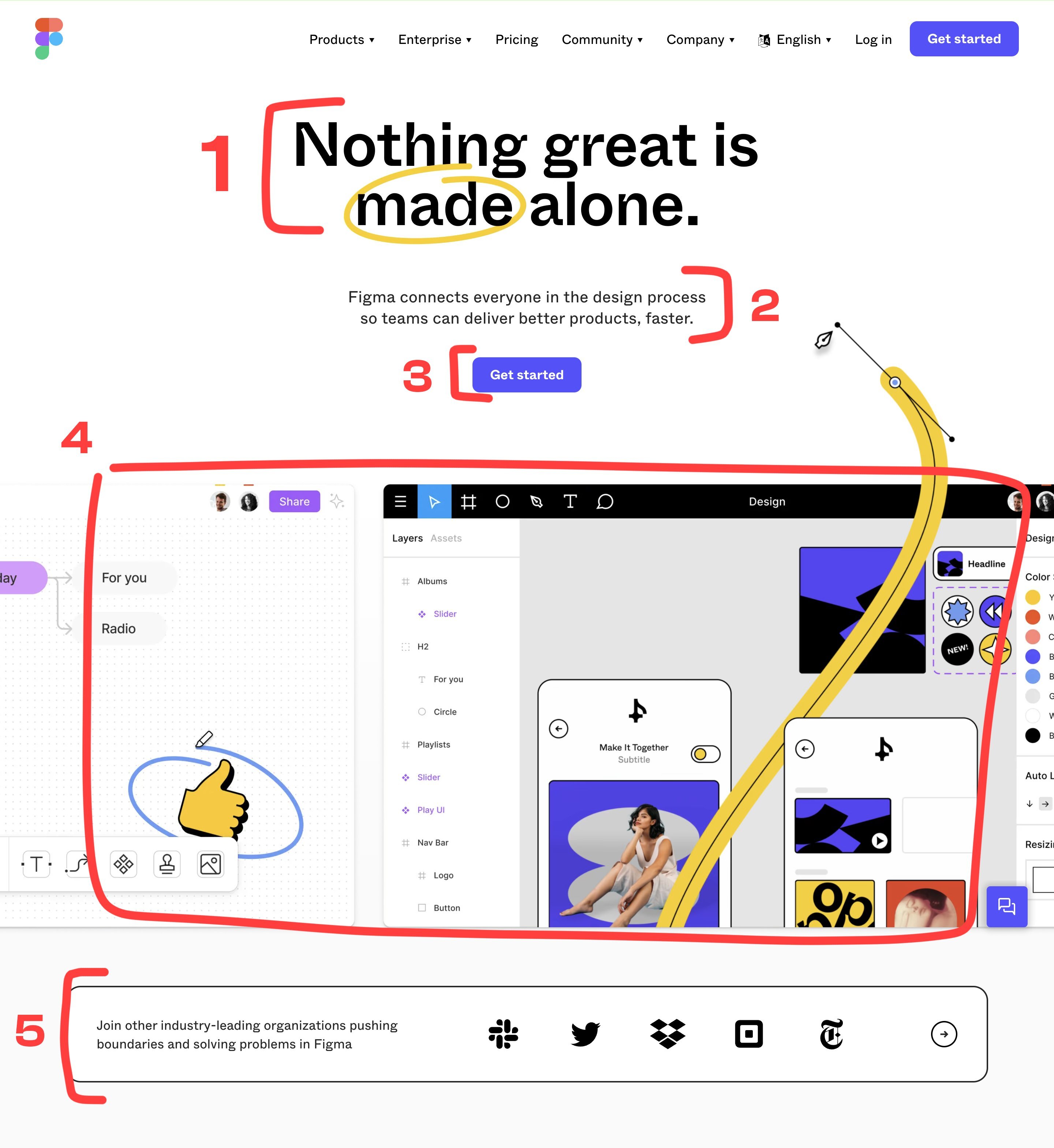
1) Your title:
The first thing your customers will read is your title. It's the most important part of your landing.
"A 5-year-old should understand the value of your product at first sight."
That's why you should make an impactful sentence that directly explains the value of your product.
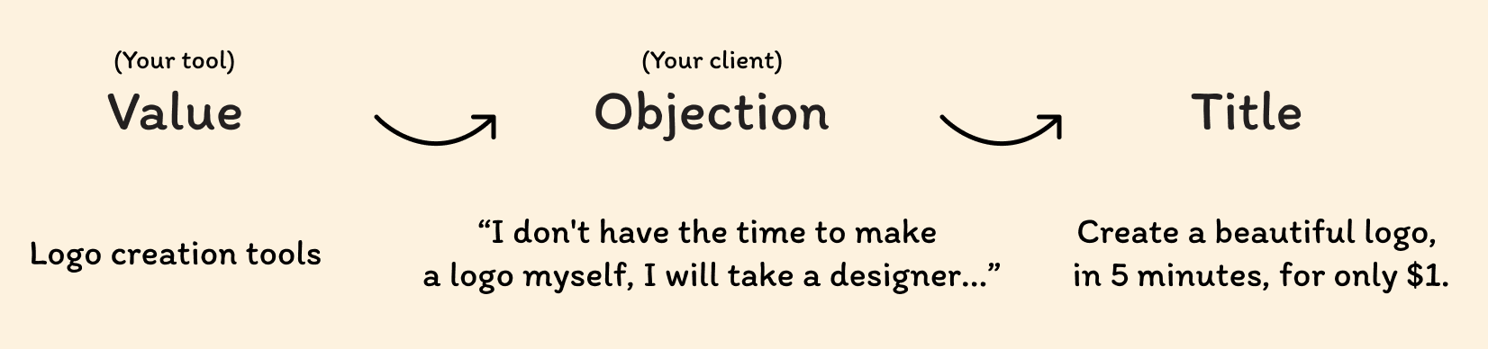
How to make an impactful title?
Value > Objection > Title 👇
2) Your subtitle:
Your subtitle is the second most important thing in your landing, why? You will introduce your product, explain why visitors should use it.
Make a short description of your product using elements from your title.
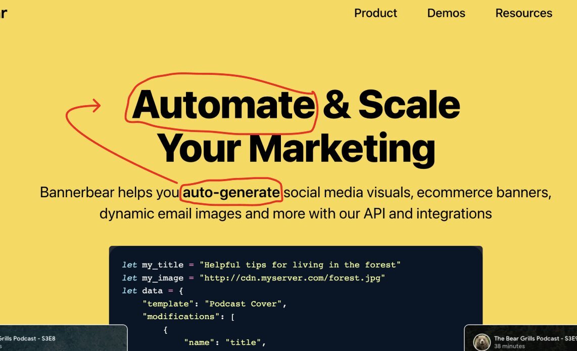
Exemple with Bannerbear (by @yongfook)👇
3) Your call to action:
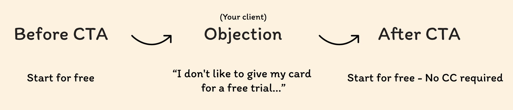
Most of the CTA buttons you find on landings are: "Start for free", "Book a call", "Get started" etc...
Deploy conversion-optimized solutions by defying bias (always put yourself in the customer's shoes).
See this example👇
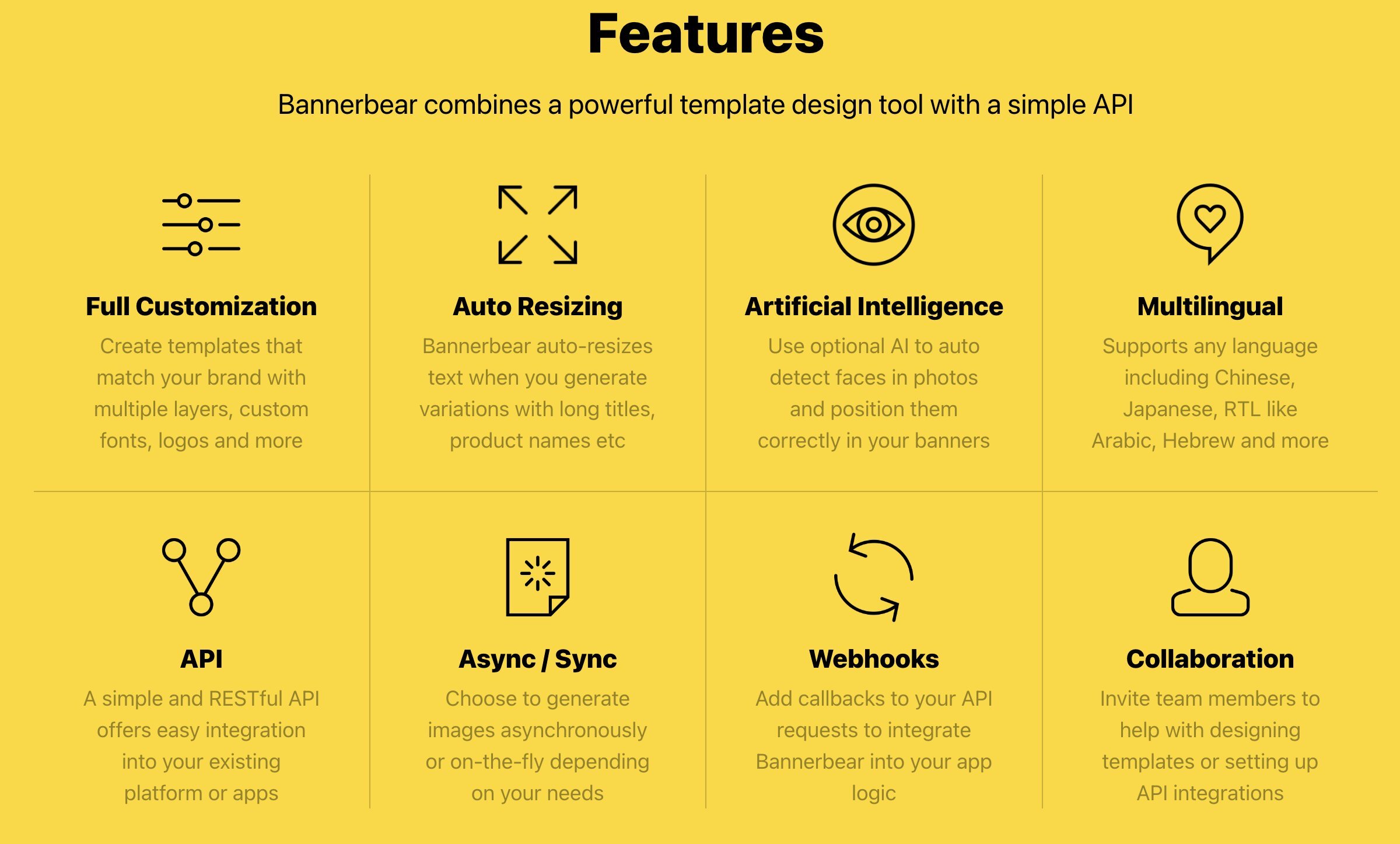
4) Illustration or Video:
You can put illustration of your application, your features (like figma).
You can also make a presentation video of your product, always in a conversion perspective, not a "how to use video": explain the features and try to convince your prospect as much as possible.
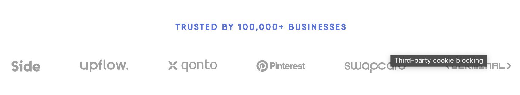
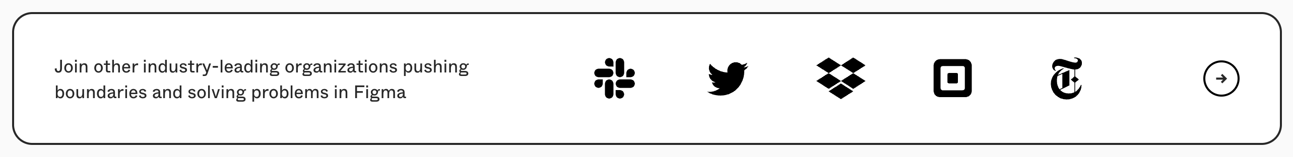
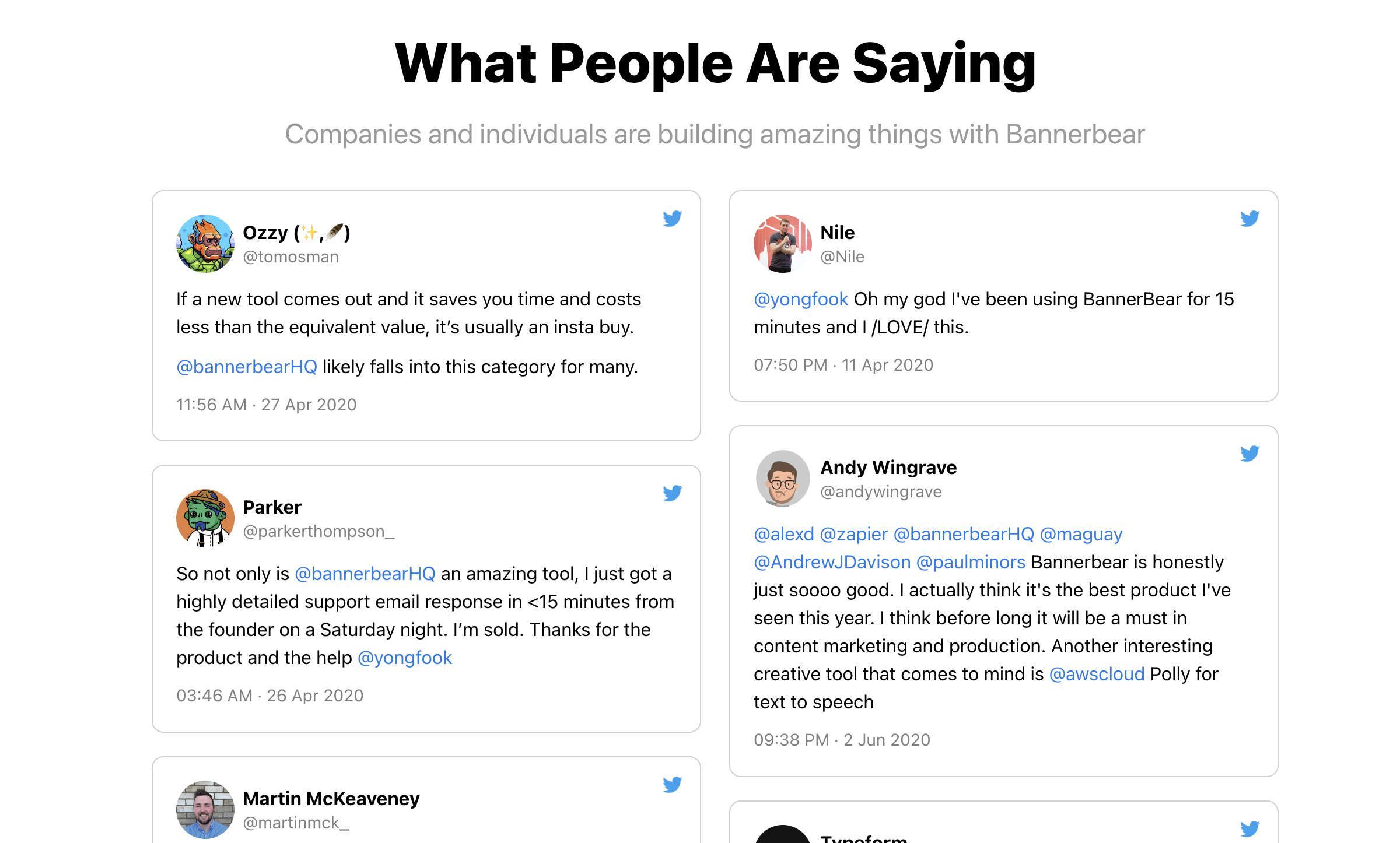
5) Add social proof:
It gives you instant credibility.
Several types of social proofs exist, it's up to you to make your choice according to your product.
Some examples👇

Bellow the fold
Let's start the second part.
Once you get the user's attention in the first section. Your goal now is to convert this user. The first thing you do below the first section is make concrete the value you promise above.
Take Figma for example.
The subtitle is:
"Figma connects everyone in the design process so teams can deliver better products, faster."
The first title bellow the fold is:
"Explore ideas together"
That's where it all comes together.
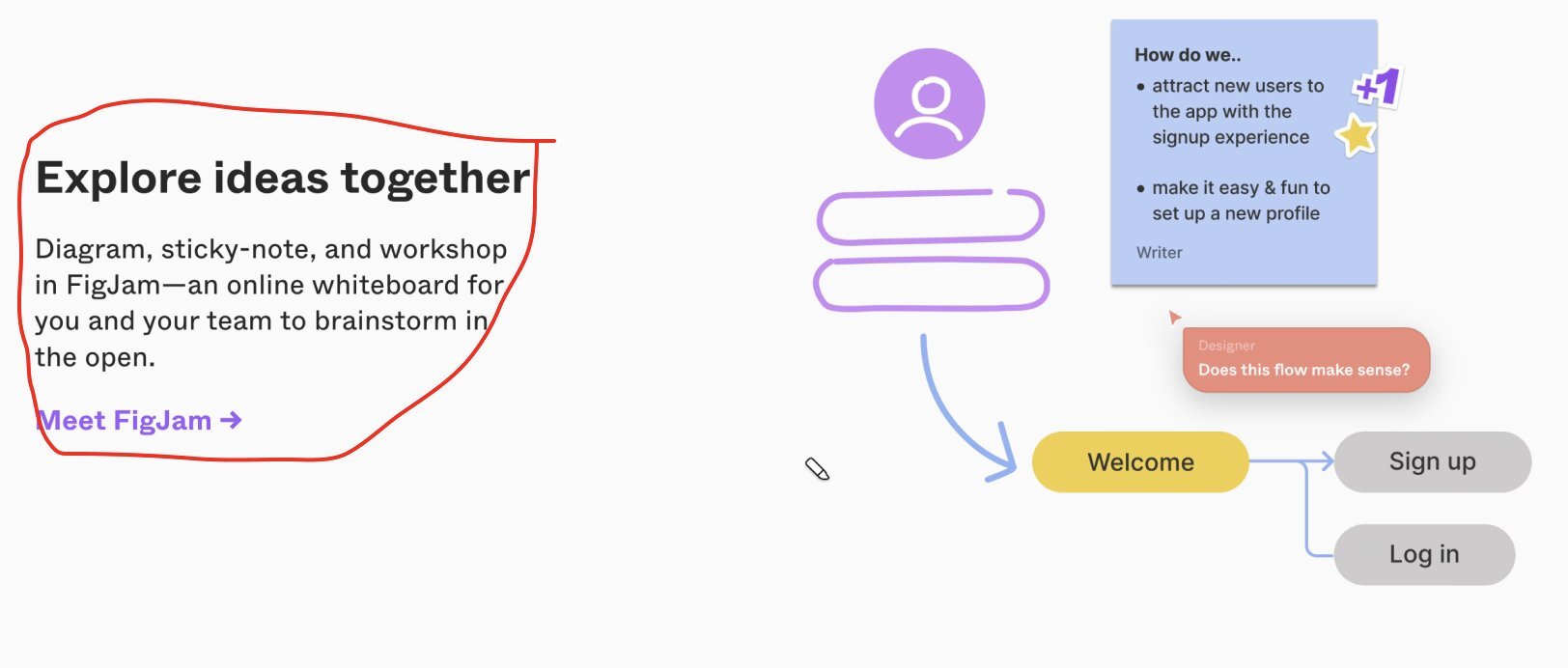
Present your features in this way in the following sections.
After that, you can make a less detailed description with the list of all your features, to let the customer know all the usefulness of your saas.
Example👇
Expand your social proof:
Add a section with more customer reviews. Use existing customers to "bring to life" the value you promise.
Example👇
At this stage your customer may still be reluctant to buy your product...This is where the FAQ comes in.
Put yourself in the customer's shoes and answer the most frequently asked questions.
You can also install a chat system so that your customers can ask you questions directly
Once you've done all that, it's time for the final call to action!
Remind your visitor why they should use your product. You can add a CTA button, a newsletter or a section to create an account with a title and a small description.
Quick tips to optimize your pricing page:
STOP the titles like this:
"Basic, Starter, Platium"
Change with what your offer proposes: For example:
"For hobbyist, For casual reader, For avid reader".
The customer will immediately be able to identify with a plan. You can also add a plan comparison table below. And don't forget to optimize your CTA buttons as I explained above.
Perfect, you are ready for the conversion!
You can implement these things very easily on no code tools for your MVP
Quick reminder: Don't neglect branding! In a testing phase it is not important, but when you will validate an improved MVP, you will see a clear difference on conversions.
Customer support is also very important. Install a chat bot and customer support on your landing and work on your FAQ. He will be confident and more likely to buy your product.
Wait wait...
If you liked this post don't hesitate to like, follow me here and on twitter: https://twitter.com/MrrRemi.
Thanks ❤️

Very nice article Remi. It will inspire me for the landing page of my SaaS.