Need feedback on justgreen.in
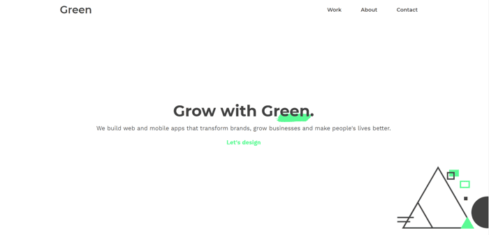
Need feedback on the redesigned site! justgreen.in and this time I am more focusing on a portfolio. As most people ask about my work and I have nothing to share.
Need feedback on the redesigned site! justgreen.in and this time I am more focusing on a portfolio. As most people ask about my work and I have nothing to share.

Add some real green color.
Looks really great! I like the design. I’m on mobile right now, and one thing that stuck out was how padded your work section is. To the point where I have to zoom in just to see what is going on.
I would probably reduce the padding on the left/right and link those images out to case studies if you have them.
Thanks. I will correct the padding and yes, I am working on the case studies and will keep adding them.
Thanks.
make the "w" in work capital. Also, i don't think showing work in a laptop didn't appeal to me plus the core part which the content size is reduced. Show the in box type with green border or something similar.
Sure I will fix that 'W' and your point is valid on screenshots of work. I will work on it.
Thanks for your time and feedback.
This comment was deleted 6 years ago
Thanks. I will experiment with fonts and button design.
This comment was deleted 4 years ago