Need feedback on the new layout
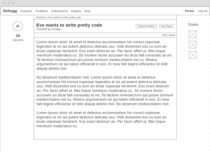
In Debugg, a Problem is the most crucial part of the content. Since it is a platform, users won't sign up unless there are Problems that they find interesting and challenging enough.
While the contents of the Problem are definitely crucial, I think the current layout doesn't utilise the space right. So, the wireframe is what I've come up with for the redesign (just ignore the navbar in it).
What are your opinions on it? Are there any issues I need to take into account. I'm all ears (eyes?)

I think you are on the right path. looking at the current site, the content on the learning problem statement pages are spread out and my eyes feel overwhelmed. The wireframe is more compact which is better for reading the content. The right rail content can be cleaned a bit as well - maybe more separation between 'How to solve the problem' steps and the newsletter sign up. Also, the steps seem to take up too much vertical spacing and the list can be moved out horizontally to vertically align with the header.
Yeah you're definitely right. I'm not proud of the right rail either