Need help to review my new landing page💡
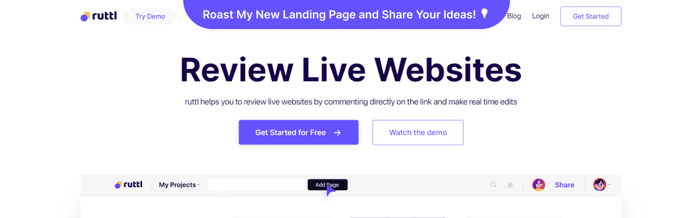
Hey guys, I'm finally launching my product this week and am ready to share the final landing page design of my website with you guys!
https://ruttl.netlify.app/
To give you guys a background, here's the older version I was using to get waitlisted users for ruttl - https://ruttl.com/
Here are bunch of things that I've worked on and improved for the past 2 months -
- Made the content a lot simpler to understand
- Improved the footer design to include important page pointers
- Added targeted content for user personas like designers and developers
- Created new illustrations for the website
- Improved the overall mapping between different elements
- Changed the blog page look and feel
- Added details to the feature page
- Used more product interaction videos in certain parts of the page
Am I missing any thing crucial that can help the visitors?
I wanna make sure that everything is perfectly ready for the launch and I need your help! Can you please review my website and share your thoughts?
I'm open to new ideas for the landing page as well, so make sure to comment them down below! 👇
Thanks for your help!
Harsh 🙌

Hi! I really like the color theme, there is enough space between sections. About the homepage, I just think that your H1 titles are too big, I would reduce them and lower the bold.
About feature page, I'm not fan of the illustrations overlapping the purple header. I would reduce the header height and put the illustrations below. Other than that it's a great website, congratulations!
It really seems like you spend hundred of hours on this page. Looks very nice. One weird spot is the "Try the free demo" next to the logo. Thats not where I would expect it to be.
Usually when you click on the logo you want to go back to the homepage. Having the demo cta next to it... Thats unusual. Does it work? Do people click on it?
The purpose is to differentiate it from the rest of the pages considering it could be my go-to-product page
Really nice landing page. I didn't see anything bad in there. I'm not a big fan of animations when you scroll down, it's distracting for me and I just want to scroll more to see all of them without looking at the content. But maybe it's just me :D
Thanks for the suggestion. I am also in favour of removing those animation in coming weeks
Looks appealing, how is this different from usepastel.com I'm wondering?
Usepastel is a very close competitor of ruttl however it is only limited with comment feature but in ruttl you can also inspect each element and change the values in order to give precise feedback
It looks really impressive. I love the color combination and the simplistic design.
I think that website is awesome. Really impressive! Just two things: