Need some feedback on a job board design
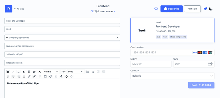
Hi everyone! I am working on the Job Post Composer for https://remotefrontendjobs.com and https://remotebackendjobs.com and wanted to share with you some early version of it.
I think I am gathering most of the information I need already, but I am wondering if all fields makes sense to you without labels on (I am using placeholders, which are not visible once the inputs are filled in)
Also, I don't think I am sold on the preview of the ad, because you don't really see a preview of the ad description right away, but just one for the main details.
Please share anything you got, this will probably be live in the next coming days (once I finish the Stripe integration :D)
Thanks!

Angel how's it going? Love what you are after! I did have a few thoughts I wanted to share.
I think you should for sure have labels on the fields. While it looks more minimal, when a user clicks into your labels, it is very likely they will forget what they are supposed to type. So then they have to click back out to see the placeholder, then click back in. Not a great user experience.
I like the idea of the preview, but I agree with you. I can't tell immediately that is the preview. I think labeling it as "Preview" could be a decent strategy and provide more value.
Lastly, I would probably give a smaller max-width to this container. Making it too wide is taking away from some of the visual design, and making the fields gigantic. Big fields make it harder for a user to know what goes in there.
Wow, thanks for the feedback! I completely agree with everything you said and will incorporate it back into the design :) Will comment on here when it's live so you can see the product of your feedback. Thanks again!
Happy to help Angel! Best of luck!
Hey @alpinerob. I've implemented some changes related to your feedback. Also, the feature is now live @ https://remotefrontendjobs.com/ad-composer
Thanks so much! It looks much better now!
WAY BETTER!!! Looks awesome @anikolov! Happy to help!