Need some feedback on my Indie Hackers mobile app icon
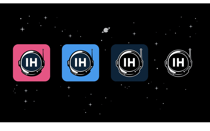
The app is called Moon. Its an Indie Hackers mobile client inspired by Octal for Hacker News and Apollo for Reddit.
Inspiration for the name and new icon came from the IH Astroshipper design.
The struggle I'm having with designing an icon/logo for Moon is how to effectively incorporate the IH logo without just ripping it off.
Thanks!!

I like the bright blue one! Followed by the dark blue one.
The IH logo is super plain, unfortunately, so it's hard to iterate on. Don't worry about it!
Good to hear! Thanks Courtland!
It's a fantastic design. Really like it @levidxyz
Thanks Felix!
For me it would be number 4 (black) then nr 1 (pink)
Thanks for the input
3rd
Thanks
1st
Thanks!
I'm a fan of the 3rd (dark blue). I like the white outline around the helmet.
They're all great though
Thanks Brandon!
I'm really liking the 3rd.
Thanks Yaro 🙏
This comment was deleted 6 years ago
Thanks Steven! You can download and try the app now if you want! Just join the beta at https://themoon.app
This comment was deleted 6 years ago