New Landing Page - Feedback for B2C Fintech please!
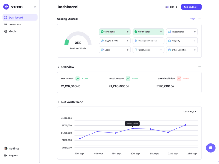
https://www.strabo.app
Hey! We've just launched our new landing page, designed to collect signups for a consumer fintech - stuck on a couple of thousand atm. Feedback welcome please!
Strabo is a platform for users to track, manage and forecast their assets across all assets, all over the globe.

It looks good, it's very simple and clean. 👏
My two cents:
P.S. If you need help with design, check out our design on demand service Panotive.com ✌️
Thank you! V useful, particularly the points on pricing
Looks very professional. My main critique is that it's very text heavy. For someone that's not in the financial space, I understood what your product was from the fantastic strapline "A customisable investment dashboard to manage your assets around the world" :clap emoji ;)
Scrolling down I was like fuk I can't be bothered to read all of that text so I scrolled straight past the main section and saw the press and reviews section and was like fuk again but because I was impressed. I feel this section should either be hoisted to the top. Or reduce the text explaining the feature set a little bit to just one-liners.
Thanks v much! It's only text heavy for SEO, but point taken I think it might be a good idea to try and slim the features sections down.
Your kind words and feedback are much appreciated
Hi,
The initial first impression the landing page gives is a little sterile, and lacking in “reasons to buy”.
After scrolling below the fold, there are many descriptions of the “Features and How”, but not many of the “Benefits and Why”. I’d try to add a couple of very compelling “Why this is great for you” type messages.
I think it will be fairly straightforward for you to add some human interest without diluting your message. Above the fold on the home page, I’d be inclined to feature more human aspects: case studies, testimonials, benefits, and happy customer faces. See the smiling faces on the home page of this well-known large financial institution for an idea of what I’m describing:
https://www.standardlife.co.uk/
Hope this helps.
Good idea, thanks for the suggestion. Benefits, why and a bit more personality should help improve our CTR
Cool product. I might have caught the website mid-update. I’m opening it on mobile and some elements are a little off but it’s clean, modern - looks good.
My main thoughts are: it doesn’t explain it’s free to use. I like the tweets, maybe they could be put higher (but would need to be a little smaller, more condensed). Autoplaying video showing usage would be nice. One reason I’m put off using the service is the time I think it might take to setup :)
Boring observations from mobile user:
Good luck!
it looks good. use more white space, be aware of margins and please please change the font for the email sign up bar. haha. but good job overall.