New landing page for Folum
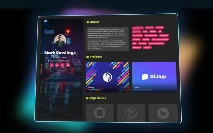
https://www.folum.me
I recently launched folum.me and I could use some landing page feedback!
Thanks
Guillo
I recently launched folum.me and I could use some landing page feedback!
Thanks
Guillo

Hey Guillo, checked out folum.me. The concept is solid — resume-to-website in seconds is a clear value prop. Here's what I'd sharpen.
Your headline "A free web resume that reflects your potential" leads with "free." That positions Folum as a commodity before you've established value. "Turn your resume into a professional website in seconds" (your current subheading) is a much stronger lead — that's the transformation people want. I know others have flagged this too, which tells you it's a real issue.
You have demo profiles for Product Managers, Data Analysts, Marketing Strategists, and Software Engineers. That's smart audience segmentation. But they're buried in the footer. These should be prominently placed right after the hero — "See it in action" with visual cards for each role. Letting people see a finished example for their specific job title is the fastest path to conversion.
The feature list reads like documentation, not marketing. "Drag-and-drop blocks: roles, projects, achievements, skills, links and more" — that's a spec sheet. Show me a 5-second GIF of someone dragging a block. The before/after of "resume PDF to polished website" is your strongest visual story and you're telling it in bullet points instead of showing it.
"Ready in minutes" with the 3 steps is the right structure but needs visuals for each step. Three numbered steps with screenshots converts dramatically better than three steps with text.
One thing I noticed — the footer has Travellar app store links and social media handles that appear to be from another project. If that's leftover template code, clean it up immediately. Nothing kills credibility faster than visible template artifacts.
"Shareable URL or your custom domain" is a premium feature buried in a list. Custom domains should be highlighted as a paid tier upgrade. Speaking of which — pricing exists but isn't visible from the homepage. A comparison table removes friction.
Biggest win: replace bullet-point features with a visual before/after showing a resume transforming into a live site. That's your entire pitch in one image.
I do full prioritized teardowns as a service — search "Aiden Vale Roast My Landing Page" on Gumroad. Would love your thoughts on whether this lands.
Thank you for the great feedback!
Hi Guillo, this is a great product and I would love to try it out. I can easily see the value, but it would be helpful to have testimonials there as trust enhancers.
Also, I think "Turn your resume into a professional website in seconds - for free" fits more as the headline. It is clear and immediately communicates your value and should be in the most important spot, which is the headline.
P.s. I just read through the other comment and saw that the same points were raised, but I think it helps to hear it from multiple sources.
Thanks for the feedback, Faridat! I'll have testimonials into account when looking at the roadmap 🙏
Happy it helped and good luck.
Overall I think you did a really nice job on the page. It looks great. It's clean and well organized. The CTAs have good contrast.
I think having the live demo a helpful feature. It adds a bit of interactivity, which is good for engagement, and it really helps people understand what they're getting.
I'm not a fan of all reversed out text over a dark background, because it's harder to read, but since all the text is brief chunks, it may be OK. Perhaps you could test black text with a lighter background in the blocks where the font is smaller.
The biggest area for improvement I see is the headline. It's kind of vague and doesn't provide a clear enough benefit for differentiator. I would use something similar to the first bullet point you have in the hero section "Turn your resume or website into a professional website in seconds"
Some other, smaller things to consider:
Best of luck.
Hi Sean, thank you for taking the time to put this together. It is great constructive feedback!! I'll make some adjustments.
Cheers,
Guillo
Glad it was helpful.
Hi,
I’m specialized in CRO (Conversion Rate Optimization), which is the art of improving conversions on the web.
Right now, I’m offering completely free support for landing pages. Basically, I’ll audit your landing page and give you clear recommendations, both short- and long-term, to help boost your conversions, all based on research and proven methods.
I provide this service for free under these conditions:
Feel free to reach out if you’d like my help, or if you know someone who might benefit from it. Thanks for your time, and have a great day.
You can contact me at: tom.haug67@gmail.c o m
You need to go back to the drawing board. Not trying to be harsh, but this is just bad. Why would you build a new portfolio builder that looks worst than all the other builders out there? that makes no sense. who are you even targeting? whats you unique use case?
Since Folum looks like a portfolio builder, I think the hero needs one clear line that says who it is for and what the win is. Maybe try: "Create a standout portfolio in minutes. Ship your work, get hired." The sub-line can mention templates, custom domains, and an example link. It can help to show one real portfolio above the fold with a short caption like "built with Folum" so visitors understand in one glance. I would keep one call to action only in the hero and repeat it after the features.
Next, ship a speed pass. Large glow effects and PNGs often slow first paint. Swap heavy images to WebP, lazy-load below-the-fold visuals, and cap hero artwork to ~200–300 KB. Check LCP, CLS, and TBT on mobile since that is where most traffic lands.
You could also hire a web design agency to do all that. I hired WebXpress for a quick audit on a similar page and they trimmed scripts, staged updates, and the first paint felt snappy without changing the look. Fast pages make the demo button feel brave instead of risky.
Hi, as someone said "Turn your resume into a professional website in seconds" fits much better for a headline.
Thank you for your deep feedback! I think I can make a lot of improvements with it. Very much appreciated