Obserf 0.3
The review inbox got a real redesign
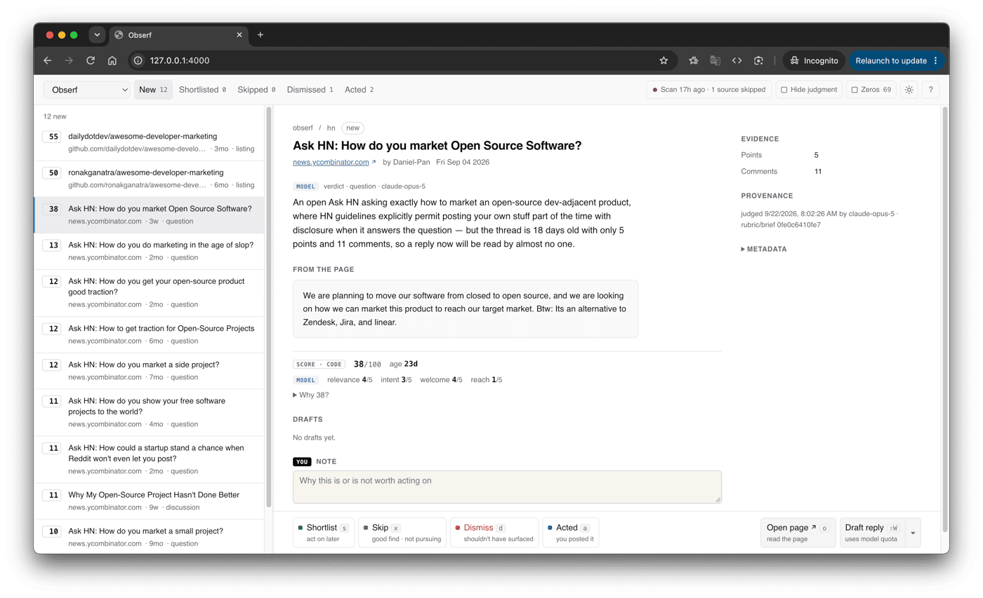
Quick follow-up to last week's post. Turns out the part of Obserf I use most isn't the scanning, it's sitting down with 30 findings and deciding what's worth a reply. That inbox was a pile of buttons, so 0.3 is mostly a redesign of it.
What changed:
- Each finding shows the model's verdict first, then the actual page text, then the score. "Why 55?" shows the math, because a number without its reasoning is just vibes with a decimal point.
- Everything has a keyboard shortcut. Press ? to see them all. I can get through a queue without touching the mouse now.
- Undo sits right where you made the decision, because d is one key away from s.
- If a scan finishes while you're reviewing, you get a "refresh?" banner instead of the list reshuffling under your cursor.
- Scores are plain numbers now. The green/amber colours implied a precision the ranking hasn't earned yet.
Still never posts anything. Still local, still free, still just Bun + Claude Code.
Upgrade: bun add @obserf/cli@0.3.0
New: bunx @obserf/cli init ~/dev/marketing
Honest question for anyone who's tried it: does the ranking hold up on your projects, or does the top 10 still need a lot of squinting?

-
2Have early users shown that the revised ranking consistently surfaces the findings they actually choose to act on, or is the main improvement still the review workflow?3 hours ago Reply

-
1No, the ranking itself didn't change in v0.3. score() returns the same numbers; I only added a function that shows the math behind a score. This release is all review workflow. The groundwork for checking the ranking went in with 0.2. Each scan freezes its top 10, and I mark each finding as shortlisted, skipped ("good, not for me") or dismissed ("shouldn't have shown me this", with a reason). My bar is 5/10 worth a look and nothing embarrassing in the top 3. Honestly, so far that's mostly my own projects, so I can't call it consistent yet. Part of why I redid the inbox was to make labelling fast enough that I'd keep doing it. If you try it, your dismissal reasons would help me more than anything else.3 hours ago Reply

-
2Could be useful to compare notes once you have more of those labels from other users — happy to continue by email sometime.2 hours ago Reply
-
-