Please roast my idea and landing page
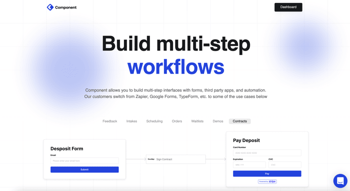
Hey guys,
I recently launched Component, which is a no-code visual workflow builder that lets you create forms and connect them with other useful applications, like DocuSign for contracts, Stripe for payment, Hubspot for marketing, and so forth.
Would love to get feedback on (1) whether the idea and landing page copy is clear, (2) whether you've used Google Forms, Qualtrics, x in the past and what you liked/didn't like about it, (3) whether you could use Component for any of your business workflows.
Feel free to check it out here: https://www.usecomponent.com/
Thanks a lot!
Inspired by https://www.indiehackers.com/post/please-roast-my-idea-and-landing-page-d8ad87259f

Headline needs to state the benefit. For example... "build multistep workflows" doesn't tell me anything. As most ppl skim headlines and sales pages, put the reason why they should care into the headline.
Here's my site as an example, it does well at getting folks to sign-up because the value proposition is crystal clear.
Just updated my headline and would love to hear what you think -> https://usecomponent.com. Does it make sense and do you think the benefit is now stated?
I like it!
Good point -- I'll change that sometime today. I've been debating between leaning more on forms or leaning more on workflow automation. Depends on what early customers see more helpful. Any thoughts on your own needs in this domain?
Here's my take on your landing page:
I hope this adds value.
Regards,
Suresh.tech
This is super helpful! Thank you :) Am pushing a landing page update today and will get some of these items in! Any thoughts on if you thought the product spoke to any of your needs?
Not sure if it's done on purpose but the "Login" link disappears on mobile which seems odd to me, and the page could definitely benefit from some animations or example gifs/videos as a couple people have already said
Overall it seems interesting, would love to see some examples of the Customization options and maybe a completed example of it embedded in a website
Adding an example right away and will fix the login -- thank you! Both great points. Here's one that I used during out beta period: https://www.usecomponent.com/request-access. If you don't mind me asking, did a use case come to mind when you first checked it out?
Thanks for the link! Just as a note, I did get a 400 request when I tried to submit the first step - https://imgur.com/a/F0WNOh2
When I first had a look I saw it being pretty useful in my own SaaS project subscription system, especially the "orders" workflow demo as dealing with customer/order flows is a pain for e personally
Oh woah -- so sorry about that and thank you for the screenshot. Just updated it -- turns out I had revoked my own Slack access : ' ). If you refresh the page it should be working :)
Ahaha no worries at all, happens to everyone
I'll have another go!
Instead of using images in the "Drag and Drop" section and "Get started for free" use gifs or videos. You are trying to sell how easy it is to drag and drop, and still pictures are not showing that.
Good catch -- I'll update it to a gif!! Thank you :)