Home
Starting Up
Case Studies DB
Products
Ideas DB
Vibe Coding Tools
Subscribe to IH+
Starting Up
Case Studies
Ideas DB
Products DB
Sign in
Join
4
Likes
9
Comments
Please roast my landing page!
by
Esteban Saa
Please roast my landing page!
https://www.simpletasking.com
The rocket flies up when you sign up.
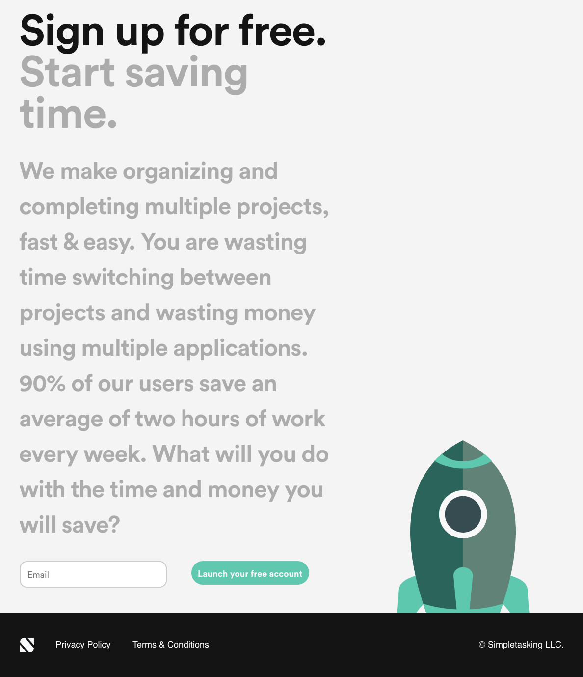

Hey @steban Love the simplicity and bold text!
2 things I'd improve. Include a call-to-action earlier and make the supporting description slightly shortly to facilitate how people read.
I bet you saw my recent landing page on Notion, keen to hear your feedback too :)
Break up the copy into paragraphs
The zooming animation makes the text too big to read.
Other than that, the landing pages looks clean and I get what your MVP is proposing.
Got it! Did you notice the launch rocket animation on sign up?
No, not that I recalled.
I was looking at your website from my desktop
Ok, it seems I need to get more attention to that call to action. Will add an animation.
Maybe because your text is too big and too much which distracts initial users from seeing the CTA?
For practicality and usability, maybe keep KISS (keep it simple, stupid) in mind? Readers have short attention span, if something doesn't keep their interest, they will leave.
My two cents on it.
It is a good call to reduce the text. You may have noticed the design is actually very simplistic, yet still, attention is so limited that I need to further simplify. The design works great on mobile but bigger screens make the text awfully big. Thank you!
Glad to help