Production-Ready ShadCN Tabs Components to Copy
Key Takeaways
12+ production-ready Shadcn Tabs built on React, Next.js, Tailwind CSS, and Framer Motion.
Some tabs are free and support both Radix and Base UI primitives.
Install any tab with a single CLI command using pnpm, npm, yarn, or bun.
The code copies directly into your project: no black-box packages, no hidden dependencies.
Several tabs include a copy prompt functionality you can paste into V0, Lovable, or Bolt.
Each entry below includes real use cases and a clear “Best for” line.
Why do most tab examples break in production?
A ticket lands for a tabbed settings page. Before you know it, you are deep in keyboard navigation, focus trapping, active indicator timing, and Framer Motion config all for something that looked like two hours on the board but ends up closer to a full day.
Most tab examples stop at a basic two-panel switch. No real accessibility, no smooth animation, and no production-tested layout behavior. That works fine for a demo but falls apart fast when you need icon triggers, badge counts, a vertical layout, or an animated indicator that does not cause layout shift once the app goes live.
Every tab on this list runs on React, Next.js, Tailwind CSS, and Framer Motion. Some are free. Each one supports Radix or Base UI primitives, so keyboard handling and ARIA roles come built in. You pick a tab, run one CLI command, and the code lands directly in your project.
What is a Shadcn Tab?
A Shadcn Tab is a tab component built on the shadcn model: the CLI copies readable source files into your project instead of hiding them inside an NPM package. You own the code outright: rename props, adjust Tailwind classes, refactor logic without worrying about breaking upstream dependencies.
Under the hood, each tab uses Radix or Base UI primitives for state, focus management, and ARIA roles. Keyboard navigation and screen reader support come baked in. You spend your time on the parts that actually need your attention: styling, layout, and behavior. The official shadcn/ui Tabs documentation covers the base API if you want to go deeper.
Tabs Anatomy (Composition)
Use the following composition to build a tab:
Tabs
├── TabsList
│ ├── TabsTrigger
│ └── TabsTrigger
├── TabsContent
└── TabsContent
Tabs Holds the state. TabsList wraps the clickable triggers. Each TabsTrigger maps to one TabsContent panel. Match the value on each trigger to its content block, and the switching logic handles itself.
Best Shadcn Tabs Components and Examples
We handpicked these Shadcn Tabs components and examples based on real-world usability, accessibility, animation quality, developer experience, and production-ready performance.
Animated Tab
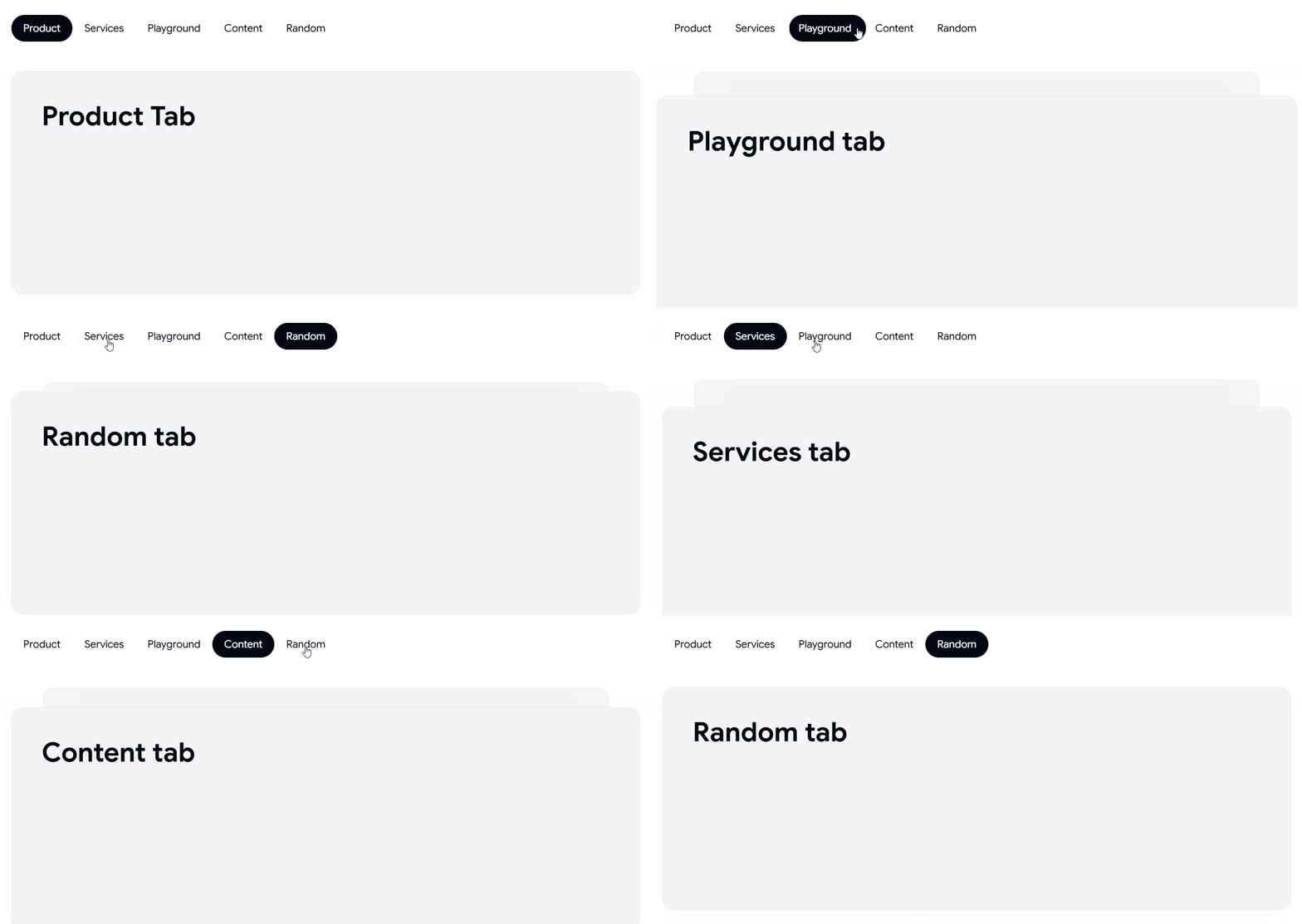
This tab uses a Framer Motion indicator that slides under the active trigger as you switch views, so the transition reads as one continuous motion rather than a hard cut. State sits on Radix primitives, which keeps keyboard arrows and focus order intact without any extra wiring. You retheme the indicator with a single Tailwind class, and panel content swaps without causing layout shift.
Use cases:
Analytics dashboards with multiple metric views
Product settings split across profile, billing, and team
Reporting screens toggling daily, weekly, and monthly data
Feature comparison panels on a pricing page
Multi-step review flows before a final submit
Best for: SaaS dashboards needing smooth, accessible metric view switching.
👉 Read the full Article Here → https://wrappixel.com/blog/shadcn-tabs

