Professional Logo Design in Santa Clara: Why Simple Logos Build Stronger Brands
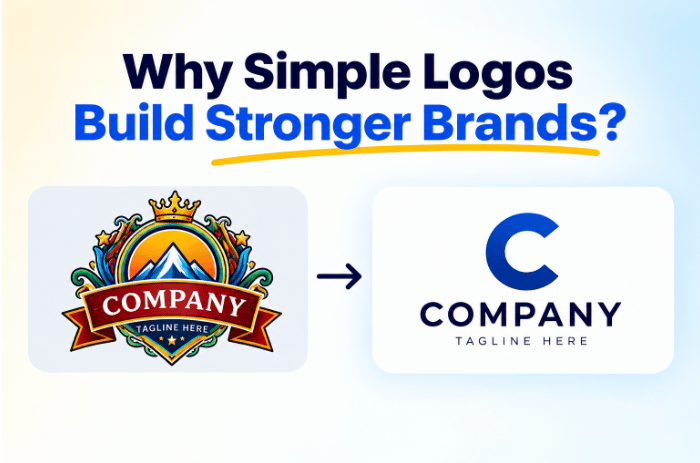
I’ve designed enough logos to know that the loudest design in the room isn’t always the best one. In fact, some of my favorite pieces of work are the ones clients barely mention after launch. They simply use them, again and again.
This might sound strange. You’re investing in branding and logo design in Santa Clara, so shouldn’t people notice every clever detail? Not necessarily. Sometimes, the real victory is when your logo, icon, colors, and typography become so familiar that your customer recognizes you without thinking why.
Good Design Should Feel Effortless
Think about the icons you use every day. You probably don’t study the shape of a search icon before clicking it. You don’t pause to admire a familiar app symbol. You simply know what it means.
That’s the sweet spot.
Apple’s current Human Interface Guidelines make a similar point. Effective icons should communicate a single concept quickly, use simplified shapes, and remain recognizable at different sizes.
As a graphic designer, I’ve learned that this simplicity is harder than it looks. Anyone can add another color, shadow, line, or clever detail. Knowing what to remove takes judgment.
The Tiny Details Are Doing the Heavy Lifting
Here’s where things get interesting for you as a business owner.
A good logo isn’t just a pretty symbol sitting on your website. It has a job to do across dozens of situations. Your logo might appear on a business card in the morning, a social post at lunch, a presentation in the afternoon, and a tiny browser tab by evening.
The design has to survive all of them. That’s why branding and graphic design services in Santa Clara should consider the entire visual system, not just the logo itself.
When Recognition Matters More Than Attention
There’s a useful difference between being noticed and being recognized. Being noticed gets someone to look. Being recognized gets them to remember.
This distinction matters when you’re building a business. Your customer may not consciously think, “Nice use of negative space.” They may simply see your packaging and know it belongs to you, which is the primary goal.
I recently came across a Medium piece about looking more closely at Apple’s icons and the tiny decisions hidden inside them. I liked the premise because it highlights something designers often forget: details can be incredibly important without becoming the main event.
What Good Logo Design Does Quietly
What you see
What the design is actually doing
Simple shape
Making recognition easier
Consistent colors
Building visual memory
Clear typography
Keeping communication readable
Balanced spacing
Creating visual comfort
Scalable icon
Working across different sizes
Consistent style
Connecting every brand touchpoint
None of these jobs need to shout.
In fact, if your customer is struggling to understand what your logo means, the design may be working too hard.
Why Does Your Logo Need a Bigger System?
This is also why I’m wary when someone treats logo design as a one-and-done project.
Your logo needs to have friends. Your colors, typefaces, photography, icons, layouts, packaging, presentations, social graphics, and other visual assets should feel like they belong to the same family.
This broader thinking is part of what a full-service creative agency in Santa Clara can bring to a brand. Copa Design, for example, describes graphic design as part of a brand’s wider visual identity rather than an isolated piece of artwork.
So, Should Your Logo Stand Out?
Absolutely. But it should stand out for the right reason.
You don’t need a logo that screams, “LOOK AT ME!” You need one that makes your customers quietly say, “Yep, that’s them.”
This becomes especially important when your business produces content constantly. Everything, from ads to digital assets and brochures to packaging, needs to look connected.
For businesses with ongoing design needs, the best subscription graphic design services in Santa Clara can make that consistency easier to maintain. This is possible because design becomes an ongoing process rather than a series of disconnected projects.
After years behind the screen, that’s one lesson I keep coming back to: the best logo design doesn’t always demand attention. Sometimes, it earns recognition so naturally that you never think about the design at all.
FAQs
What makes a logo memorable without being overly complicated?
A memorable logo doesn’t need lots of details. Simple shapes, clear typography, distinctive elements, and consistent use can make a brand easier to recognize. The best designs often feel effortless because customers remember the visual identity without consciously analyzing every design choice.
How do I know if my logo will work at different sizes?
To ensure a logo scales properly across all formats:
Preview the design across actual placements—favicons, social profile badges, business cards, packaging, and large signage.
Shrink the icon to 16x16 pixels. If key details blur or disappear, simplify the shape.
Verify that typography remains readable at small sizes without letters merging.
Design simplified secondary marks or sub-marks for small spaces while keeping the full logo for larger formats.
How can ongoing graphic design support a consistent logo and brand identity?
If your business needs regular marketing graphics, an ongoing design service can make the process more consistent. For example, Copa Design offers graphic design support covering both digital and printed visual materials, while its subscription model provides businesses with ongoing access to design expertise.

