Re-designed dashboard & reactions for feed entries!
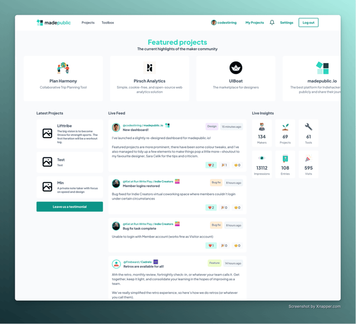
I've redesigned the dashboard for madepublic.io and released the new reactions functionality! This means users can now respond to feed entries with 3 set emojis: love, celebrate and confusion.
I wanted to pilot reactions before implementing a full commenting system to see how people like it.
Would love some feedback!

I just did a bunch of deploys so that could have been why - can you refresh and tell me if it's better now?
Thanks!
Yeah this is now my landing page also, I will likely put in an about page - what do you think I can do differently to make it clearer?
Bug is still there, I am afraid. I get a loading bar on top and a spinning cursor but I still never get to see any Featured Projects :(
Apart from that, what you could experiment with is a big tagline that just says what your site does, or better, what is does for me as a visitor
Odd, I'll see what I can do
@chrisgreg it looks slick!
I agree with @blackbrokkoli that adding a 'Hero section' tagline with a punchy value proposition for not-logged-in visitors could help with clarity and even conversions.
There is a marketing block that appears if you're not logged in to the left side of the homepage - is this not enough? Or do you think more is needed?
Ah, nice! It's great. That's totally enough I think, it just doesn't appear on mobile
Ahh good point! I'll find a way to make it work on mobile!
This looks similar to getmakerlog
Eh, I guess but that's because it's a feed with columns on the side? By that logic it looks similar to facebook? Haha
Noice! Some initial feedback:
I like the choice of reaction emojis and how they're displayed in the feed. Showing all three regardless of their count makes it instantly clear they're the only three options, and that it's a simple click to react to a post.
To me, the UI suggests my reaction will be automatically 'toggled' to the most recent emoji I've clicked for a post, but it actually requires me to deselect my current reaction in order to select a different one (eg. If I clicked the wrong one by accident). This behaviour is consistently reproducible from both my homepage feed and my project page feed on Safari, iOS 15.6.1. This might be desired behaviour, just pointing out that it differs to my personal expectations based on how it's presented in the UI 😊
That is desired but maybe your way sounds easier! I'll look into it, thanks!