Receive business & first class flight deals in your mailbox - Roast my landing page
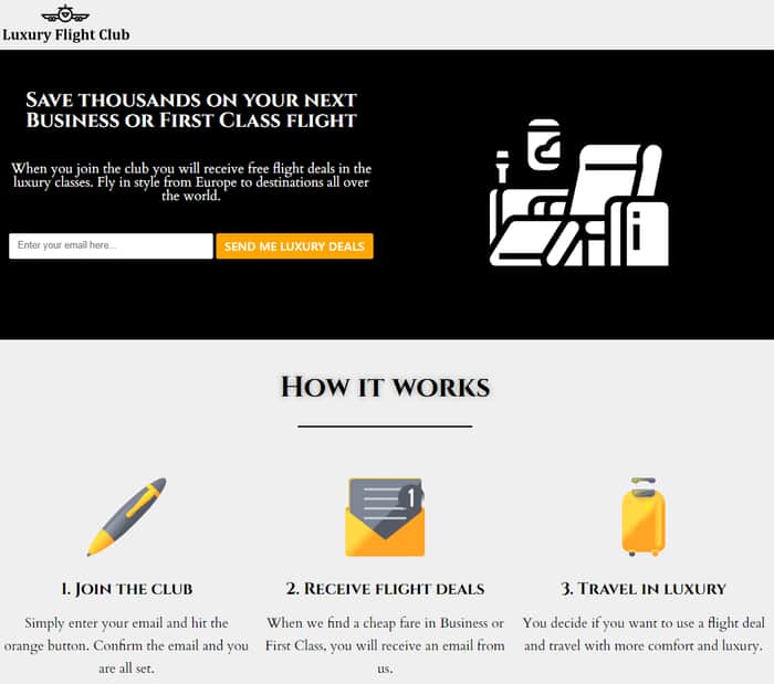
Hi, first of all thank you Indie Hackers for all the tips and inspiration. Maybe you recognize some things I used in my design and copy ;)
For some time time now I have been posting cheap business and first class fares on a couple of frequent flyer fora. Dozens of people have booked these flights so I think I bring some value to the table. That's why I started this newsletter.
It would be awesome if you could take a look at the landingpage and tell me what you dislike or what I could improve:
Cheers,

I can't feel the luxury in the sense of design. Maybe it's me. I haven't felt any luxury in my whole life.
Wow, I roasted myself.
Hahaha thanks!
You're probably right, it's one of the things I'm struggling with. I tried to implement some sense of 'luxury' by using black/silver colors.
Any ideas how I could improve the luxury feeling?
Man, I suck at design. But I'm sure there are tons of blog posts and how-to videos about it.
I'm sure you can do it in a day or two.
Yeah I did some searching but I wasn't that inspired from what I've found.
Thanks tho :)
Maybe look at Jewellers and/or perfume sites? Or just pay a designer for some sketches..
Yeah will do.
If it does get any traction I probably will talk with some designers.
Love the concept, and the messaging is pretty clear.
My main gripes are the font used throughout the page text - I just don't like the serif font chosen. The buttons with sans serif text are far easier on my eye. I would probably choose a nice sans serif type face and use that - especially for the headings.
Note: I think that font you chose works fine within the graphics of the cities etc., just not on main text - it made my eyes just want to skip over blocks of text.
Also, I think solid black for the text is too dark. Try using a shade of dark grey or something, which to me is more sophisticated.
The header picture of the business class seat takes a while to identify, and it looks a little out of place. I think an actual picture of a passenger in a luxury business seat looking out the window or something would work better and be more appealing.
But overall, I love the concept and hope you do well with this.
Thanks man!
Your feedback makes sense and I will try a couple of things out :)
To get a feel that is more luxurious, I would have a good look at and reference
Luxury brands (start looking through LMVH brands) and see what they do. They don't generally have the best landing pages or UX, but good starting point for style at least.
Fashion brands. People who consider flying business / first generally have a bit more cash (though still deal hungry) and so I'd reference some fashion brands too. A quick look in the fashion section of awwwards shows up a lot of modernist design, sans serif type, excellent quality full bleed imagery, etc. https://www.awwwards.com/websites/fashion/
Private jet membership sites, jet manufacturers, yacht brokers, etc
Imagery, stock is passable/fine if you know what you're looking for, so try and figure out a theme and avoid any cheese or cliche with photography. Suggested photography I'd start looking out for with Luxury Flight Club would be "looking down from 30,000ft" you'd probably get some incredible shots of earth. Or find a really awesome airplane photographer and ask if you can use their photo.
Thanks this is awesome!
Haven't even thought about checking out private jet websites.
I really like the concept! I would change the orange colors to a shade of gold and tone down the black to a dark grey/slate color which should give off a more luxury feel.
Maybe reduce "How It Works" into just one line text of each step.
Perhaps have your best "Recent Deals" as a slider.
Also look at websites that you consider luxury with a nice design that you like for high level inspiration. A lot of them (the ones I've looked at) have common themes such as large images and minimal text.
Good luck with it, I think you are on to something good here.
Thanks man!
I did look for large luxury/first class free stock photos and videos but couldn't really find something good. Maybe I should spend some money on a couple of good stock photos and videos.
Personally, I would either only have one big "Recent Deals" section and those six deals in there, or rename/reword the second "Recent Deals" section so that it doesn't look like a quick copy-paste from the first section. Hope that makes sense.
It does make sense yeah, thanks!
Maybe use no black background on images and use a lighter shade like the rest of site. Use some free illustrations. Arrange it a bit and maybe remove the subscribe box from everywhere and keep it at top and at bottom.
I was thinking that I maybe put to much subcribe boxes on the page. Thanks!
From which country is it? Only hint is the Euro.
Like most of the design, not so much the laguge image.
Also half expecting past deals to be clickable/have more details.
Thank you for your honesty!
The flights depart from all of Europe (for now). Most premium class flyers don't care if they have to 'position' themselves for a long-haul flight.
Do you mean the 'big white chair' icon? I'm not proud of it either and will probably change this in the future.
I have thought about showing some more details/screenshots of past deals. But I haven't figured out 'how' I would do this with WordPress/Elementor.
Oh, it's a chair...
I'm surley not the target audience, but like the "deal'" is just a place and two numbers, for me it's the spammist lie ever, just missing the big red percent saved/discount. For me you can build trust with having the actual details, When? Where? What airline?
Cause like there is a difference if you find a cheap business in like a low fare low ranked airline from some island flying out or a premium one from an accessible capital city let's say..
Maybe you should look at examples from other sites.. here's a random known brand here.. https://www.flightcentre.com.au/deals
Yeah maybe it does looks a little spammy. All those flights were from capital cities and with full-flat seats.
Thanks for the link!
I'm so glad, and all because I'm going on vacation soon, I thought for a long time where, but decided to fly to Europe, I found a website and here you can buy a business class consolidator https://businessclassconsolidator.com/ and I will fly in the coolest plane, I want my vacation to be remembered from the very plane. Looking forward to seeing Rome.