🚇 Releasing my inner train nerd
A pure passion project where data, design, and curiosity came together into a vibe-coded interactive MRT map
Intro/hook (The “why”)
I’ve always considered myself a metro enthusiast.
But beyond riding subways around the world, I’d never actually created anything to express that love.
After shutting down another startup in May, I felt the need to reconnect with my inner child.
Just build something.
A passion project.
Don’t care about user interviews, monetization strategies, and lean traction-optimized MVPs.
Just focus on unrestricted play.
Geek out.
Make art.
So, meet Metrograf - a vibe-coded visualization of Singapore’s MRT.
It’s my way to redeem my inner train nerd finally.
Metrograf. I asked ChatGPT to come up with a logo and name that looked like an Atari game, but was also a bit German
Building the tool (Process / technical journey)
Being sock-obsessed for a year, I had mostly lost touch with software. AI had leapt forward and vibe coding had become a thing, while I was busy studying single-cylinder knitting machines.
Step #1 was simple: re‑immerse myself in modern coding tools and see what I could create.
Coding stack
Lovable. Great for starting fast, but it couldn’t handle my growing complexity (and the free plan’s prompt limits got in the way)
Switched to Cursor’s 2‑week Pro trial for more directed changes. Helpful, but context kept slipping. I probably used it wrong.
Claude Code – This has been amazing. Structured, logical, and great for both feature building and debugging. Still not flawless, but easily my favorite.
I also open‑sourced the MRT map on GitHub and deployed it with Vercel. ChatGPT was used to write PRDs (Product Requirements Document).
Prepping the MRT map
Then I needed a fully annotated SVG map to visualize data precisely. I found a Figma file by Shuglee (thank you!) and spent several late nights manually adjusting station names and adding dual tracks to allow for bidirectional flows. In hindsight, rebuilding from scratch might have been faster.
Shortest route
Finally, to visualize flows, I assumed the fastest paths between stations, using Dijkstra’s algorithm to handle platform changes at places like Raffles Place. Maybe not always the route real passengers would take, but it keeps the simulation clean. Thank you for letting me fork your repo, Wu Tingfeng!
Biggest learning
Vibe‑coding flipped my approach to building. The bottleneck isn’t hunting for the right libraries or debugging anymore. The key is planning deliberately and describing what the product should do so the AI co‑pilot can execute.
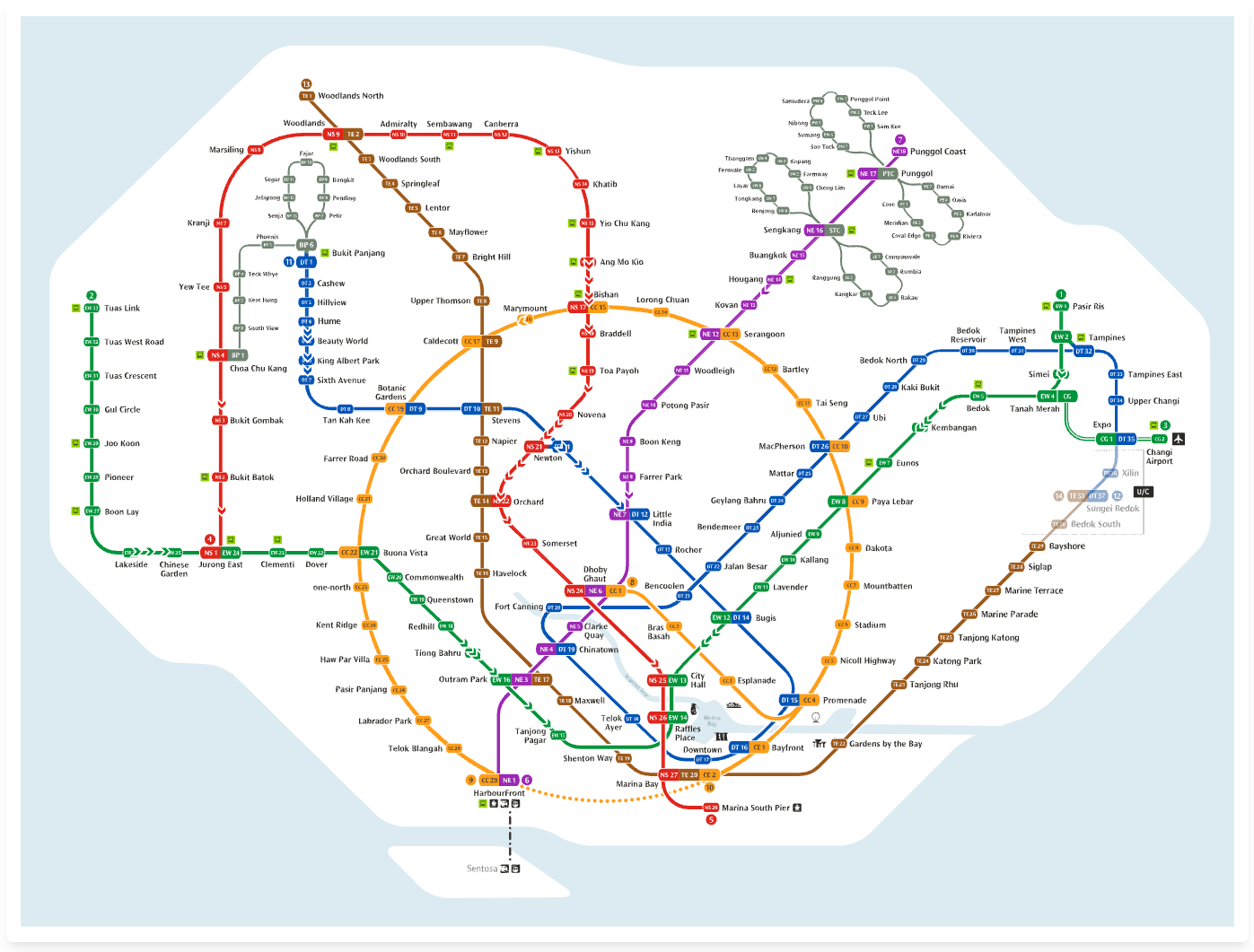
Chevrons running around in Singapore’s MRT map. An SVG optimized for data visualization
Data & simulation (Making it work)
Once the map was ready, the next step was to bring the data to life.
LTA’s Datamall
Luckily, Singapore’s Land Transport Authority has an Open Data API. Otherwise, I would’ve been relegated to creating a work of fiction. The raw data I’m using is hourly for May 2025 and split into weekday and weekend/PH trips. It’s historical, not live, but accurate enough to simulate the daily rhythm.
Chevrons
Passengers on their way from origin to destination appear on-brand as MRT‑style chevrons. But to keep browsers alive, I filter to only the busiest traffic flows.
Interpolation & leaderboards
I thought it’d be cool to make a time‑lapse for both day types. To make that smooth and dynamic, I used some creative freedom to interpolate hourly data into continuous flows. This also led to leaderboards like Network Peak Volume, Top 5 Origins and Top 5 Destinations at any one time during the day.
AI commentary
Something I’ve tried to take a stab at - but opened a can of worms - is a thing I’ve called “AI Commentary”. In essence, it’s real‑time data storytelling (which I think will become huge). In this case, it’s presenting hourly narrative insights merging peak data with cultural context to build a daily evolution of the network.
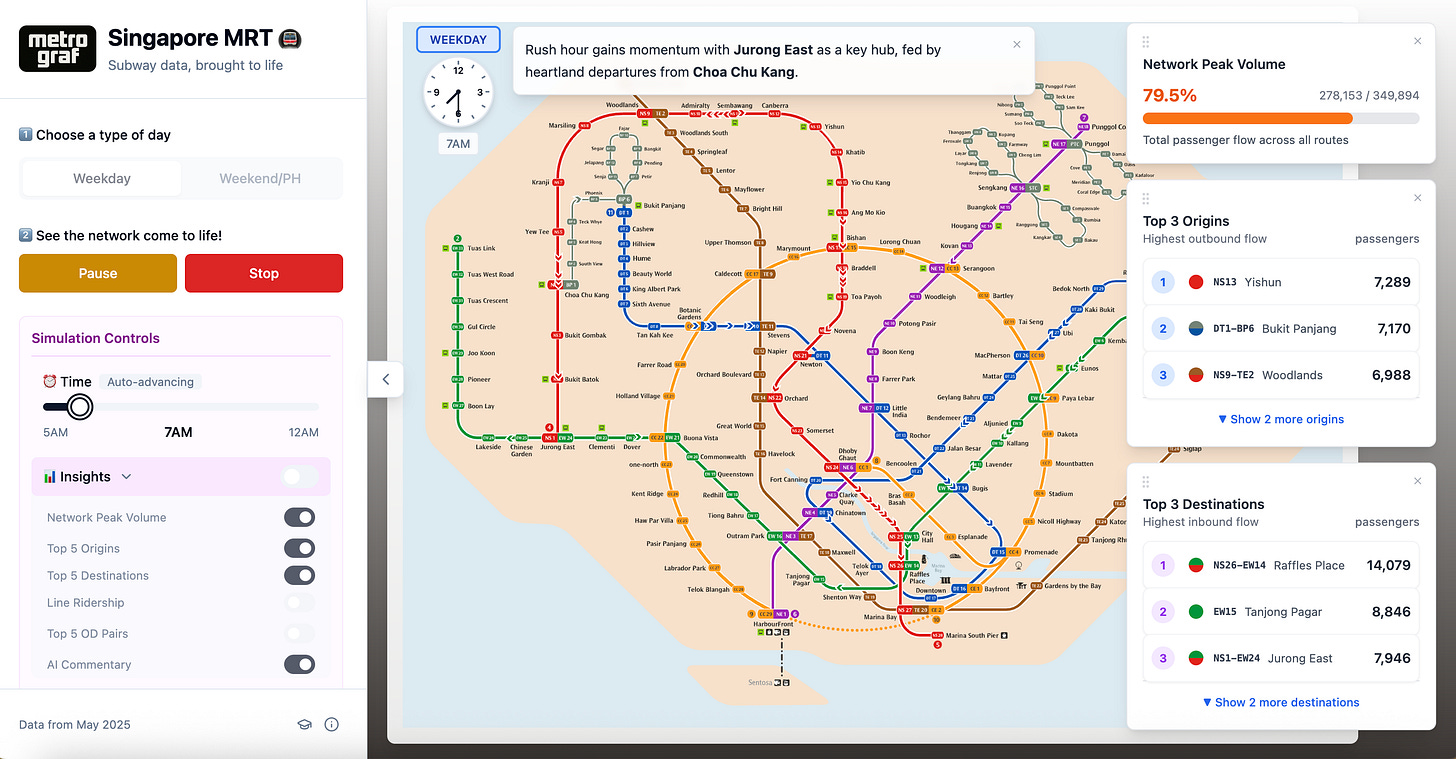
Leaderboards (Network Peak Volume, Top 5 Origins, and Top 5 Destinations), on a Heat Map, with AI commentary during a weekday morning rush hour. Simulation controls are shown on the left
Heatmap
It was a very late addition to the project, but inspired by the complaints of overcrowding at Bishan in Alfred Lua’s Is the MRT down again? tool, I knew I had to visualize a station’s busyness throughout the day.
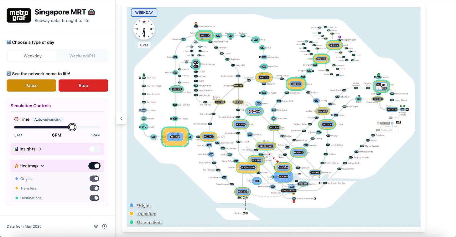
Heatmap for a weekday during evening rush hour - Jurong East is a huge transfer station, whereas the biggest exodus occurs in the CBD at Raffles Place and City Hall
Play, art, and brand (The emotional core)
What’s functional doesn’t have to be ugly. I heard they call it “taste” these days.
Exploration & simulation
The tool lets you play with station-level data or simulate the entire network as a time lapse for both weekdays and weekends/PHs. It’s unlikely to inform city planning, but there’s something soothing about seeing the data of “your” station come alive.
Dark mode
They say if you’re adding dark mode to a B2B SaaS, your priorities are off. So, of course, I had to build dark mode. It adds a midnight feel to passenger flows during the wee hours. And yes, it was a headache in SVG manipulation, but worth it.
MRT branding & Tailwind
I stayed close to Singapore MRT branding, but stopped short of styling the leaderboards the same way to avoid another rabbit hole. Lovable handed me the CSS framework Tailwind. That’s probably why the design has that familiar vibe-coded look.
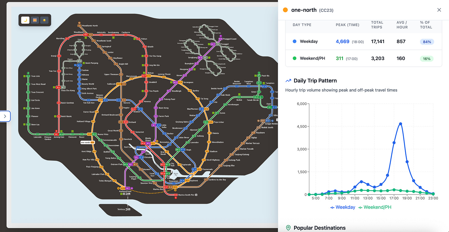
Exploration of “my” one-north MRT station in dark mode. I love living here, because on the weekends it’s so quiet 🤫
Reflection/closing (Final thoughts)
This project only exists because of vibe‑coding. Without it, I doubt I would’ve even started.
I’m not starting from zero (I built the MVP for my old payments startup in Python),
but in the past, my ideas were always limited by execution and delegation bottlenecks.
Now, it feels like I’ve unlocked superpowers.
I can finally translate product sense into working software, fast.
The real limitation isn’t code anymore.
It’s the imagination.

