Revamped my Personal Website with NextJS
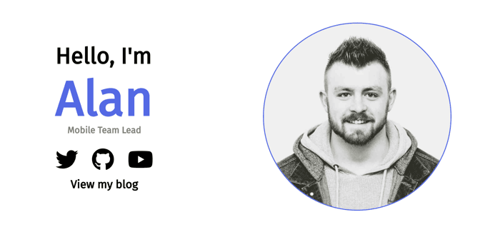
My personal website was sitting for a few years as a quick HTML/CSS site I threw together very quickly. It had fast become outdated, both content wise and functionality, tech-stack wise.
I decided to spin up a new version using NextJS and SASS. Simple flexbox and media queries to make it responsive on mobile/smaller screens.
At the minute, there's just a top hero section-type area, an about me section and an area to showcase some of my main skills in development I possess.
I still have a few things to add, I'd like to add a few more pages to show off some work I've done (although this isn't really critical as I'm not looking for a job, and won't be in the near future, as I'm in a stable role, however would be nice to outline some key projects I've worked on out-of-work), a contact area and a footer. Think it's looking good so far though.
I was also thinking of open sourcing this as a "personal website template" with easy to edit values, colours, layouts, which I might do in the near future, not that it's anything spectacular but it'd thrust me towards contributing to the open source world.
Let me know what you think - Best viewed on desktop but obviously responsive on mobile too.
https://alanmontgomery.co.uk

Looks Good.
Appreciate the feedback
I'd also increase the line height in the paragraphs to make them easier to read in general.
Thanks for your feedback! Greatly appreciated
Looks good! Just a suggestion, if you are looking for a job, I'd remove the numbers. You don't want to lose out on a job interview because you put 6/10 or something like that
Thanks so much mate!
As stated though... I'm not looking for a job. 6 is a true reflection of my skill, specifically in Angular, which I won't be revisiting as I specialise in React/Ionic and NextJS. If i was looking for a job I wouldn't include this and my CV would reflect skills and knowledge for the job at hand anyway. I won't be going anywhere for a while as I'm in a very good position currently! This is a Personal Website only.
Just a little feedback. It could be just me though. I find the "About Me" section a tiny bit hard to read, mainly because of the lighter background color. Maybe using a deeper blue would be better because then the contrast between the background and the text will be higher.
Made the blue a little deeper now. Alot easier to read.
Brilliant feedback thank you. I've actually changed this a little to be a bit deeper, in my local version where I'm adding more, so this is perfect. Really appreciate the feedback.
Just a side question, How you give yourself number on different tech? What is measurement step you follow? what is the means 9 vs 10 ?
Thanks for the question. It's based on experience and how much knowledge and exposure I've had to the technology. A 9.5 is basically a 10 but I would never give myself a 10 no matter how experienced as I believe there's always more to learn even if you think you know everything.
An 8 is basically I have a strong understanding and feel very confident but feel I could learn more.
A 6 for example means I've dabbled, know the basics, could use the tech confidently but maybe wouldn't be a "go to" and could definitely learn more.
A key on scores might be good... thanks!
Just a nitpick: It's actually "Apache httpd" - one of the many many projects at the Apache Software Foundation. Add least add it in the paragraph ("I use Apache httpd on a...") otherwise people who care will raise an eyebrow.
And ending just with the skills feels a little unfinished, but other than that - pretty good. As a personal website template I think it might need some more work.
Yes you're right, I will add the httpd to that title! Thank you 😂
Unfinished at the moment... Adding in recent blog posts and a contact section and footer below the skills area, will update when I get time to finish it off later, then hopefully it'll feel a bit more full and polished!
Really appreciate the feedback.
Love what you did with putting the technologies in some context. Each with a short description and “score”. This is so much kore effective than just the list of 1,000 tools and frameworks you’ve ever used.
Thank you so much for this feedback I appreciate that. Yes I felt listing the technologies I've used with a description helps really outline what I know rather than listing off random things I've "came across" I'd rather highlight the tech I'm really good at, have had alot of exposure to or feel like I'm very strong in, rather than listing everything.
I've built games in C# and used C++, Java, and lots more but I just feel like they are irrelevant as it'd be a bad reflection of what I know so no point listing them, same goes for frameworks used etc, I've used every CSS framework under the sun and I'd be proficient in them but I don't see a point in listing those
Hi @alanmontgomery, cool site! I noticed each of the paragraphs start with “I”. Consider adding variation to the copy, for example:
“One of my big passions is sharing my web development skill and knowledge through coding tutorials and other means. I find engaging with people eager to learn fulfilling.”
Keep up the good work. :)
Hey @stefcoetzee I really appreciate the feedback! 🙌 Thanks so much. I'll make a little adjustment to some of my copy. Thanks for the suggestions!!
Will add a few more bits and pieces today and a recent blog post section.
Looks cool!
Aw thank you I appreciate your feedback
Look pretty cool! A small feedback is that the social buttons' animation is weird for me, it makes me feel rather annoying than exciting to click. Would recommend you to check this out https://youtu.be/0lynCRmkqqE in case you want some ideas & inspirations for button animations.
Changed the animation or hover effect for those now. Thanks
Thanks for the feedback. I really appreciate it.
I actually thought that about the buttons also 😂 I'll check out that video thank you
Looks solid. I am also using NextJS for my current project and I am liking it so far, mainly started using it to get better SEO though. If you do decide to open source it then please ping me (it dosn't have to be easily editable for me, I can manage it hehe :p).
Thanks for the comment @Kristjan . Yeah the SEO is insane. I'm currently building a development community using Next as well and the SEO for that will be magic.
I will do. I think i'll polish it off a little and add a contact section and stuff, then release it!
Appreciate the feedback!