Revamped my product landing page for better conversions 💸 and improved features visibility🔥
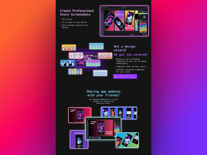
I did a major revamped of the landing page ui for my indie project, AppShots.
This updates give much more proper visibility into each individual features of the product with their own dedicated showcase sections.
Here's how it looked before,
And here's how it looks now,
The improvements I made where the top 3 sections you see after the hero section. I quickly designed that ui in figma this mrng out of thought that users may be bouncing off as there was earlier no proper visibility into features of the product, they were just grid cards with image ,title and some description.
So got up and started designing this new ui updates and got done in <2 hrs on the revamped ui design. All designs done by me in figma.
And then finished up with coding that ui in <2 hrs in astro in plain vanilla html/css with quite a bit of help from ChatGPT. Ton of web stuff I forgot was coming back to me as I was working on this, so was able to make some quick adjustments to code on my own as I was building this.
You can check out the product site here. Any feedback on this new designs is very much welcomed.😊🙏

Congratulations! It seems to me that there is a small glith on the Newsletter part where the block is badly designed (in the footer)