Roast my landing page
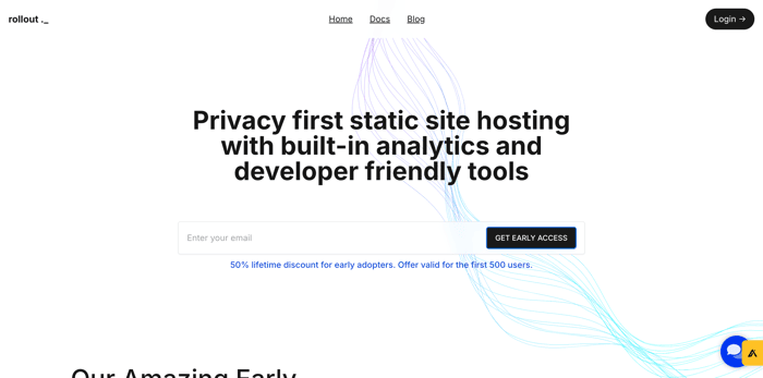
After a lot of feedback, overthinking, procrastinating. Finally I redid my landing page.
What do you think? Link - https://rollout.sh
After a lot of feedback, overthinking, procrastinating. Finally I redid my landing page.
What do you think? Link - https://rollout.sh

Hi,
I’m specialized in CRO (Conversion Rate Optimization), which is the art of improving conversions on the web.
Right now, I’m offering completely free support for landing pages. Basically, I’ll audit your landing page and give you clear recommendations, both short- and long-term, to help boost your conversions, all based on research and proven methods.
I provide this service for free under these conditions:
Feel free to reach out if you’d like my help, or if you know someone who might benefit from it. Thanks for your time, and have a great day.
You can contact me at: tom.haug67@gmail.c o m
The new landing page for Rollout looks clean and well-structured! The design is simple yet effective, making it easy to understand the product. However, adding more compelling CTAs and a bit of social proof could further boost engagement. Overall, a solid update! For those looking to enhance their security, professional security services can ensure safety and peace of mind.
Hey Neeraj! love the website and idea. just for context, i am also building a devtool startup/open source project and am working on our website/marketing/messaging. hopefully i can share a bit of what ive learned along the way and that this is helpful:
Would love to know what do you guys think?