Roast my landing page - Ask Me Anything, a tool for your audience to ask you anything
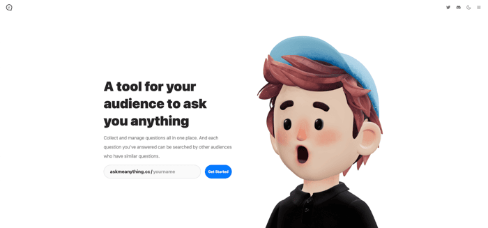
We launched our landing page last week and had got so many feedback from our early users. Now we want you give us more feedback to improve it, so just come to roast it! https://www.askmeanything.cc
We're open to constructive criticism and want to know what you really think. Let us have it, no punches pulled. We can take it and we promise to improve based on your feedback. So bring on the roasts and let us know how we can do better.
And also welcome to join our community to introduce yourself and share your AMA page with others. And feel free to give us any positive or negative feedback! https://discord.gg/Z6nbAbUMPT
Looking forward your feedback.
Many thanks!

First thing I notice is that the website is pretty slow. I would recommend pressing F12, clicking on the double arrows in the upper right, and clicking "lighthouse" and then running a page analysis.
It can sus out SEO stuff and also why your page might be slow.
Secondly, small criticism, but your favicon has a white background, and is not transparent. Not a big deal, but could be improved.
Thirdly, I don't see the benefits listed on this website, just many features. For example, it's good that I can get a good feel of what it is, but I think you should have a catchier tagline in the start: "Social Media for AMAs: collect all your answers in one place"
Overall, although this isn't a website criticism, I don't see how this has that much benefit over just hosting a reddit AMA or allowing users to submit questions through email or Quora.
However, I think you'd definitely have a market if you could detect questions in a reddit AMA or email and have them routed to one place.
They could set it to public, so questions from other social media like reddit AMAs or twitter questions would be routed here in a embeded timeline, or private, where they'll only get their questions in an inbox here.
As for how you can detect what's a question to not, you could use AI. GPT-3 is a pretty good sentiment analyzer right now.
I think this is a good website in terms of design, but copy could definitely use some work. I also don't understand the purpose of the avatar in the header. It doesn't seem related to the product.
I would also like some criticism for my website once I launch btw. For the record, I'm developing an AI API that allows developers to connect their apps to various AI, and we're launching with Stable Diffusion (art AI) and BLOOM (GPT-3 alternative).
If you're curious, I post frequent building in public updates on my twitter https://twitter.com/TheRealEtch
Good luck!
I'm opening your landing page while sipping my morning coffee.
I like the logo, it's cute. The huge image of the cartoon character dude with his mouth open is also cute, but I don't really know how is he relating to the website. He looks more confused than ready to ask anything (or answer a question).
You use blue font text for both sub headlines and for text links. It's quite impossible to say by just looking at the page what is a link and what is not. That's not great for usability. Do you want me to read your page? Then don't make think.
After scrolling down a bit, the re is almost no other colors in this website other than blue. It gets visually repetitive and a bit dull.
I tried the "Ask Me Anything" feature you have at the bottom of the page, and it was a bit confusing experience, as the content on screen changes yet I need to manually scroll the browser in order to see the currently active content.
I think this is an interesting idea. Your main problem is that the landing page is visually very repetitive with only using blue color and there were some usability issues.