Roast my landing page 🥺
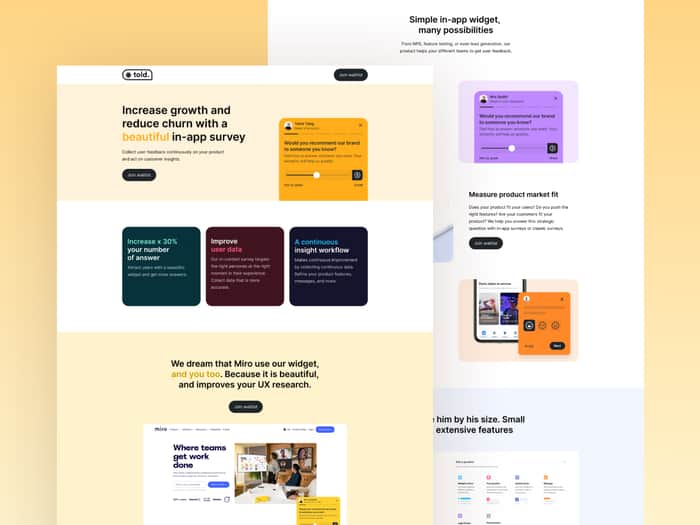
https://told.framer.website/
Hi, community,
I'm currently running a pivot. Can you help me roast my landing page for our new product? We want to help you collect feedback with in-app surveys. Be honest, thank you very much.

Gorgeous layout, but some of the language is confusing:
"We dream that Miro use our widget, and you too. Because it is beautiful, and improves your UX research." - This comes off stuck up and like you're begging for people to sign up, and also from a grammar point of view doesn't make sense. I don't think a section designed for 'we hope this company would use it" would help you.
"Increase x 30% your number of answer " - The wording here is a little confusing to me. I'd replace with: "Increase your response rate by +30%"
I can see you're using Framer to build your site - If you have control over the HTML tags used, I'd recommend setting your title at the top as a 'H1'.
I think you can improve your 'title' - "Told - In-app survey widget": Feels pretty uninspiring.
Your site snaps into a mobile layout way too early (circa 1395px). I'd reserve a single column layout for 968px and below, otherwise anyone on a slightly larger screen (24" desktop) will see a single row of elements with huge gaps of space either side.
I'm not much of an artist/designer, but color-wise I feel like the site is quite 'busy' and therefore because there are so many colors, it makes your CTAs for "Join Waitlist" VERY easy to miss/ignore.
Looks cool though, good luck!
Thank you so much @CaptainBeard for taking the time to review my landing. I completly agree with all your points. I will work today on changes. If I can help you in return, let me know!
✅ love your 1 picture is worth a thousand words in the hero - btw would be better if it was interactable, for example i tried to press (Send) but nothing happened
✅ I think you should have "titles" or headers in your card's content, for example
you wrote "Evaluate the Net Promotion Score of your website or application" - i would write
"h2 - NPS
paragraph - Evaluate the Net Promotion Score of your website or application"
👀 Collect feedback in colors - what's this I don't see any value add from this whole section
👀 'Don’t judge him by his size. Small product, extensive features' - this sounds sexual or whatever, also why HIM? Use "it" or something else tbh
👀 For PM
🔴 No testimonials
🔴 Not enough "human" faces/anything i can relate to considering it's a communication tool for powerusers - maybe this is a personal preference?
Thanks a lot, @orliesaurus, for taking the time to look for my landing page. All your insights are valuable. I will work on each point from this perspective.
Another point which I would love to hear your thoughts on: for now, I don't have any testimonials because the product is not launched. Do you think I need to trick this part to reach more people? Thanks a lot again.
no, don't trick anyone - just get 1 great testimonial as soon as possible!
That's what I thought! Thanks a lot again!