||🔥 ROAST || My Landing Page & Pricing Page
👋 Hello Indie Hackers,
A month ago we've 🚀 launched Awesome Social in private beta🤐.
👇Link:
https://www.awesomesuite.com/social)
Our app is almost ready for public. We are planning on launching Awesome Social on Product Hunt soon
However before we launch we wanted a 👀 fresh opinion and feedback on our landing page and pricing.
I'm keen to get some famous IH feedback on this new landing page and see how many of you guys understand our offering and how it might inspire you to use it.
Also, wanted a second opinion on pricing page💸.
👇Link:
(https://awesomesuite.com/social/pricing)
Currently we have a more playful pricing page. But now I am rethinking towards making it more simple. I think I got carried away when developing the previous version.😅
Any and all comments/feedback much appreciated.
Enjoy Roasting 🔥

First things first, your site is absolutely gorgeous
So well designed!! Did you design this yourself or hire someone?
I especially love the nav hover states. Love the 3d elements and love how well everything works together.
On the UX side of things the website hierarchy is impeccable especially since you've designed the nav menu to go with the icons.
I'll definitely we using this website as inspiration.
One thing to do though, is definitely make your value proposition more clear. It needs to be super obvious what you're selling. A 14 day free trial for what?
Thank you for the amazing feedback @sunnysideup :) . I did design the everything myself but had taken a lot of inspiration from places.
Looks like value proposition is a constant problem everyone has been pointing.
Once again, it really means a lot, thank you for the feedback.
Here is my feedback for Awesome Social.
Have you thought about using AI to help your users better predict when it is the best time to post? I think it might be missing that missing that feature to connect everything together.
By the way, if you're interested in a more comprehensive feedback for you via Growth Audit to build a Growth Strategy upon.
Here is an example of a Growth Audit:
https://docs.google.com/document/d/1LjRjzZbR2tHHtXcilFcFxxpS3atnYA7yM8mbvk5N9Rc/edit?usp=drivesdk
Here is an example of a Growth Strategy, too:
https://docs.google.com/document/d/1FGaYC0X9eIRrZDG6TEDGu2ukDn7qsnu4o_hGue6b1es/edit?usp=drivesdk
If you are interested, feel free to schedule a video call with me here: https://calendly.com/omnisaas/30min?month=2023-04
Thanks @growingSAAS for the amazing feedback :)
the h1 needs to have a clearer and more concise value proposition.
h2 does need to have the unique value proposition for you to stand out. Is it price, quality or something else? what makes me choose over buffer or hootsuite? who is the target market?
would love you to rate my landing page
https://www.indiehackers.com/post/fire-plan-landing-page-feedback-ef03d643eb
Thank you @bramburn. Would surely improve upon this.
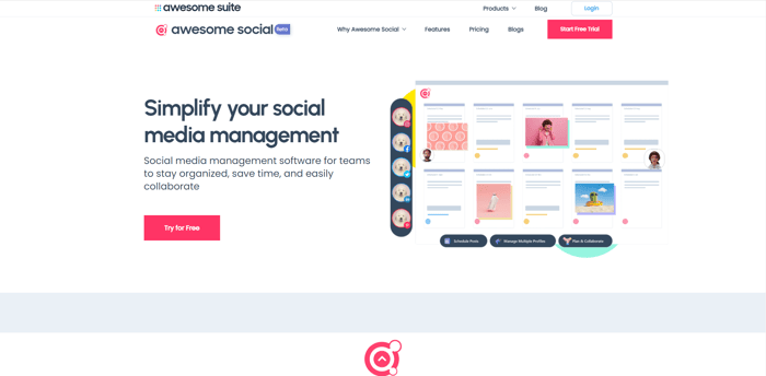
Not sure why there is a gray space between the banner and the first section.
And there is too much on the nav bar. 3 rows on the top.
Don't really like the animation in the Team Collaboration section.
The pricing page seems to have some performance issues, but not a big one.
Thanks @simon_cheng. That was really helpful. Really admire the feedback. For Team collaboration section you mean the animated characters or the CSS animation
The colors and visuals are aesthetically pleasing however the navigation bar and the header are too close and unnecessarily separated
agree, the navigation bar is too busy.
Thanks @simon_cheng
Thanks, would surely look at improving the navigation.
Hi,
It looks very nice! Congrats!
I left some comments here - https://visualdebug.com/show/awesomesuite.com
Hey Stan,
You are Awesome!! Really really appreciate the feedback and many thanks for going beyond and showcasing the issues. :)
No worries, if you need any further help. Let me know!
Colour pallet is adventurous..
Thank you EdmondAmaning.