Roast my landing page: Vitaely
Hey everyone!
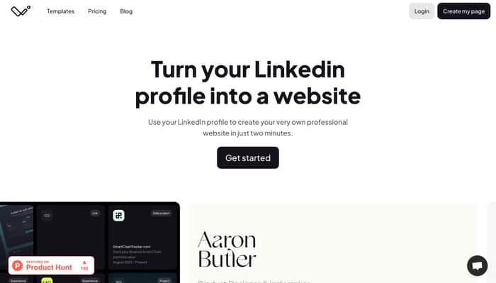
This is an open invitation to roast the recent landing page updates for https://www.vitaely.me — a site that lets you turn your Linkedin profile into a landing page in just two minutes.
I recently made a few changes to the overall styling and tried to show off the templates more than just trying to communicate the idea with words.
It's less colourful than before but I think this will give me more flexibility in the future to have more colourful templates.
If you have two minutes spare, let me know what you think of the page,
Thanks everyone!

Hello!
You have a great landing page. A few suggestions I would make:
Other than that it looks great to me!
Thank you for taking a look and for the kind words and thoughtful feedback!
The duplicate content is a really good point...
Not a lot of love for the unexpected horizontal scrolling carousel 😅
Hi Aaron,
I don't think it needs roasting - I think it's very good.
I hope a couple of observations may help:
In my experience, most real-world business folk who are on LinkedIn but not in a tech start-up neither know nor care about Product Hunt. So if you're trying to reach a broad LinkedIn audience beyond tech and you introduce a headline which most people won't understand the significance of, they may find their first impression a little mysterious - as in "what's this for?"
The wide landscape spread of screenshots and your picture is a bit of an overload for the initial impression. If the page began with the first item below the fold "Show off your best work", that feels like a much stronger and clearer first impression - viewers "get that" straight away.
Hope this helps
Hey there, thanks for taking the time to go onto the website and to leave your feedback!
You're not the first person to mention that ProductHunt might be a bit out of place but it's a great point specifically about the type of audience that would have Linkedin—I'll likley remove references to ProductHunt unless I'm in the middle of a launch.
I agree that the horizontal scrolling section is a little overloading and pretty frustrating too. Great feedback that the "show off your best work" section resonated with you. I'll consider bumping that up the page!
Under "Show off your best work," which I thought I perfectly understood, I was then thrown by "Smart Chain Tracker 2021: Track the value of your BSC crypto portfolio" underneath the graphic. I'm guessing that the combination of image+text is meant to be an exemplar of what "Aaron Butler's" LinkedIn page would generate, but the context doesn't make that clear. I felt like image+text was supposed to tell me something directly about Vitaely, but then Smart Chain Tracker just looked like an ad for another service.
I think it might be the unexpected specificity of "Smart Chain Tracker" that causes the problem. If you mean it as an exemplar of project by a fictitious person, then it should be playing the role of lorem ipsum text, but its concrete, nongeneric specificity takes my mind and attention away from Vitaely to thinking about crypto.
Yes, I now see "Choose the information from your Linkedin (sic) profile that you want to display on your resume." But the way my eyes moved was (1) "Show off your best work" → (2) Image → (3) "Smart Chain Tracker" → (4) Started to compose this comment due to my confusion and only now do I see the secondary text under "Show off your best work."
Thanks for taking the time to check out the page!
Really good point that it's not clear that this is something that the website generates, and that it even looks like an add!
I think I'll have a rethink of these sections having the "tan" background that bleeds into the images
Hey Aaron, took a quick glance. Here are a few thoughts!
The horizontal carousel scroll as I scroll down the page was a little disorienting for me. Not sure if you are getting anything out of that effect because my instinct is to flip through the carousel to see all the screenshots and I'm not able to.
I'd like to see more examples. The headline is perfectly clear "Turn your Linkedin profile into a website". I think what's less clear is "why I need this?" and to show me how great the resulting website looks.
I feel like there needs to be more contrast between your white background and the slightly darker tan cards you are using as the backdrop for the different sections.
Hope this helps.
Best,
Matt
Hey Matt, thank you so much for taking the time to check out the page and for dropping your feedback!
Seems like the horizontal scrolling needs to go for sure... replaced by a better way to see the templates
Great point on the contrast too, it all feels a bit too flat now—will for on that too!
No prob!
I think the site title / caption "Turn your LinkedIn profile into a website" sounds good and is easy to understand.
Moving the screenshots horizontally while I scroll vertically is (very) annoying.
The "FEATURED ON Product Hunt" badge on the left is distracting and it makes your product seem less professional / unproven to me.
There is a general problem on the page that I get confused whether I'm looking at screenshots of your product or example outputs. Maybe you can add some descriptive text saying that this is an example website of a product designer. Maybe even add a screenshot of their LinkedIn page?
Good luck!
Thank you very much for taking the time to check out the page!
Great point on the horizontal scrolling part being annoying, I was trying to be a bit too cute with that bit without thinking it through. Will looks to improve that section.
Nice point on the Product Hunt badge. It felt great at the time but I agree it does seem to label the sight as amateurish.
Very good point on the lack of clarity over examples of pages that have been made by the product vs the product itself.
I like the idea of comparing a linkedin page to a page made via Vitaely using the same content—definitely going to explore that!
One thing I was wondering while reading your landing page is if I could also use this tool as a freelance software developer.
Maybe you could make it more explicit whether your tool is targeted at employees and / or self employed people.
That's really interesting that you were wondering that. As a freelance software developer, what would you hope that the tool can do? How would you envision using your page?
It would be great if the tool could generate an up to date freelance CV from LinkedIn (maybe from a LinkedIn company page?) with a list of projects and skills and show it on the website as well as generate a PDF.
It would not need to do much more I think, as long as the website looks professional it’s much better than not having any website for a freelancer.
I think it could help acquire new projects, negotiate a slightly better rate and (maybe automatically) update agencies with my availability.
I’m moving away from freelancing though so I probably can’t use your service myself.