Roast my site and I’ll “roast” yours!
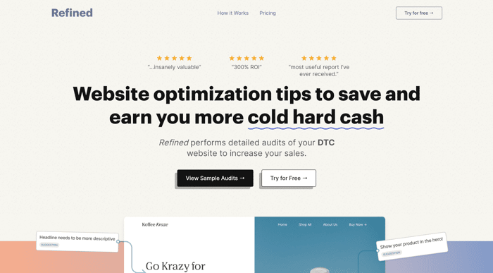
Hello all 👋
I’ll keep this short,
I’m a long time roaster, first time poster.
After 5 years of being a senior UX designer,
Analyzing 100s & 100s of landing pages,
And getting real brands more sales,
I decided to make a productized service,
Refined -- https://www.refined.report/
Detailed UX reports on your brand’s website, focused on the DTC niche.
For this launch, if you leave me a roast on my website, I will give you a free quick win on your brand’s website.
I don’t know how many roasts I will get, so putting the limit at 20 roasts. Anyone after that I apologize in advance, first come first serve ;).
I’m looking for feedback on
- Is the product offering clear?
- Is this something valuable you or someone who runs a DTC brand would pay for?
- What is your overall impression of the branding / website.
Thank you all in advance 😄!

Landing is super clear and after spending ~2mins on the site I'm completely aware what you offer.
Only thing I'd change is that weird "wavy" animation when you hover on underlined words, e.g "cold hard cash" since I found it super distracting.
My site is https://notify-me.rs/ and simply put - We can track websites that you are interested in, and each time they change, you'll get a color coded update with the changes straight into email inbox. Our aim is to provide super simple UI so you don't ever have to input more than site url, name and optionally some keywords.
Hey @imafikus! Thanks for your feedback.
Glad to know it's super clear! To be honest, I'm kinda a big fan of the waves and have gotten some comments on people both liking it and disliking, so in this case , I may just opt for personal preference and keep them haha!
I went through your companies Landing Page today, and was able to crank out a Quick Win for you. I signed up and plan on using it as well, so great job on your product!
Here is your Quick Win!
Link to Quick Win →
https://www.figma.com/proto/4lOmBkQoaxmDDV6jrVadkG/Notify-Me---Quick-Win?page-id=0%3A1&node-id=501-2&viewport=593%2C-232%2C0.28&scaling=scale-down
Link to Raw Figma Files →
https://www.figma.com/file/4lOmBkQoaxmDDV6jrVadkG/Notify-Me---Quick-Win?node-id=0%3A1&t=oqOjzJThGPJDrvpS-1
Hope you get some value out of this!
Hi @GetHimMama, First thing I should point out, right before "30 day
money-back guarantee" section, the section above that sort of looks weird visually. The dude with the crowns head is really small and the image is completely off
Also, the checkmarks look weird with that 3d effect. would remove black box shadow effect or make it lighter and blurred out I would think.
I'm not a fan of the wavy underlines. it seems overkill and looks weird.
Your pricing is a bit weird seeming. Why not charge per page rather than offering a second plan that says the whole site? Might be useful for users who only need certain pages roasted.
I feel having testimonials at very top is adding a bit much to above fold.
Any feedback on https://obeatow.com would be great.
Hey @Sewellstephens! Thanks again for your feedback
Here is your Quick Win!
Link to Quick Win →
https://www.figma.com/proto/ExuQLOiJLHgOh7FQgMK0iJ/Obeatow---Quick-Win?page-id=0%3A1&node-id=401-2&viewport=592%2C89%2C0.37&scaling=scale-down
Link to Raw Figma Files →
https://www.figma.com/file/ExuQLOiJLHgOh7FQgMK0iJ/Obeatow---Quick-Win?node-id=401%3A2&t=uyfORmbMmYL53yGJ-1
Hope you get some value out of this!
Hey @Sewellstephens, thanks for taking the time to write up some feedback.
Yeah you're right about the "crown head guy" image, was thinking about refining that section as well, so thanks for confirming that!
And for pricing, still trying figure out the best way to do it. I've seen people do it with all pages like you mentioned, so I may switch to that pricing method. Think I'm going to keep as it is for now and see how it performs, and if it doesn't do well I'll ideate with the "pay-per-page" pricing.
Just scrolled through your landing page, I have a few ideas I will flesh out in design and get back to you by the end of this week.
Thanks again!
I like the order of things.
Meaning, you start with a great headline and then immediately show an example of an audit.
Then, you dive right into your customer's pain points and get them hungry for a solution that you feed them in the very next section.
This leaves the rest of the page to go over logistics and explaining how that problem will be solved.
Neat and tidy delivery, great idea.
I also like how you give yourself a 2-week turnaround window and focus on the audits themselves, rather than the implementation of the design changes. They are paying for your expertise, not your technical services.
My site is https://retinadesign.co
A graphic design firm operating on a subscription model.
Technically, a productized service but I feel the subscription idea communicates it better.
I signed up for a quick tip so that's fine if you want to address feedback there! I'm excited!
Hey @Retina_Design,
I sent you back an email, but figured I'd comment back here as well just in case you miss it!
Here is your Quick Win
View Quick Win →
https://www.figma.com/proto/rQBl6ke5DThGNeoERqNgZu/Izabella-Boutique---Quick-Win-(Copy)?page-id=0%3A1&node-id=202-3&viewport=445%2C-68%2C0.33&scaling=scale-down
View Raw Figma Files →
https://www.figma.com/file/rQBl6ke5DThGNeoERqNgZu/Retina-Design---Quick-Win?node-id=1%3A2&t=taFs0kevTgg2P6PX-1
Thanks again!
Hey @Retina_Design!
Thanks for the feedback! I spent a lot of time working on the copy for the website and the structure of verbiage from top to bottom.
And yep got you "free quick win" sign up, thanks for filling that out! I will get that over to you by the end of this week!
Yeah, wow I'm in love with this design. Going through this alone was beneficial for my design education. Your level of experience is super immediately evident.
A couple things I noticed:
Things I love:
I don't have a product landing page yet, just a personal site:
https://www.wattsupjaz.com/
If you're willing, I'd super appreciate any design insight you have. And best of luck with your service!
Hey @WattsUpJaz ! Thanks again for your feedback
Here is your Quick Win!
Link to Quick Win →
https://www.figma.com/proto/m7GqIhw7AUB3hQvI7Pwmqf/Watt-up-Jaz---Quick-Win?page-id=0%3A1&node-id=301-2&viewport=185%2C503%2C0.21&scaling=contain
Link to Raw Figma Files →
https://www.figma.com/file/m7GqIhw7AUB3hQvI7Pwmqf/Watt-up-Jaz---Quick-Win?node-id=0%3A1&t=OTM6WpnIP4C5QANx-1
Hope you get some value out of this!
Wow thank you so much!! This is super valuable, I'll definitely be implementing this feedback. Super appreciate the candor and professionalism of your comments 🙌🏽 🙌🏽 I really hope your service takes off! It's a great product
My pleasure! Glad you enjoyed it.
Thanks! I hope it takes off too haha ;)
Hey Jaz! Thanks for your feedback!
I will definitely try rewriting the hero screenshots and grammar, been thinking about making that image an actual "before-and-after" screenshot of a website so it's super clear, but we'll see.
And yes you're totally right about the thumbs up & down icons, they all look the same, so I'm guessing that gives the feeling that "all these blobs of text below the icon are the same" as well, so will 100% update those.
I'm glad you like the design! I'm trying to have it read and present professionally, while also have characteristics of fun & my personality.
Thanks for sharing your personal site, I'll go through it this week and get you a quick win with before and after screenshots by the end of the week!
Some notes as I read your landing page:
"Recommendations unique to your cool brand" The word "cool" seems unnecessary here. Not all brands are cool!
Overall really good!
Here's my landing page:
https://bankstatementconverter.com/
Hey @AnGuRuSO!
Really appreciate your feedback on my landing page. I may add another section so people can see more detailed examples of those reports.
For niche, I picked DTC because I had already had experience working with a few brands and they were really receptive with this idea, but honestly opening up to all kinds of websites seems like a good idea. I will explore this for sure.
I went though your brand’s landing page, super nice! Already have a lot of good practices in store.
I found a few areas you could refine to have a better experience and get more customers.
Here’s a link to the Quick Win
https://www.figma.com/proto/1ziH4HC7u0QmivKwGCdlPj/BSC---Quick-Win?page-id=0%3A1&node-id=1-26&viewport=1098%2C442%2C0.38&scaling=scale-down
And here is a link to the design file documented in Figma
https://www.figma.com/file/1ziH4HC7u0QmivKwGCdlPj/BSC---Quick-Win?node-id=1%3A3&t=DSnYSa7VyWP5iRYN-1
Hope I provided you some value, thanks again!
Thank you very much! The quick win is awesome, will implement it.
Heck yeah! Glad you enjoyed it!